Nature Photographers Network
This is the preserved archive of the original Nature Photographers Network. The community continues at naturephotographers.network.
Sound of colors - Repost
‹ PreviousLandscape GalleryNext ›

Sound of colors - Repost

by Serban Simboteleca

Gallery: LandscapePosted October 25, 2012359 views15 comments
I want to thank you guys for the feedback on the original post http://www.naturephotographers.net/imagecritique/ic.cgi?a=vp&pr=198004&CGISESSID=e07f9efba38b2b689f69a597e712b312&u=16895
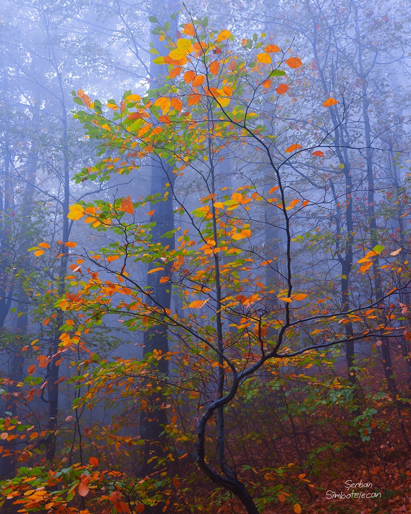
I worked a little bit on the image and I got to a point where I'm really happy with it now.
I adjusted the colors more, it's slightly warmer now. I reduced the saturation so it doesn't punch you as the original did, just enough as it still has the contrast created by the colors.
The compression of jpeg hurts a little the quality of the image.

Comments

15 comments
Comment posted by Harry Lichtman on October 25, 2012 at 6:27 AM
I like the original and this one looks great too. It porttreys that feeling I get in the woods during a foggy autumn day. Super job with this. :toast:
Registered on September 17, 2010, 304 Posts, 3507 Comments
Comment posted by scott lanz on October 25, 2012 at 7:23 AM
Very nice, Serban. I like the repost even more than the original, mostly due to the reduced saturation giving the image a more realistic feel. I'd probably reduce the sat even more, but it certainly looks good as is. The image captures and conveys a wonderful mood and is quite artistic. :toast:
Registered on November 14, 2003, 840 Posts, 12902 Comments
Comment posted by Tom Hilton on October 25, 2012 at 7:26 AM
Great shot...
well seen and processed...
:toast:
Registered on September 19, 2011, 68 Posts, 668 Comments
Comment posted by Serban Simboteleca on October 25, 2012 at 7:38 AM
Thanks again.
Scott, I tried that, but the image doesn't work anymore the way I intended. I want those leaves to appear bright but soft in the same time, that's why I pushed the saturation. In the same time I want the separation from the background, but done through the colors. That's why I adjusted to have the blue there. I will try probably to print it on mate paper someday, it is the kind of image would work well.
I think there was one more thing that I could've done, to brighten a little the lower part.
Registered on March 17, 2011, 8 Posts, 67 Comments
Comment posted by Bill Chambers on October 25, 2012 at 11:15 AM
This is very nice Serban. I don't remember seeing the original post, but I like this one a lot. Richly saturated leaves, but very believable, and the color contrast is very attractive. I do wish there was a bit more room at the top though.
Registered on April 10, 2005, 753 Posts, 21216 Comments
Comment posted by Mark Seaver on October 25, 2012 at 11:26 AM
Beautiful work, Serban. Between the color in the leaves and the distance from the background trees your subject stands out well and really glows against the foggy blue background. Great job of separating the subject from the rest of a potentially busy scene.
Registered on January 23, 2011, 1103 Posts, 17270 Comments
Comment posted by Joseph Campisi on October 25, 2012 at 12:26 PM
I loved the original Serban, and this version is even better! :toast: Those little tweaks are a definite improvement.
Registered on November 24, 2008, 304 Posts, 3211 Comments
Comment posted by John Williams on October 25, 2012 at 12:38 PM
The way the blue backs up the wonderful warm colors in the foreground is superb. :toast:
Registered on September 6, 2007, 221 Posts, 5985 Comments
Comment posted by Nancy Lea Sandy on October 25, 2012 at 12:51 PM
Great job re-working this. the original was nice and this is even better.
Registered on January 24, 2011, 576 Posts, 6942 Comments
Comment posted by Dean Sauskojus on October 25, 2012 at 3:38 PM
What a beautiful image that pops right off the page. The multi-colored leaves are intense and the blue background fog intensifies this even more. One thing you might consider that would take this image even further is backing off the colored leaves in the LLC, either by sat. levels or darkening. This would lower the competition between the corner and the tree. This is the type of image I really try to seek out and you nailed this one. Nice work Serban!
Registered on September 29, 2009, 137 Posts, 2659 Comments
Comment posted by Robert Dayton on October 25, 2012 at 4:59 PM
Lovely, Serban! The adjustments work.
Registered on November 11, 2008, 281 Posts, 3958 Comments
Comment posted by Shantikara Valuska on October 25, 2012 at 5:18 PM
Lovely image. I love the atmosphere and the warm and cold colors harmony.
:toast:
Registered on July 25, 2011, 38 Posts, 451 Comments
Comment posted by Youssef Ismail on October 26, 2012 at 12:51 AM
Serban,

Now we have something! Nice work re-processing.
Registered on November 1, 2003, 474 Posts, 5555 Comments
Comment posted by Serban Simboteleca on October 26, 2012 at 6:32 AM
Thank you all for your input. I will possible stick in the end with two versions on this one: one for web for a realistic look on which I will lower the saturation and increase the brightness and another one saturated like here for a painting look, that I would print on mate paper.
I'll add those version here in the post if they satisfy me. :toast:
Registered on March 17, 2011, 8 Posts, 67 Comments
Comment posted by Stuart Williams on October 27, 2012 at 1:01 AM
exquisite. well seen and conceived.
Registered on December 7, 2007, 247 Posts, 4792 Comments