Nature Photographers Network
This is the preserved archive of the original Nature Photographers Network. The community continues at naturephotographers.network.
(c) Out for a stroll
‹ PreviousWildlife GalleryNext ›

(c) Out for a stroll

by Jorne de Bruin

Gallery: WildlifePosted October 31, 2012244 views9 comments
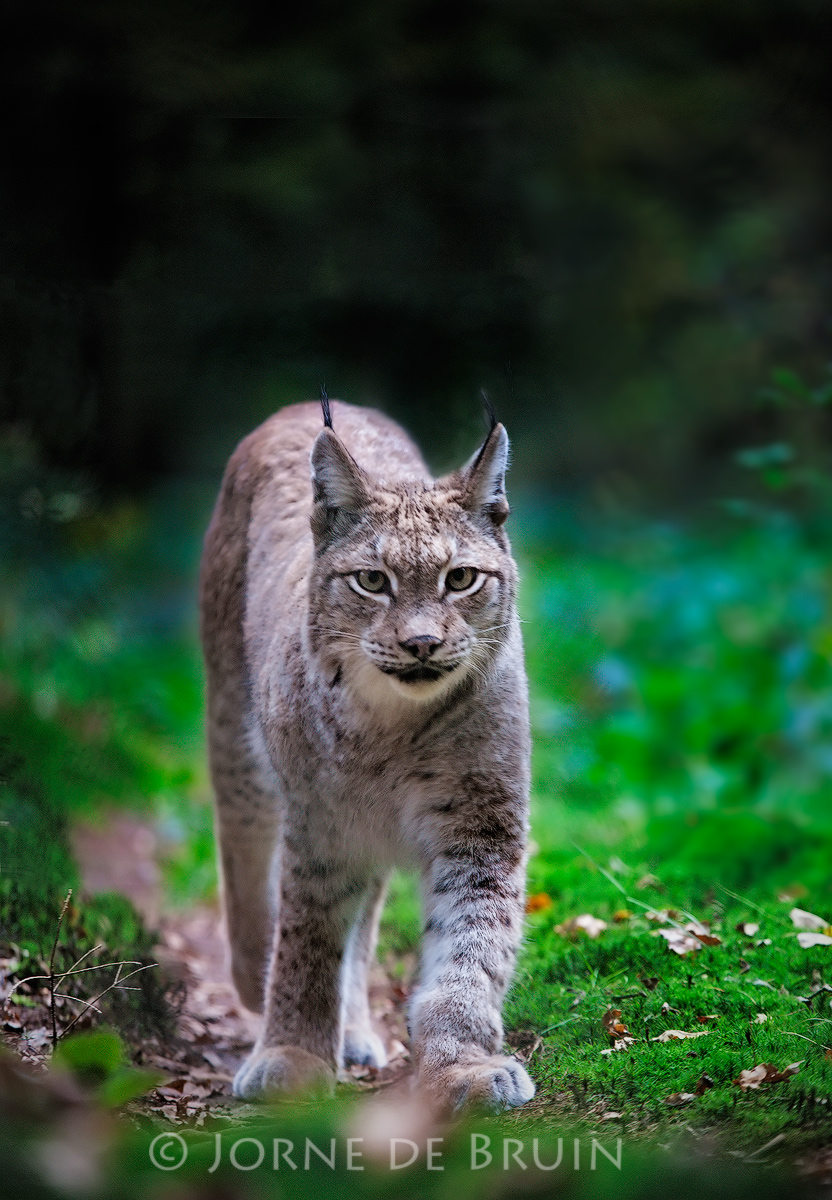
So I finally had some time to do some animal photography, so last friday we went to Germany (just over the border) to a small wildlife park with large enclosures for Lynx. While I'd prefer to photograph some real wildlife, the time and money simply has not been there the last few years, so this has to do! The Lynx was strolling up and down a path a few times, giving us the time to get a low perspective. I did remove some distracting elements in the background (since it's a captive picture anyway).

Please view large, c&c welcome!

edit: I still have some problems with the sharpening I see... Hard to get right with the fur!

tech Canon 1dsmkII, 200mm @ f4, 1/320 sec & iso 800

note that (c) means this is a captive subject

Comments

9 comments
Comment posted by John Tobias on October 31, 2012 at 9:42 AM
I like the sharpness of the eyes and face of the lynx. I do find the small OOF white spot right in front of its feet distracting and would suggest darkening it. Not sure what it is, but the BG in the larger image looks a bit odd to me. Nice portrait of the cat, thanks for sharing.
Registered on September 12, 2009, 2120 Posts, 6455 Comments
Comment posted by Zack Clothier on October 31, 2012 at 12:22 PM
Nice perspective on this cat, Jorne, I agree with John about the background looking odd in a few places, especially in the larger version. The left and right sides of the animal have unusual artifacts, perhaps from the cloning. As long as your not against cloning I would suggest removing that light spot in front of the animals paws.
Registered on January 28, 2010, 343 Posts, 2257 Comments
Comment posted by Jorne de Bruin on October 31, 2012 at 12:37 PM
Thanks for the suggestions guys. I think the artifacts you are seeing are the result of the sharpening, they are not in the original version. Did some tweaking on the image. you can see a large version here: http://500px.com/photo/17109055
Registered on June 26, 2008, 178 Posts, 2136 Comments
Comment posted by Jamie Douglas on October 31, 2012 at 11:50 PM
Nice work and what a special encounter Jorne. I might reduce the saturation a tad and remove the blue cast that shows in the fur.
Registered on July 16, 2012, 10 Posts, 87 Comments
Comment posted by Jorne de Bruin on November 1, 2012 at 8:52 AM
Thanks Jamie. However on my monitor I see no blueish cast? Does anyone else see this? (it is calibrated)
Registered on June 26, 2008, 178 Posts, 2136 Comments
Comment posted by Brad Hill on November 1, 2012 at 8:59 AM
Hey Jorne,

I quite like the contrast here - the quite light cat really pops off the much darker background very well. Great eye contact and overall a really focused look on the cat's face. Perhaps a bit of an awkward stance/pose on the cat - but that's no fault of your's (this guy should have spent a bit more time working on its stride - on the catwalk of course! :wink: ).

One small "personal preference" nit: Personally I'd like to see more foreground (the cat positioned further back in the frame) so that it has more room to move into. In this case the cat seems to be about to leave the frame (which some may like), which puts ALL the emphasis on the cat - and little attention is paid to the cat's surroundings. Hope that makes sense...

Cheers...thanks for sharing this one...

Brad
Registered on May 29, 2007, 431 Posts, 6061 Comments
Comment posted by Marsel van Oosten on November 1, 2012 at 10:21 AM
Jorne - nice one. I like the dark background and the angle that you shot at. Overall I'd say the saturation is a bit nuclear. :wink: Looking at the large version, there seems to be some motion blur on the head - it is less crisp than the front leg that is not moving. Finally - there are some cloning artifacts in the upper part of the background, most noticeably a sharp line (probably the result from choosing your source point to close to the edge of the frame).

How did you like this park compared to the Bayerischer Wald?
Registered on March 9, 2004, 285 Posts, 2277 Comments
Comment posted by Jorne de Bruin on November 1, 2012 at 11:27 AM
Thanks for the comments and suggestions Brad & Marsel!

Marsel: the artifacts should be gone in the 500px version. While you have to deal with the fence, I think this park is better for photographing Lynx. However, for a decent (but fat) wolf shot the Bayerische Wald is probably still better, but you can't do that in a single day. I'm still looking for more budget wildlife options in or around the Netherlands...
Registered on June 26, 2008, 178 Posts, 2136 Comments
Comment posted by Ingrid Vekemans on November 3, 2012 at 1:28 PM
I think you may have made a typo here, as the shutter speed reads 1/320s whereas on 500px it's 1/125s - the latter makes more sense to me because of the motion blur in the head of the lynx. The pose I love, as well as the colour, though a bit less saturation might make it even nicer imo.
Grt, Ingrid.
Registered on August 2, 2010, 138 Posts, 780 Comments