Nature Photographers Network
This is the preserved archive of the original Nature Photographers Network. The community continues at naturephotographers.network.
Cold Morning/Warm Light
‹ PreviousLandscape GalleryNext ›

Cold Morning/Warm Light

by Nancy Lea Sandy

Gallery: LandscapePosted November 9, 2012158 views8 comments
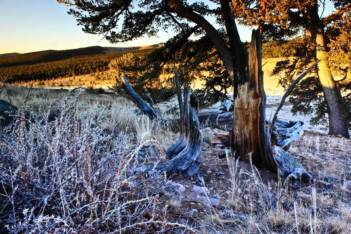
I took this one shortly after my last post. the light may not be as dramatic but I think I like it better. The contrast between the frosty blue shadows and the warmly lit bg delights me. I bumped up the contrast a bit and dialed down the saturation in the blue shadows. (they were really, really blue) Criticism and suggestions always welcomed. Thanks for having a look.

Canon T1i
1/4 sec f/22 18mm

Comments

8 comments
Comment posted by Scott Smorra on November 9, 2012 at 9:46 PM
I like the contrast between the cool and warm tones here Nancy. My only nit is the extreme contrast in the upper half of the image. I might consider lowering the contrast there a little and maybe recovering the shadows a bit.
Registered on November 2, 2009, 161 Posts, 2143 Comments
Comment posted by Eva McDermott on November 9, 2012 at 10:18 PM
Wonderful mix of warm and cool tones Nancy. If it were mine, I might try lightening the limbs a little to the right of center. Overall though, I do like the contrasts.
Registered on January 4, 2009, 1015 Posts, 13229 Comments
Comment posted by John&Patty Benway on November 10, 2012 at 7:57 AM
Really like to get out on frosty mornings, and I would have liked to get some detailed shots of the frosted charred limbs. Very nice scene Nancy, and like everyone else, I like the contrast between the warm and cool tones. Well done.
John
Registered on May 12, 2006, 626 Posts, 8700 Comments
Comment posted by Nick Bristol on November 10, 2012 at 9:26 AM
Very nice Nancy, and I enjoy looking at this. I pretty much agree with Scott's thoughts on this with the contrast in the upper half. I quite enjoy the comp you came up with here too. :smile:

Nick Bristol
Lone Rock, WI
Registered on February 1, 2004, 752 Posts, 14140 Comments
Comment posted by Morris McClung on November 10, 2012 at 10:44 AM
Ditto Scott on dialing back the contrast some, and I would like a little red added to the top brighter half. At least on my monitor is seems too yellow and could be warmed a little with more red. I like the concept and the comp, and can see why you were drawn to shoot it.
Registered on May 7, 2007, 670 Posts, 19650 Comments
Comment posted by Bill Chambers on November 10, 2012 at 2:12 PM
I like the composition, but agree with Scott that the contrast is overdone quite a bit. I like the warm/cool contrast idea, but it just appears to be overdone IMO. One nit - there are 3-4 dust bunnies in the sky.
Registered on April 10, 2005, 753 Posts, 21216 Comments
Comment posted by Dietrich Gloger on November 11, 2012 at 4:59 AM
The warm/cold contrasts work very well, although I think it is a tad strong - also the blues in the frosted fg. But it is an interesting composition, offering an engaging perspective on the landscape.
Registered on January 26, 2007, 360 Posts, 9876 Comments
Comment posted by Stan Rose on November 12, 2012 at 12:56 PM
Tough subject 4sure. Personally, i think the high contrast is fine, it defines the mood/subject. I just think it needs to be a tighter crop, The lhs is kind of empty and the rhs pulls the eye--so i would crop for more of the center. In fact, if i crop the rh 1/5 and the lh 1/3, i get a real nice vertical that i quite like. But my tastes are not necessarily the norm...
Registered on September 15, 2005, 836 Posts, 17099 Comments