Nature Photographers Network
This is the preserved archive of the original Nature Photographers Network. The community continues at naturephotographers.network.
Elowah Falls
‹ PreviousLandscape GalleryNext ›

Elowah Falls

by Scott Smorra

Gallery: LandscapePosted November 9, 2012982 views20 comments
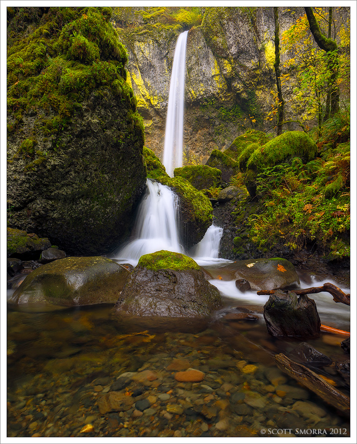
Fall colors at Elowah Falls, Columbia River Gorge, Oregon, November 2012.

I made another trip out to the Gorge today to catch the last of the fall color. The leaves are quickly dropping and the colors are fading fast! I spent a long time at Elowah today experimenting with some new comps.

Nikon D800, Nikkor 16-35 f/4 G at 17mm, polarizer
2 image blend for dynamic range and water detail/tree motion
1/4 sec at f/16, ISO 400
2.5 sec at f/16, ISO 100

Please let me know if this comp works for you or not. I'm very interested to hear your opinions. Larger version is provided.

Comments

20 comments
Comment posted by Kurt Budliger on November 9, 2012 at 9:41 PM
Wow Scott, this is stunning! Processing is impeccable as usual. Super nit picky but since you asked about the comp, was the top most branch in the lrc small enough to move? You know where I'm going with that. Like I said, super nit picky and I can't believe I even mentioned it. Okay I'll shut up now... :toast:
Registered on June 11, 2006, 113 Posts, 2116 Comments
Comment posted by Scott Smorra on November 9, 2012 at 9:50 PM
Thanks for the comment Kurt. I really wish that branch wasn't there as well, but it's attached to a huge fallen tree!
Registered on November 2, 2009, 161 Posts, 2143 Comments
Comment posted by Eva McDermott on November 9, 2012 at 9:57 PM
Wonderful verdant color and clarity especially in the foreground. The yellows in the background really add to the scene Scott. Beautiful capture.
Registered on January 4, 2009, 1015 Posts, 13229 Comments
Comment posted by Kurt Budliger on November 9, 2012 at 10:04 PM
Yeah, that's what I thought. Hate that! I don't think it really hurts the image, it's just one of those things we hyper-freaky-over-observant-photog-weirdos or HFOPWs see :biggrin:
Registered on June 11, 2006, 113 Posts, 2116 Comments
Comment posted by Tony Kuyper on November 9, 2012 at 10:34 PM
Perfect!
Registered on November 1, 2003, 364 Posts, 22328 Comments
Comment posted by Phillip Noll on November 9, 2012 at 10:49 PM
Hands down, the best shot of Elowah I have ever seen! Fantastic!! :toast:
Registered on November 17, 2003, 207 Posts, 1083 Comments
Comment posted by Richie Graham on November 9, 2012 at 11:23 PM
I love the green! For what it's worth on the crop issue: the the middle of the photo is what really catches my eye and feels to pull me in, the top third 2nd, and bottom third the least eye catching or attractive to my eye. Moss and water is awesome.
Registered on September 2, 2011, 15 Posts, 33 Comments
Comment posted by Daniel Rappaport on November 10, 2012 at 12:33 AM
Fine new composition. Just when I thought I'd seen it all, it changes! Beautifully presented.
Registered on September 9, 2009, 294 Posts, 2006 Comments
Comment posted by Andreas Resch on November 10, 2012 at 3:35 AM
Splendid, Scott! Excellent balance which is crucial in this shot with the branches and trunks on the right. If the balance is off, these things fall apart easily. You big empty spaces on the left are a strong and efficient counterweight. The waterfall nicely avoids both of this areas by elegantly staying in the middle. On top of that - killer processing and clean web sharpening.
Registered on November 14, 2007, 322 Posts, 6101 Comments
Comment posted by Peter Richter on November 10, 2012 at 7:50 AM
An absolutely convincing composition for me, Scott, all the diverse elements work perfectly together to my eye. Especially the subsurface structures at the bottom add an interesting focal point to me, nicely counteracting the mighty cascades in the distance.

Peter
Registered on November 10, 2010, 218 Posts, 2723 Comments
Comment posted by Nick Bristol on November 10, 2012 at 9:06 AM
Fantastic! This is really well done Scott. :toast:

Nick Bristol
Lone Rock, WI
Registered on February 1, 2004, 752 Posts, 14140 Comments
Comment posted by Robert Dayton on November 10, 2012 at 9:17 AM
Great color and well composed. I like the detail throughout and the formations and lines
to the right.
Registered on November 11, 2008, 281 Posts, 3958 Comments
Comment posted by Morris McClung on November 10, 2012 at 10:46 AM
Another fine comp of the great waterfalls in the northwest. Great color and light. :toast:
Registered on May 7, 2007, 670 Posts, 19650 Comments
Comment posted by Brian Schrayer on November 10, 2012 at 12:34 PM
I think the comp works very well, Scott. Despite the fact that the waterfall placement is essentially in the center of the frame I think the composition is still very effective. It's a subtle detail but I like how the color patterns in the foreground rocks compliments the patterns of the autumn leaves mixed with the vibrant greens (especially the orange colored rocks / leaves). I enjoy everything about this, Scott. :toast:
Registered on May 28, 2004, 114 Posts, 2890 Comments
Comment posted by Nancy Lea Sandy on November 10, 2012 at 3:42 PM
Excellent. Beautiful colors
Registered on January 24, 2011, 576 Posts, 6942 Comments
Comment posted by David Bostock on November 10, 2012 at 9:37 PM
Scott, this is stunning. The best shot of the falls I've ever seen. Awesome. :toast:
Registered on November 1, 2003, 90 Posts, 2778 Comments
Comment posted by Guy Nelson on November 11, 2012 at 12:15 PM
Hi Scott,
Wonderful Photo! I like the feel, colors, composition, what a beautiful place/scene.
Guy
Registered on October 12, 2012, 24 Posts, 138 Comments
Comment posted by Catherine Gagne on November 11, 2012 at 5:04 PM
Great shot. The water and the moss on the rocks go perfectly together
Registered on July 29, 2012, 33 Posts, 114 Comments
Comment posted by Zack Clothier on November 12, 2012 at 12:00 AM
Nice job coming up with a new take on the falls, I like being able to see the rocks below the water in the immediate foreground.
Registered on January 28, 2010, 343 Posts, 2257 Comments
Comment posted by Marsel van Oosten on November 13, 2012 at 4:38 AM
Very cool. I don't mind the two dark branches at all, but I do find the straight and saturated one a bit distracting - I'd be tempted to tone down the brightness and saturation of that one. Same goes for that little gold rock near the bottom of the frame. Well done.
Registered on March 9, 2004, 285 Posts, 2277 Comments