Gallery: POP PhotosPosted November 25, 2012103 views7 comments
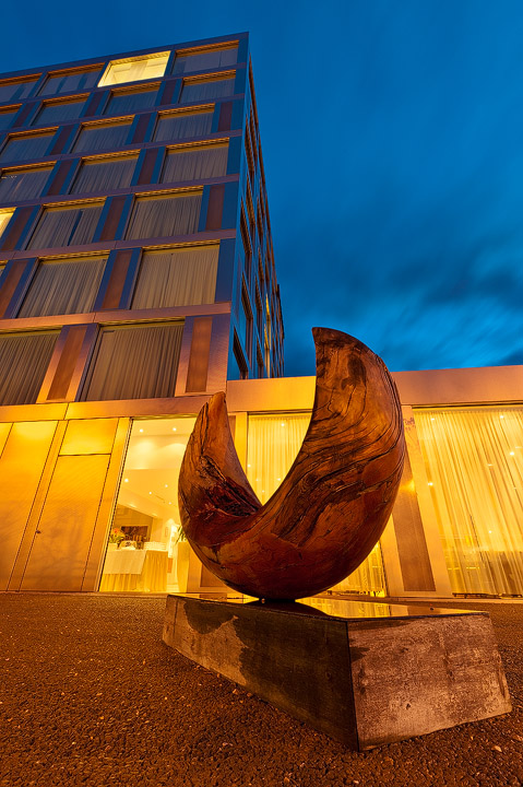
This is a shot from last april.This is a sculpture next to the Ramada Hotel in Solothurn/switzerland.
nikon D700, AF-S Nikkor16-35 @ 14mm, 13 & 25sec, f11, iso 200, manually blended for dynamic range.
Comments
7 comments
Comment posted by Philip Hodgkins on November 25, 2012 at 3:46 PM
Expertly done, Bill, and I love the perspective exaggeration!
Registered on July 24, 2006, 2741 Posts, 12349 Comments
Comment posted by David Chauvin on November 26, 2012 at 10:47 AM
This is a very clean comp which I often find difficult to get in these situations. The color is also very well handled.
Registered on August 5, 2004, 1007 Posts, 5595 Comments
Comment posted by John Clulow on November 26, 2012 at 6:20 PM
Great lines and colors. I like the room light at the top on the left and the other one sort of in the center on the right side of the building. Personally, I find the one on the left edge distracting, but maybe it was left there for balance. I'm also wondering if perhaps a transform or transforms followed by a crop might have been used to straighten up a few lines.
Just me, but I think it would have been helpful to have some definitive vertical or horizontal anchor. For example, maybe the left top of the lower portion of the building could have been brought parallel to the bottom edge of the frame; just that edge.
Alternatively, perhaps the front corner of the high-rise section could have been brought parallel to the left edge of the frame.
You sort of have an ancor like that in the base of the building where it meets the gravel, but not really.
I am not saying that everything should be square; I'm just saying that to my eye it would be helpful if there were one clear line in the image that was so with respect to the edges of the frame.
Again, just me; The old saying may apply here; one gets what one pays for
If I didn't think that this image had a great deal going for it, I wouldn't have taken the time to express what my subjective reaction to it is.
Registered on November 1, 2012, 155 Posts, 1079 Comments
Comment posted by Harley Goldman on November 27, 2012 at 9:43 AM
Great light and cool perspective. I love the warm and cool tones, too. Very well done, Bill.
Registered on November 19, 2003, 586 Posts, 11271 Comments
Comment posted by Morris McClung on November 28, 2012 at 1:17 PM
Excellent use of color and the comp shows it all off very well.
Registered on May 7, 2007, 670 Posts, 19650 Comments
Comment posted by SandyRichardsBrown on December 5, 2012 at 3:05 PM
Very cool - congrats on the WP!
Sandy
Registered on November 24, 2003, 3937 Posts, 12909 Comments
Comment posted by R.Bill Moser on December 20, 2012 at 3:44 PM
I just figured out this one was selected as weekly pick a while ago.
Thanks for your comments.
Registered on January 29, 2010, 285 Posts, 4281 Comments

Comments
7 commentsJust me, but I think it would have been helpful to have some definitive vertical or horizontal anchor. For example, maybe the left top of the lower portion of the building could have been brought parallel to the bottom edge of the frame; just that edge.
Alternatively, perhaps the front corner of the high-rise section could have been brought parallel to the left edge of the frame.
You sort of have an ancor like that in the base of the building where it meets the gravel, but not really.
I am not saying that everything should be square; I'm just saying that to my eye it would be helpful if there were one clear line in the image that was so with respect to the edges of the frame.
Again, just me; The old saying may apply here; one gets what one pays for
If I didn't think that this image had a great deal going for it, I wouldn't have taken the time to express what my subjective reaction to it is.
Sandy
Thanks for your comments.