Nature Photographers Network
This is the preserved archive of the original Nature Photographers Network. The community continues at naturephotographers.network.
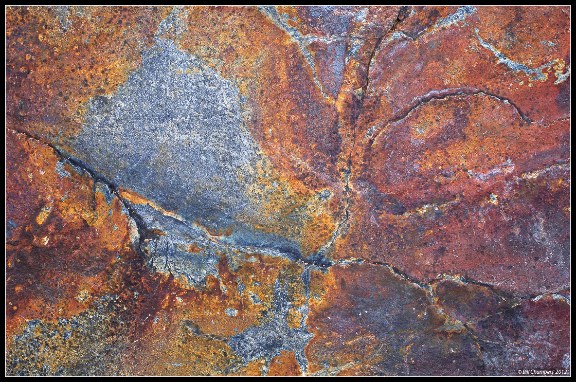
Rockscape 2
‹ PreviousLandscape GalleryNext ›

Rockscape 2

by Bill Chambers

Gallery: LandscapePosted November 30, 2012302 views16 comments
Next in the series...

Thanks for your comments on my last image. :smile:

LARGE version available.

D2x w/ 35-70 @ 55mm
.4 sec @ f/16 - MLU and remote release
100 ISO
Singh Ray polarizer
Tripod
Capture One 6, CS4

I would love to hear your thoughts. Thanks for looking.

Comments

16 comments
Comment posted by John&Patty Benway on November 30, 2012 at 8:38 AM
Holy cow Bill, this is fantastic, love the colors, detail and composition, the colors in the iron deposits really make this pop. Beautifully seen and presented.
John
Registered on May 12, 2006, 626 Posts, 8700 Comments
Comment posted by Harley Goldman on November 30, 2012 at 9:25 AM
This is a great series so far. Great color and pattern. It is a real nice abstract!!!
Registered on November 19, 2003, 586 Posts, 11271 Comments
Comment posted by David Chauvin on November 30, 2012 at 9:36 AM
This is awesome, Bill. I love abstract images that let the imagination run wild and this does just that. The lines, texture and color are framed in a way that flows. The lack of clues for scale is a big plus. :cool: :cool:
Registered on August 5, 2004, 1007 Posts, 5595 Comments
Comment posted by Youssef Ismail on November 30, 2012 at 10:02 AM
This is going to be an interesting series Bill. I love the bold colors in this photo and the sharp graphic nature of the lines. Well seen.
Registered on November 1, 2003, 474 Posts, 5555 Comments
Comment posted by Nancy Lea Sandy on November 30, 2012 at 12:29 PM
Large version is definitely worth the visit. Love the textures and colors and, in particular, the little cracks that add so much character to this one.
Registered on January 24, 2011, 576 Posts, 6942 Comments
Comment posted by Nathan Apodaca on November 30, 2012 at 1:03 PM
The details and colors are great, but I am especially enjoying the greater hint of side-lighting this has. I love this one!
Registered on November 16, 2011, 67 Posts, 1127 Comments
Comment posted by SandyRichardsBrown on November 30, 2012 at 1:16 PM
Missed the last one ( will go look in a minute) but this is wonderful. LOVE the colours and patterns and the comp seems ideal.
:toast:
Sandy
Registered on November 24, 2003, 3937 Posts, 12909 Comments
Comment posted by Lon Overacker on November 30, 2012 at 2:05 PM
Bill,

Excellent! The color/sat look spot on, very natural looking. Great design, texture and details. Could be just me and my monitor, but I could see dropping the light values just a smidge. Regardless, I love this stuff. Look forward to more.

Lon
Registered on November 24, 2006, 521 Posts, 19147 Comments
Comment posted by Alister Benn on November 30, 2012 at 8:12 PM
These are tough to pull off mate, but this is really great - it just works. Nicely seen scene :-)
Registered on June 9, 2011, 23 Posts, 258 Comments
Comment posted by Vance Gese on November 30, 2012 at 8:38 PM
This is fantastic, Bill. Love your composition, the wonderful textures, and the mix of warm and cool color.
Registered on November 13, 2008, 298 Posts, 6629 Comments
Comment posted by Nick Bristol on November 30, 2012 at 8:43 PM
Bill, I agree with all the above! This is wonderful! It kind of reminds me of an aerial photo from far above. Excellent!

Nick Bristol
Lone Rock, WI
Registered on February 1, 2004, 752 Posts, 14140 Comments
Comment posted by scott lanz on November 30, 2012 at 10:17 PM
Love this one, Bill. :toast:
Registered on November 14, 2003, 840 Posts, 12902 Comments
Comment posted by Peter Richter on December 1, 2012 at 3:44 PM
Bill, your composition really keeps my attention. I appreciate the diversity of details and textures to explore. The metallic look also adds a lot of interest to me.

Peter
Registered on November 10, 2010, 218 Posts, 2723 Comments
Comment posted by Tony Kuyper on December 1, 2012 at 7:41 PM
Very wonderful detail. The colors looks great, but if feels a bit oversharpened and bit to light as a result on my monitor.
Registered on November 1, 2003, 364 Posts, 22328 Comments
Comment posted by Tom Haxby on December 1, 2012 at 9:38 PM
Bill: This one rocks too. Both of your rock images are wonderful, but I like this one more. This has so much going on, and it is all good. Wonderful color, texture, lines. And, I haven't even looked at the larger image yet. Thanks for the inspiration.
Registered on July 6, 2006, 126 Posts, 647 Comments
Comment posted by Morris McClung on December 3, 2012 at 11:55 AM
Another cool abstract. A large print would be a joy to view.
Registered on May 7, 2007, 670 Posts, 19650 Comments