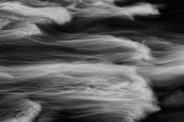
Abstract Water Study #9
by Barry Vangrov
I know that abstracts are not for everyone and I had mixed reviews on my previous color water abstract, but all comments are welcome good and bad. I've been working this theme in both color and black & white and here's one of the b&w's - same river, different location.
D90/Nikkor 16-85@ 68mm/f19 @ 1sec/circular polarizer

Comments
6 commentsI really like the texture in the water - some parts almost have a film-grain kinda look, which I think is quite appealing in this image here. the contrast and tonal range is excellent as well.
While I love the flow of the water, the texture as I mentioned, I'm not quite sold on the comp - or at least the arrangement. It feels a little "tight" or confined to me. Unlike the previous color image where there was bit more space (I wasn't bothered by the separation top to bottom as someone commented about making two panos.) Anyway, not sure if that makes sense, but I feel like this needs more room around the edges. Still, great job with the b&w here.
Lon