Nature Photographers Network
This is the preserved archive of the original Nature Photographers Network. The community continues at naturephotographers.network.
The Dead & The Dying!/W edit
‹ PreviousLandscape GalleryNext ›

The Dead & The Dying!/W edit

by Chris Chamberlain

Gallery: LandscapePosted December 2, 2012258 views22 comments
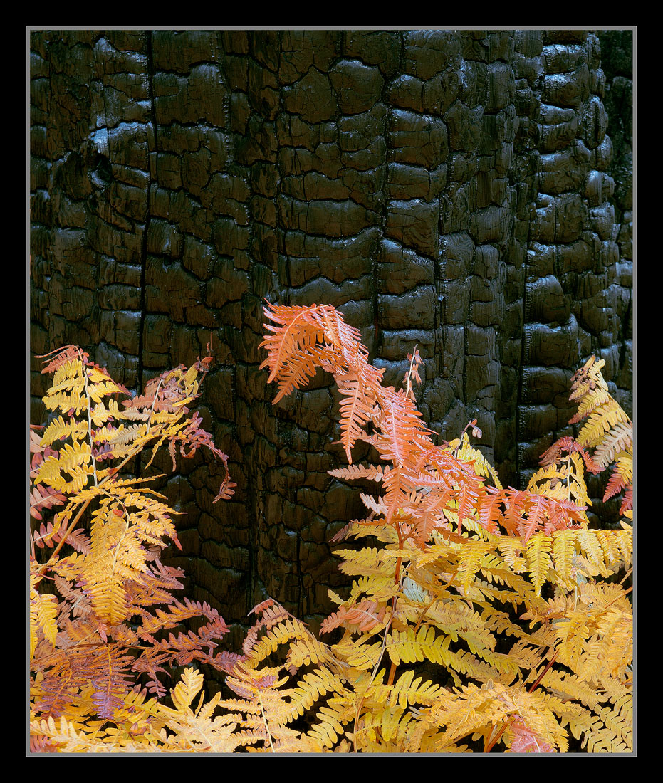
My take on the ghost forest. Different day, and not together, but I know Preston and I, at least shot this tree. Different ways of seeing it though. Anyway, I'm assuming these bracken are a single season plant. Dying off each winter and sprouting new each spring. I like the color contrasts here, and the reflected gold light off the charred bark.

D800,
24-70mm,
1sec, F/11

Thanks,
Chris

Comments

22 comments
Comment posted by Andrew Morrill on December 2, 2012 at 10:35 PM
Very nice contrast you've got going here. Like it! Could perhaps use some more saturation?
Registered on June 10, 2010, 51 Posts, 216 Comments
Comment posted by Nancy Lea Sandy on December 2, 2012 at 11:05 PM
Terrific textures and contrasts. color and light are nice, too. Lovely image
Registered on January 24, 2011, 576 Posts, 6942 Comments
Comment posted by Youssef Ismail on December 2, 2012 at 11:40 PM
You guys really came away with some very interesting stuff from the ghost forest. It will have to be a destination for me next year. I am just amazed at how much the charred black wood reflects the tones of the ferns in all of your photos. This is another great photo Chris.
Registered on November 1, 2003, 474 Posts, 5555 Comments
Comment posted by Stan Rose on December 3, 2012 at 12:05 AM
Pretty cool, Chris! I think id crop a little off the top for balance. The ferns look a bit glossy--dont know if you used a CP but it might have helped in that regard. Real nice overall.
Registered on September 15, 2005, 836 Posts, 17099 Comments
Comment posted by Lon Overacker on December 3, 2012 at 12:13 AM
Chris,

Wonderful! Yep, same exact tree as both Preston's wider view and my tighter charred trunk I posted earlier. I saw and was attracted to ferns against the bark, but scratched the idea thinking the ferns were too imperfect. Boy, was I wrong!

Fantastic job with the color and everything having to do with the charcoal and reflected light - awesome job with this. Great detail, awesome job all the way around.

Lon
Registered on November 24, 2006, 521 Posts, 19147 Comments
Comment posted by Dietrich Gloger on December 3, 2012 at 1:14 AM
Really good Chris! After seeing Lon's image, it is interesting to see your interpretation. To use these ferns(?) for the base of the composition was a really good idea and you executed it so well.
Registered on January 26, 2007, 360 Posts, 9876 Comments
Comment posted by John&Patty Benway on December 3, 2012 at 4:25 AM
Chris, Very nice indeed, the charred bark makes a beautiful back drop for the ferns, really like the reflected light and colors. Beautiful work.

Chris, I have a question for you, have you tried any of your old Nikon D lenses on the D800 and what were the results. My D3x doesn't seem to get along with them. Soft on the edges and the color seems to be a little off. I have a newer Nikon 70-300 VR G that works very well with it so I'm really thinking it's a lens problem. What do you think of the 24-70 2.8? I would appreciate your input. Leaving for the Adirondacks, will be back on Wednesday and I'll check for your response. Thanks. John
Registered on May 12, 2006, 626 Posts, 8700 Comments
Comment posted by Stuart Williams on December 3, 2012 at 6:34 AM
love the reflections and colour in the burnt wood. i'm not sure about the slightly scruffy bracken but then having a neat arrangement may have made it less compelling.
Registered on December 7, 2007, 247 Posts, 4792 Comments
Comment posted by John Clulow on December 3, 2012 at 8:33 AM
Lovely contrast of color and form and dynamic range between the leaves and the charred background. And I think the way you've chosen to frame it definitely adds to how it holds the eye. Especially in the larger view, the textures on the charcoal surface make the aforementioned contrasts even more beautiful.
Registered on November 1, 2012, 155 Posts, 1079 Comments
Comment posted by Bill Maile on December 3, 2012 at 9:08 AM
I haven't seen any of the previous ones Chris, but this immediately grabbed my eye and wow, glad I clicked!!! Absolutely love it, would love to have seen it and shot it. Beautyyyyyy!!!
Registered on March 2, 2009, 984 Posts, 2518 Comments
Comment posted by Preston Birdwell on December 3, 2012 at 9:40 AM
This is a real beauty, Chris. I agree with Stan that a slight crop from the top would make for a nice balance. The color looks very nice, and you did a fine job with the reflected light on the char. What I find interesing about char is that although it looks black, it has lots of fine detail that is not black.

I took two shots of the tree, one from the side you so nicely portrayed, and one from the other side. It was raining very lightly when Lon and I were there, so the light was similar, but different. Here's my take on the Ghost Forest posted at CANP.

We had a great time in Yosemite, and was nice to hang out with you.

--P

Registered on November 1, 2003, 471 Posts, 5188 Comments
Comment posted by Harley Goldman on December 3, 2012 at 10:39 AM
Real nice, Chris. I love the understated colors against the dark coal and the blue accents on the tree work well too. Beautifully done.
Registered on November 19, 2003, 586 Posts, 11271 Comments
Comment posted by Eva McDermott on December 3, 2012 at 10:44 AM
This is real nice Chris. I like the contrast of color against the charred trunk. Wonderful tones and textures in the charred wood as well.
Registered on January 4, 2009, 1015 Posts, 13229 Comments
Comment posted by Bill Chambers on December 3, 2012 at 11:28 AM
Very nice Chris. As you mentioned, love the color contrast, also the composition. Beautiful.
Registered on April 10, 2005, 753 Posts, 21216 Comments
Comment posted by Morris McClung on December 3, 2012 at 12:27 PM
An excellent concept and captured beautifully. Love that color against that burned spar! :toast:
Registered on May 7, 2007, 670 Posts, 19650 Comments
Comment posted by Nick Bristol on December 3, 2012 at 1:04 PM
Very nice work here, Chris. The texture and detail in the charred tree is really something, especially in your large version. I like the blue tones in there alot too. The gold and orange color of the ferns is a nice contrast against the dark of the tree. :toast:

Nick Bristol
Lone Rock, WI
Registered on February 1, 2004, 752 Posts, 14140 Comments
Comment posted by Mark Metternich on December 3, 2012 at 1:28 PM
Color contrast and detail here is outstanding Chris. :toast:
Registered on June 19, 2009, 276 Posts, 6240 Comments
Comment posted by Jimmy Gekas on December 3, 2012 at 11:03 PM
Very cool, Chris. Love the contrast of the dark, charred bark and the golden leaves below. :toast:
Registered on July 26, 2007, 244 Posts, 2807 Comments
Comment posted by Rick Turner on December 4, 2012 at 10:10 AM
Well seen and processed :toast:
Registered on February 18, 2012, 534 Posts, 2755 Comments
Comment posted by Chris Chamberlain on December 4, 2012 at 10:43 AM
Thanks for the feedback, folks!

Here's a crop to square. Maybe a little more than needed, but it's hard to decide where to cut things off sometimes. Where I cropped to was within an inch of square, so I just went ahead made it that way.

Thanks,
Chris
Registered on March 13, 2007, 500 Posts, 8365 Comments
Comment posted by Zack Clothier on December 5, 2012 at 10:12 PM
A striking portrait of nature, Chris, beautifully done. :toast:
Registered on January 28, 2010, 343 Posts, 2257 Comments
Comment posted by Joseph Campisi on December 6, 2012 at 1:30 AM
Wonderful Chris! The contrasting colors and textures are very eye catching!
Registered on November 24, 2008, 304 Posts, 3211 Comments