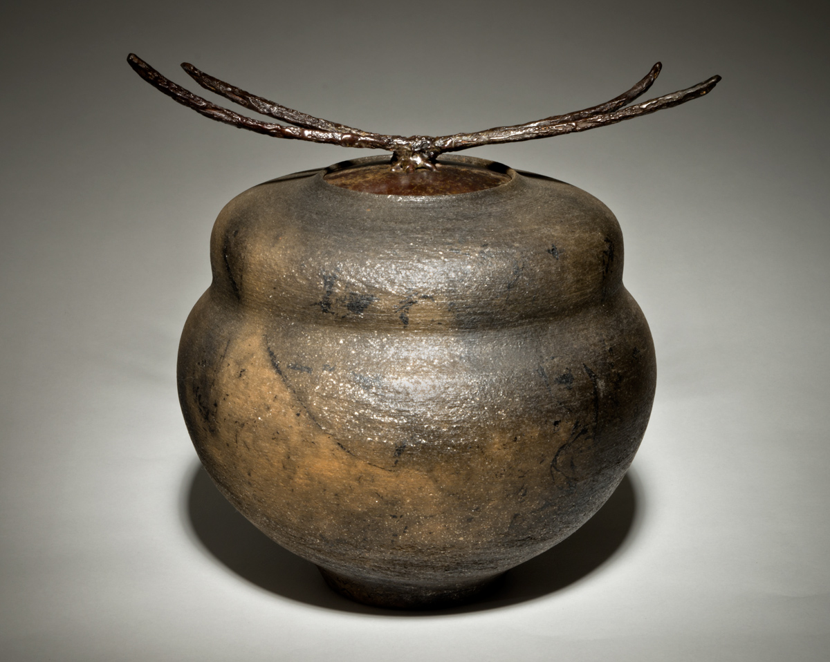
I took a pic of this pot last weekend and got a wealth of feedback. So since it is shipping out tomorrow, I thought I'd try a do-over, attempting to incorporate what I though I'd learned.
I was thinking about it during the week, and while I thought I'd learned, I figured I'd only know for sure if I tried it again. As Wittgenstein wrote in The Tractatus, "That which
can be shown cannot be stated." or as Jack said in Harley Davidson and the Marlboro Man, "Talk's cheap, and I ain't buyin' any."
So same backgroup, camera, lens, ISO, exposure, but I did a manual white balance, made sure I selected RGB, cleaned up the dust bunnies, and attempted to get some gradation in the background with the lighting. I tried probably 8 lighting arrangements on this, finally settling on a single light with a 10° honeycomb direct at 45° angled downward with a slight fill flash on the right at 45°.
I like it better, and thought I'd post it as a way of saing Thanks!
Any further suggestions will be most welcome.


Comments
8 commentsSo I spent the better part of today trying to photograph some of Carol's slumped glass work. She makes a ceramic sculpted base and then puts three sheets of glass on it -- an iridescent sheet, a colored sheet, and a clear sheet. Then she fires that in her electric kiln and the glass takes the form of the ceramic which remains rigid where glass flows. The final step is to place this round sheet on a bowl form to allow the composite to slump and make a bowl shape.
I made use of the many great suggestions from before in shooting this and managed to capture bits of the irradescence.
Thought I'd try to include this in my reply. Cheers...
Nice glasswork and photo thereof in the comment. Love the richness and depth of the color. The photo nicely shows the iridescence, though for my my eyes the intensity of the shadow distracts a bit from the object. I wonder if a bottom light would work on these glass pieces to reduce the shadows and make the colors glow. Just a thought. Roger.
Don't shoot down at a piece. Be level or shoot slightly up. This will give the piece a bit more "lift" and presence. Flash is hard to work with as you can't see the reflections you're going to get. 5000°K lights bounced into an umbrella or shot through a soft box work much better and give softer shadows. Harsh and dark shadows draw the eye in and take your eye off the piece. Look closely at photos in Ceramics Monthly, Clay Times (I've written a column for them for 15+ years), or American Craft. Notice what is done to highlight the piece while while making the background work to achieve the highlighting. All parts of the piece should be in focus while the background should recede. This means you need a large area to extend background paper. I had a large area with main bounce lights, soft fill lights, and adjustable shades to darken backgrounds. That was all in the film age. There are now newer options to try.
I've posted an image that I used as advertising for my wife's craft gallery. This is a lamp by Bill Campbell that was shot in place in the gallery. The image was then removed from it's background in Photoshop. It was then placed on a 50% gray layer and a gradient was applied to the background to create the transition from light to dark. An oval shadow was the placed under the lamp and blurred. Then some extra shadows were painted around the base. Please feel free to contact me if you have any questions about shooting pots or if your wife has any questions about Raku.