Gallery: Man & NaturePosted February 1, 2013130 views9 comments
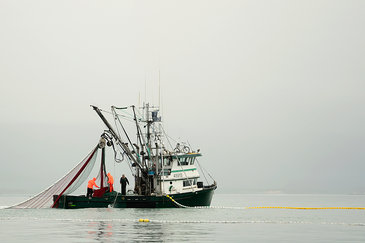
Decided to try something new and post a photo in the Man and Nature gallery for a change. This was shot on Prince William Sound. They're hauling in pink salmon.
Comments
9 comments
Comment posted by Verdon on February 2, 2013 at 2:01 AM
awesome, spent one fishing season on salmon boat at Kodiak, great memories , love the angle and spread net, bike on the top is huge bonus to original title, well done!!!
Registered on June 10, 2011, 147 Posts, 1444 Comments
Comment posted by John Clulow on February 2, 2013 at 10:35 AM
I agree with Verdon. The lines in this composition are riviting. Personally, though, I don't like the bright red jackets of the fishermen. I think I would prefer this in B&W, but that's just me.
Registered on November 1, 2012, 155 Posts, 1079 Comments
Comment posted by Rebecka on February 2, 2013 at 1:40 PM
Gorgeous, interesting image. Love the fog and the men busy working. Very nice lines here, as mentioned. Looks like you should be posting in the M&N gallery more often!
Registered on February 5, 2009, 170 Posts, 924 Comments
Comment posted by Wayne Willison on February 2, 2013 at 8:03 PM
Good one, Dan. I like the comp and that bike is just not something a person would expect on a fishing boat. Super post.
Registered on April 10, 2009, 292 Posts, 3967 Comments
Comment posted by Dan Roberts on February 3, 2013 at 11:22 AM
Thanks for the comments, folks. In the name of full disclosure I have to admit that I didn't notice the bicycle until I was doing my PP. At the time what caught my attention was the isolation of the scene with the foggy BG and the splash of color of the raingear and floats in what was otherwise a B/W world.
Speaking of B/W, I'm not typically a fan other than for old buildings etc. But I have to admit that it works for this photo though I think I still prefer the color version.
Registered on March 9, 2011, 69 Posts, 501 Comments
Comment posted by John Clulow on February 3, 2013 at 5:34 PM
Thanks for posting a B&W version, Dan. I much prefer that one. Everyone's view is different. You are the photographer, though, and it is your statement to make.
Registered on November 1, 2012, 155 Posts, 1079 Comments
Comment posted by Lon Overacker on February 4, 2013 at 5:18 PM
Dan,
Nice capture, telling a good story. Personally, I prefer the color version. The yellow floats creating the lines for the nets, the red in the net being pulled out of the water, the green stripe on the cabin and of course the flourescent orange jackets. Those elements lose their importance in the b&w version. Just my .02.
Lon
Registered on November 24, 2006, 521 Posts, 19147 Comments
Comment posted by Todd Liotine on February 5, 2013 at 6:35 PM
Dan, i prefer the color version. I wish there was a little more room on the left side but still nice as is
Registered on July 1, 2008, 131 Posts, 671 Comments
Comment posted by Dan Roberts on February 7, 2013 at 6:49 PM
Thanks for the additional comments. I also still like the color version but I have to say that I have to add fishing boats to the list of subjects for which I think B/W is appropriate along with broken down tractors, old barns, and old men with long beards.
Regarding the crop, I took several frames of this scene. The seiner's skiff is just out of frame to the left and when it was included in another comp it just didn't work. Likewise a few minutes later when the net was cinched in tighter so that the floats made a complete circle, it just didn't work as well IMO.
I really appreciate the feedback as it made me go back and take another look at my work from that day and to think through the process again. Unfortunately my mind is creative enough to spot unique lighting opportunities etc. but then seems to abandon me the moment I put the viewfinder to my eye
Registered on March 9, 2011, 69 Posts, 501 Comments

Comments
9 commentsSpeaking of B/W, I'm not typically a fan other than for old buildings etc. But I have to admit that it works for this photo though I think I still prefer the color version.
Nice capture, telling a good story. Personally, I prefer the color version. The yellow floats creating the lines for the nets, the red in the net being pulled out of the water, the green stripe on the cabin and of course the flourescent orange jackets. Those elements lose their importance in the b&w version. Just my .02.
Lon
Regarding the crop, I took several frames of this scene. The seiner's skiff is just out of frame to the left and when it was included in another comp it just didn't work. Likewise a few minutes later when the net was cinched in tighter so that the floats made a complete circle, it just didn't work as well IMO.
I really appreciate the feedback as it made me go back and take another look at my work from that day and to think through the process again. Unfortunately my mind is creative enough to spot unique lighting opportunities etc. but then seems to abandon me the moment I put the viewfinder to my eye