Gallery: Weekly ChallengePosted February 4, 201350 views9 comments
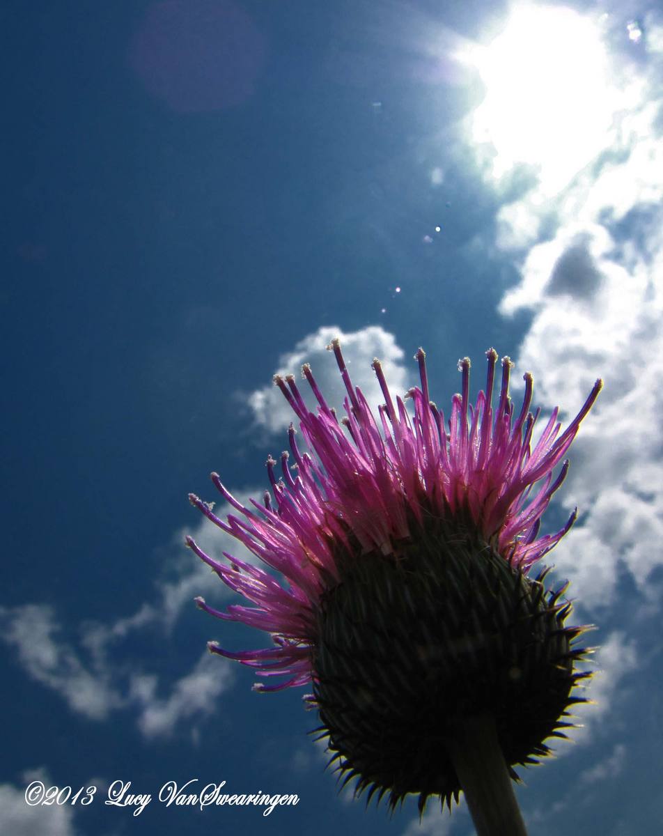
The sun flare kept me from posting this before. I like taking flowers from this angle, so many times it's hard not to get a flare. But, I actually like this one with the sun in the photo.
Comments
9 comments
Comment posted by David E Lester on February 4, 2013 at 5:41 PM
I like it also! I like how the the plant transitions from bright on top like its reaching for the sun then darkens as you go down the plant..
Registered on March 24, 2010, 155 Posts, 793 Comments
Comment posted by Dennis Plank on February 4, 2013 at 6:09 PM
Cool composition, Lucy. I like the steep feel of it.
Registered on January 28, 2008, 1767 Posts, 23192 Comments
Comment posted by RL Potts on February 4, 2013 at 10:51 PM
I really like the rim lighting, but it is the clouds that make this one work.
Registered on November 24, 2003, 188 Posts, 985 Comments
Comment posted by Carolyn Derstine on February 5, 2013 at 2:17 PM
Great POV in this shot, Lucy! I like the down-low look up at the bottom of the flower,and then on into the sky. The clouds add a nice extra touch to the composition. The sun is quite bright; I think a crop down from the top to cut off maybe half of the bright sun may help direct ones' attention a bit more to the flower. Nice colors and details.
Registered on February 16, 2011, 610 Posts, 3684 Comments
Comment posted by Lucy VanSwearingen on February 5, 2013 at 5:13 PM
Carolyn, How's this?
Registered on May 23, 2009, 800 Posts, 2042 Comments
Comment posted by David E Lester on February 5, 2013 at 5:37 PM
Love the repost!!!!
Registered on March 24, 2010, 155 Posts, 793 Comments
Comment posted by Mark Seaver on February 6, 2013 at 12:34 PM
This is cool, Lucy. The vertical balance between the sun and the thistle works nicely and the open space on the left helps emphasize the flower. I don't think this would be nearly as nice if you'd have been more traditional and moved the flower over to the lower left. It took me a while looking, but I like the repost better because it emphasizes the flower even more.
Registered on January 23, 2011, 1103 Posts, 17270 Comments
Comment posted by Wayne Jones on February 6, 2013 at 2:22 PM
This is a perfect illustration of how "blown-out" highlights can enhance a photo. I liked the original dramatic comp, but then I saw the crop that Carolyn suggested, and it made it even better. The only thing that might add to this would be just a tiny bet more detail and color in the green shadow area -- but not much; this is pretty close to perfect as-is.
Registered on April 18, 2007, 953 Posts, 6435 Comments
Comment posted by Carolyn Derstine on February 6, 2013 at 4:22 PM
I like the repost much better, Lucy.
Registered on February 16, 2011, 610 Posts, 3684 Comments

Comments
9 comments