Tower Power II & Re-Post
by Harry Lichtman
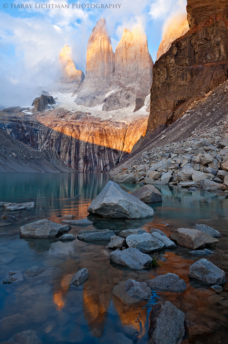
First, thanks for the comments on my last Towers image. I think this shot addresses some of the problems with the last, and has become my favorite of the two. The reflection is not as jumbled, and the rocks are not as chaotic. I think the lighting, while not as strong as the first, places more of the emphasis on the towers and less on the near rock face. This is slightly to the left of the previous shot.
Your thoughts appreciated.
5KII, 17-40L, RAW x2

Comments
18 commentsJohn
Thanks
both are great in many ways
well done
On my calibrated monitor, it appears that the shadowed areas were pulled up a bit too much leaving no true blacks. A stiff contrast adjustment would be an asset, IMO.
Thanks
Nick Bristol
Lone Rock, WI
I am also on the fence on the contrast. At first glance the repost looks better to me. I then look at both versions a few more times and found I actually prefer the original.
IMHO I feel the ULC is a little bit bright comparing to the rest of the image.