Nature Photographers Network
This is the preserved archive of the original Nature Photographers Network. The community continues at naturephotographers.network.
Country Road, version 2
‹ PreviousMan & Nature GalleryNext ›

Country Road, version 2

by Wayne Jones

Gallery: Man & NaturePosted April 11, 2013278 views9 comments
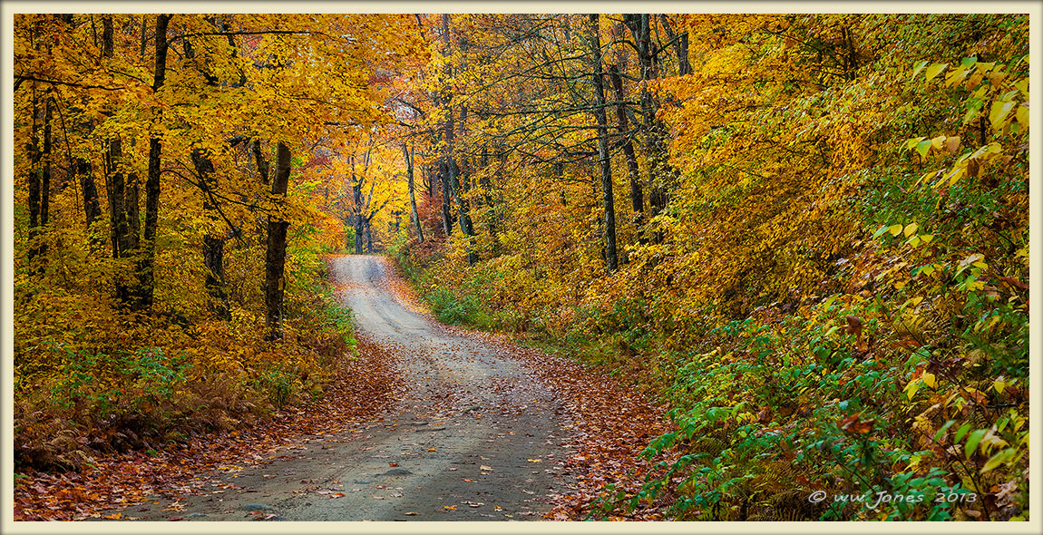
This is a moderate crop of my last post, but with a bright patch of sky filled in with some cut and paste from other parts of the same image, as well as a bit of content-aware fill. If this is too "altered" for this gallery, feel free to move it to Photo Art. (With this sort of realistic edit, I felt it did not belong in Photo Art.)

Thanks to all who commented on the original post yesterday. One of the comments pointed out the bright patches of sky. I think this solves that issue, but I am still not completely sold on this one, since the sky in the original (yesterday's post) is directly above the focal point at the end of the road, and it just looks natural to me. So far, it's still a split decision at my house, so I am still looking for more opinions.

THE CROP? I use the "larger image" option to illustrate an alternative pano crop that uses the whole 5616 pixel width of the 5D Mark II. I would be interested in hearing your opinion on the two versions.

THANKS

Comments

9 comments
Comment posted by Rick Turner on April 11, 2013 at 3:54 PM
Now you got it :wavey:
Lovely Wayne :toast:
Registered on February 18, 2012, 534 Posts, 2755 Comments
Comment posted by Michael Cothran on April 11, 2013 at 4:00 PM
Excellent job on your "cutting & pasting." I would have never even suspected any "cover-up" had you not mentioned it. The final image is always most important to me, and this one is really nice.
Registered on December 5, 2012, 31 Posts, 730 Comments
Comment posted by John Clulow on April 11, 2013 at 6:46 PM
I like this version better by far, especially in your larger version; the placement of the path a bit further off-center left, elimination of the bright sky, flattening of what I think was a slightly tilted road at the foreground in the original, better aspect ratio in the larger version.

I think both are on the edge with respect to sharpening and vibrance, but will probably print well. Great image, and nice job working with it to arrive at this latest version. A definite wall hanger... my mind is drawn to what is over that hill. :smile:
Registered on November 1, 2012, 155 Posts, 1079 Comments
Comment posted by Bill Chambers on April 12, 2013 at 2:09 PM
Well done - like even more than your previous effort.
Registered on April 10, 2005, 753 Posts, 21216 Comments
Comment posted by Scott Fricke on April 12, 2013 at 2:32 PM
I like the crop here, I think it works really well. The curve in the road works well and that bright tree at the end of the road draws the eye in nicely.
Registered on January 19, 2007, 133 Posts, 1448 Comments
Comment posted by Mark Seaver on April 12, 2013 at 10:39 PM
Interesting comparison, Wayne. Of the two here, I like the pano best, but I think some of that is influenced by the larger size. I also think I prefer the original crop with the two openings in the previous post. I think those add a nice sense of inviting my to explore well into the distance. With this version, the invitation is limited to just over the next hill.
Registered on January 23, 2011, 1103 Posts, 17270 Comments
Comment posted by Kah Kit Yoong on April 13, 2013 at 12:15 AM
Really lovely shot.
Registered on September 27, 2006, 636 Posts, 10682 Comments
Comment posted by Luke Ormand on April 13, 2013 at 10:15 AM
Wayne,

I much prefer the larger image (pano) which I think woud look beautiful hanging on the wall of a cabin. Excellent saturation and I like the undulation in the road
Registered on February 4, 2009, 1093 Posts, 7035 Comments
Comment posted by Scott Smorra on April 13, 2013 at 7:54 PM
Very nice fall colors here Wayne. I think both versions of this image work very well...it just depends where you are going to hang it on a wall.
Registered on November 2, 2009, 161 Posts, 2143 Comments