Gallery: Weekly ChallengePosted April 11, 20131,008 views11 comments
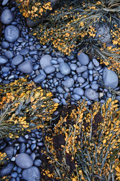
This was taken on the lava rock 'beach' at Arnarstapi, Iceland. I liked how the seaweed really popped against the black volcanic rock. Any critiques would be greatly appreciated.
Canon 1DsII, 17-40L, f22, .3 sec, ISO400
Comments
11 comments
Comment posted by RL Potts on April 12, 2013 at 12:59 AM
The gray and gold are just great together. I really like the cool rocks. Isn't the intertidal zone a great place to find unique images like this one?
Registered on November 24, 2003, 188 Posts, 985 Comments
Comment posted by John Clulow on April 12, 2013 at 4:49 AM
I like the contrasts in colors and shapes. This has a very nice semi-abstract quality.
Registered on November 1, 2012, 155 Posts, 1079 Comments
Comment posted by Mark Seaver on April 12, 2013 at 8:20 AM
Very well seen, Scott. I really like the warm/cool color combo and the details in a few of the pebbles. The eye flow along the pebbles is good also.
Registered on January 23, 2011, 1103 Posts, 17270 Comments
Comment posted by Rob Graham on April 12, 2013 at 9:27 AM
good lines and I like the flow of the rocks, the contrasting colors are great
Registered on August 22, 2006, 842 Posts, 2824 Comments
Comment posted by Wayne Jones on April 12, 2013 at 12:58 PM
What Mark said... and I appreciate this on both the detail level and the larger scale composition, with the blue-gray rocks forming nice diagonal patterns against the yellow-green plants.
Registered on April 18, 2007, 953 Posts, 6435 Comments
Comment posted by Carolyn Derstine on April 12, 2013 at 3:59 PM
What a wonderful combination of color and textures, Scott! The smooth gray rocks contrast so nicely with the tan and gray stems of the seaweed clumps. Very eye-catching, even from the thumbnail. I really like your comp with the curvy line of the stones and the spacing of the clumps of seaweed. Well done.
Registered on February 16, 2011, 610 Posts, 3684 Comments
Comment posted by Howard Cheek on April 12, 2013 at 7:07 PM
Really like the contrasting gray & gold colors Scott, nice.
Striking image and very well composed with good interest too.
Would love to see it large..
Well done & have a great weekend!
Registered on July 24, 2008, 1201 Posts, 10758 Comments
Comment posted by Kate Silvia on April 13, 2013 at 9:29 PM
Gorgeous colors and contrasting patterns! Very nice!
Registered on January 12, 2009, 56 Posts, 158 Comments
Comment posted by SandyRichardsBrown on April 17, 2013 at 5:46 PM
Congrats on the WP!
An unusual and very interesting image.
Sandy
Registered on November 24, 2003, 3937 Posts, 12909 Comments
Comment posted by Mark Seaver on April 17, 2013 at 10:37 PM
Congrats on a well deserved, WP!
Registered on January 23, 2011, 1103 Posts, 17270 Comments
Comment posted by Catherine Reilly on April 18, 2013 at 2:08 AM
A masterpiece of color and design in nature. Good eye for the comp on this and congratulations on the pick.
Registered on August 16, 2006, 603 Posts, 9192 Comments

Comments
11 commentsStriking image and very well composed with good interest too.
Would love to see it large..
Well done & have a great weekend!
An unusual and very interesting image.
Sandy