Nature Photographers Network
This is the preserved archive of the original Nature Photographers Network. The community continues at naturephotographers.network.
Sakura II + repost
‹ PreviousFlora GalleryNext ›

Sakura II + repost

by Gary Yeoh

Gallery: FloraPosted April 16, 201311,676 views12 comments
I have been going to Japan for the past 3 years to enjoy the Sakura season. In the past, I tended to zoom in on the blossoms for close up and macro composition. This year, I wanted to do something different. For one thing, I did not want to carry around all my heavy gear and travelling with family I was given a time limit on how long I can spend taking photographs. So in the end I decided to only use my 50mmF1.4 lens as much as possible.

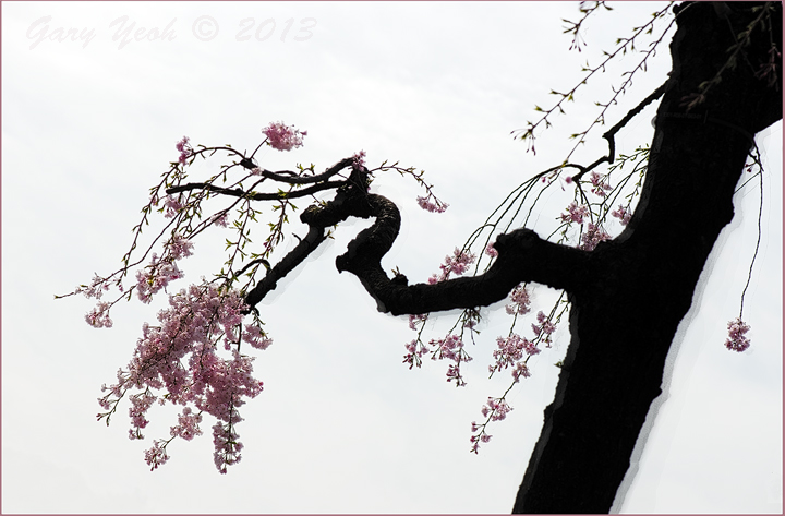
I have one particular image I want to make this season, that was an image as close to the classical ink on rice paper oriental painting look of an ancient cherry tree with twisted trunk and lovely blossoms. I spent many days looking at many trees and eventually found this one outside the main entrance to the Imperial East Garden in Tokyo. I knew that this branch was what I was looking for but the problem was there was a lot of distracting elements around as this was next to a 6 lane highway and the high rises of Marouichi Building and other buildings around Tokyo station. For this shot, I had to lie down on the walkway behind crowds waiting patiently at the lights to cross the road. Sure had a few frowns from the crowd. I also had to break out the 105mm lens to frame this shot against the sky.

I also wanted the faint shadow of the trunk with the black ink bleeding at the edge when applied to rice paper. So it is down to post processing. I layered the same image on itself, copied the dark trunk and shifted it slightly. Finished off with TK luminosity mask and glow.

Interested in your comment on this image.

D600 105mm F8 1/800sec.

Comments

12 comments
Comment posted by SandyRichardsBrown on April 16, 2013 at 11:53 AM
Hmmmmm... not so sure about this one. The dark tree trunk dominates this, when I find the lacey, dainty leaves of much more interest. I'm afraid I'm not a fan of the shadows, either.
I'd like to see a frame with just the left half of this image - mostly leaves and a bit of trunk, lightened up if possible.
Sandy
Registered on November 24, 2003, 3937 Posts, 12909 Comments
Comment posted by John Clulow on April 16, 2013 at 6:57 PM
I like this image which is why I decided to take a closer look from the thumbnail. While I have read and appreciate your narrative, I would tend to agree with Sandy Richards' comments. Maybe for a purist with your knowledge of classical ink on paper Japanese images this really rocks. But the rest of us are seeing it from other templates. I think the addition of the "ink bleed" as you describe it, in PS kind of adds insult to injury. Someone who is knowledgeable might "get it", but I don't.

But the image does have something that caught my eye, and probably Sandy Richards' eye, although I certainly cannot speak for anyone else. And so I did try a horizontal flip in photoshop. I then asked my wife to take a look at it. She has done raku and a lot of Japanese style stuff quite successfully for many years, including ikebana vessels etc.

She likes your image, however she much prefers it flipped horizontally, and she, like me, doesn't particulary appreciate the "shadow" you've added to it.

I also thought about a full silhouette, and she says, and I agree, that would be wrong and make it a totally different image.

So that's my 4 cents worth.

Registered on November 1, 2012, 155 Posts, 1079 Comments
Comment posted by Gary Yeoh on April 16, 2013 at 7:48 PM
Sandy & John

I really appreciate both of you for taking the time to comment on this image and for your honest assessment. I know I do get carried away with an idea and overlook some obvious 'flaws' and that is why feedback on this site is so valuable. In fact a 'negative' feedback is more valuable than a flattering 'this is a beautiful ' comment.

I kind of expected that this image will not resonate with many but there is something here that appeal to me (but I can't quite put my finger on it at the moment but there is something here that made me take this picture lying on the footpath!) so it is not the end of the road yet. It's back to the drawing board for another iteration. I will need to experiment with the bleeding process with blending (just bought the ebook on 'Hidden treasures of blending' yesterday).
Registered on September 1, 2009, 588 Posts, 8184 Comments
Comment posted by Philip Hodgkins on April 16, 2013 at 7:56 PM
I agree with Sandy's and John's comments, and I am glad you intend to pursue this on to another iteration. I will be most interested to see what you come up with.
Registered on July 24, 2006, 2741 Posts, 12349 Comments
Comment posted by scott lanz on April 16, 2013 at 9:46 PM
The image itself is well seen and composed, Gary, and I can see the classic Japanese artistry you were after in the underlying image. Like the previous comments, I am unsure about the shadow. I'd play with the processing some more, Gary, as there is plenty of potential here for an artistic fine print.
Registered on November 14, 2003, 840 Posts, 12902 Comments
Comment posted by Ian Wolfenden on April 17, 2013 at 5:05 PM
I like this enormously, Gary. Personally I have no problem with the bleeding effect - it somehow adds to the mood, which to me is, dare I say, slightly sinister ( another thing I love about this - so unusual for a Spring cherry ! ). There is a dark beauty here in the compelling graphic quality of the image.
Registered on May 18, 2007, 1108 Posts, 7647 Comments
Comment posted by Eirini Pajak on April 17, 2013 at 5:21 PM
I am also not a fan of the shadow & I feel the main trunk is just too dominant. I really like the smaller branch & feel that one had a lot more to offer on it's own.
Registered on December 13, 2011, 216 Posts, 1671 Comments
Comment posted by Dennis Plank on April 17, 2013 at 8:03 PM
Beautiful composition, Gary. I'm not that familiar with classical Japanese art, but wouldn't the ink bleed in all directions?

:toast:
Registered on January 28, 2008, 1767 Posts, 23192 Comments
Comment posted by Albert Darmo on April 18, 2013 at 10:28 AM
Hi Gary :wavey: A terrific composition :jump: the graphic qualities are stunning. a very fine work of art except for the shadows..... if i'm odd man out , so be it ! wish more members would try something daring like this :cool: :smile:
Albert Darmo
Registered on November 25, 2008, 1386 Posts, 11978 Comments
Comment posted by Catherine Reilly on April 18, 2013 at 5:04 PM
I'll say at the outset that I am ignorant of the ink-on-rice paper look. But this sure does have a classic asian style about it. I love, love, love the concept, Gary. I think I like the boldness of the trunk juxtaposed with the delicacy of the blossoms and like how the branches are arranged. I think I'd be happier if I could see a few more details in the trunk, even just slightly. The "bleed" is not attractive to me as it looks here. I'll be so interested to see your continuing work on this project. I'm curious about how it might look if the branches on the right dangled in front of the tree trunk... and/or if the trunk exited the frame more to the left instead of right at the corner... Or maybe it should just remain almost as is with all the tension in it. A very thought-provokig image!
Registered on August 16, 2006, 603 Posts, 9192 Comments
Comment posted by Gary Yeoh on April 19, 2013 at 11:47 AM
This is the 2nd iteration of this image and still very much work in progress. It is getting closer to what I am looking for but I am not through with the processing yet. What attracted me to this composition is the minimal zen like look. The image is pretty much B&W and in fact the B&W does not look too different from this version. The trunk is very much integral to the composition and I think I over did the black and saturation in the original. I have dial back the black and brightened up the trunk and reduced the overall saturation.

Thanks for all the comments so far and I look forward to further suggestions.
Registered on September 1, 2009, 588 Posts, 8184 Comments
Comment posted by Mark Seaver on April 20, 2013 at 6:00 PM
Gary, I spent some time looking at both of these images and writing a comment and it not here! No way to tell if that's operator error (me) or a weird web problem. Anyway, the original post definitely has much of the feeling of the art that you're talking about and I think the "blur" adds to that artistic vision. For me, the large dark trunk is too massive for the branch and blooms. I was wondering what dodging the trunk would do, when I noticed the repost. I think that helps noticeably, especially on that interesting twisted branch. Not so much with the main trunk. May a bit more dodging on the main branch would provide better balance between the light airy flowers and their supports. I also think that the three small branches with only fresh leaves coming in near the urc pull attention from the very interesting twists of the small branch and the lovely flowers. I definitely applaud your experiment!
Registered on January 23, 2011, 1103 Posts, 17270 Comments