Nature Photographers Network
This is the preserved archive of the original Nature Photographers Network. The community continues at naturephotographers.network.
Light bouncing around
‹ PreviousLandscape GalleryNext ›

Light bouncing around

by Walt Sterneman

Gallery: LandscapePosted May 14, 2013257 views12 comments
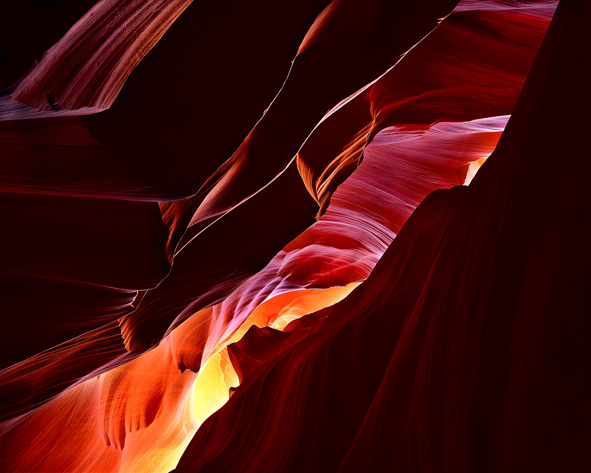
Even though I got blasted on my last post for the 1,367,896th photo of U Antelope Canyon, I'm posting another one. I guess I'm just hoping for some feedback on the image and not that concerned about how interesting it is to some of the hard core members.

I liked the huge amount of contrast in this one and the way the light is bouncing around the various rock formations but I can't really decide if it works. Comments and suggestions are welcome.

Nikon D800, 24mm, f/7.1, 1.6 sec., ISO 100

Comments

12 comments
Comment posted by Paul Breitkreuz on May 14, 2013 at 10:14 AM
I like this very well, Walt. The diagonal composition as well as the straight up perspective provides a bit of a different look here. Although I find myself trying to rotate things in the other direction. But that I'm sure is a bit of right hand or left hand feeling more then anything. Obviously anyone mounting a print could turn as preferred. The shadows are deep, but there is enough exposure on the many ledges bouncing the light around to see things and get a decent feel for depth overall. :cool:
Registered on February 25, 2006, 525 Posts, 8448 Comments
Comment posted by Doug Koepsel on May 14, 2013 at 10:17 AM
Walt, my feeling is that there is too much dark space and the lit ULC seems to grab some attention from the center. To keep the diagonal, maybe try hefty 20% crops from the top and right sides?
Registered on April 1, 2010, 196 Posts, 1592 Comments
Comment posted by Dietrich Gloger on May 14, 2013 at 12:57 PM
Wow, this looks great. I like the clarity and sharpness. The light/dark contrast works great for me.
Belongs to the top tier slot canyon shots, imo.
Registered on January 26, 2007, 360 Posts, 9876 Comments
Comment posted by Phil Pogledich on May 14, 2013 at 1:00 PM
This works pretty well for me and I think the darker areas are just fine, though I'd be curious to see a version with them lightened a bit for comparison. Speaking of comparisons, your rendition of the colors is appears very natural and is far superior to the hopelessly over-the-top melange of red and blue neon featured in this month's Outdoor Photographer magazine cover shot of Antelope.
Registered on August 24, 2009, 123 Posts, 3099 Comments
Comment posted by Scott Fricke on May 14, 2013 at 1:36 PM
Walt, I love the composition with all the different layers and the diagonal lines, it feels very dynamic to me. I like how the darker areas work with the bright areas. Probably just a personal preference, but the image seems top-heavy to me and I would rotate it 180 degrees, fully knowing there is no real 'correct' orientation here. The colors are very saturated, most probably right on the edge, but the bright red color is over the top to me, way too much magenta for even this locale. I'd say work on that a little and you've got a real winner!
Registered on January 19, 2007, 133 Posts, 1448 Comments
Comment posted by John Clulow on May 14, 2013 at 2:18 PM
I too like the strong horizontal composition as well as the bimodal tonal range which makes it very dramatic. Good sharpness in all the edges.

To Paul's comment about handedness, I tried a horizontal flip and I do think that "flows" better; It actually reminds me a lot of molten lava flowing down hill.

The hues in this are remarkable; intense reds, yellow, and violet.

Having seeing 1,367,897, I cannot now wait to see 1,367,898 !
Registered on November 1, 2012, 155 Posts, 1079 Comments
Comment posted by Walt Sterneman on May 14, 2013 at 5:11 PM
Thanks for all the great comments and suggestions. I'll give them all a try!
Registered on March 24, 2010, 73 Posts, 1268 Comments
Comment posted by Mark Seaver on May 14, 2013 at 6:24 PM
The contrast is very strong, but you've handled it nicely with subtle details in the lower right and interesting effects with the bright ridges above. It's funny, but I think this is a stronger image when flipped vertically. (How nice to be working from my laptop. :biggrin: ) This looks great.
Registered on January 23, 2011, 1103 Posts, 17270 Comments
Comment posted by Harry Lichtman on May 14, 2013 at 8:48 PM
The light from below feels a little odd, but only because I am use to seeing from above. Almost looks like a lava tunnel. Great sharpness and tones. The 2 dark corns look a bot too symmetrical for me, so maybe a crop off the right (less interesting of the 2 might be an improvement :confused: Lovely shot.
Registered on September 17, 2010, 304 Posts, 3507 Comments
Comment posted by Vance Gese on May 15, 2013 at 1:59 AM
Love the strong diagonal and the wonderful use of shadow and contrast and line, not to mention those incredible colors. This is fantastic in my opinion.
Registered on November 13, 2008, 298 Posts, 6629 Comments
Comment posted by Mark Metternich on May 15, 2013 at 11:15 AM
Depends on who you want it to "work" for? The public would love this. Nice shot! :toast:
Registered on June 19, 2009, 276 Posts, 6240 Comments
Comment posted by Russell Colletta on May 15, 2013 at 1:11 PM
Nice job handling the wide range of tones Walt, which IMO makes the image of a familiar place unique. Creates a different mood by giving that much real estate in the frame to the very dark tone.
Registered on October 31, 2009, 114 Posts, 1008 Comments