Nature Photographers Network
This is the preserved archive of the original Nature Photographers Network. The community continues at naturephotographers.network.
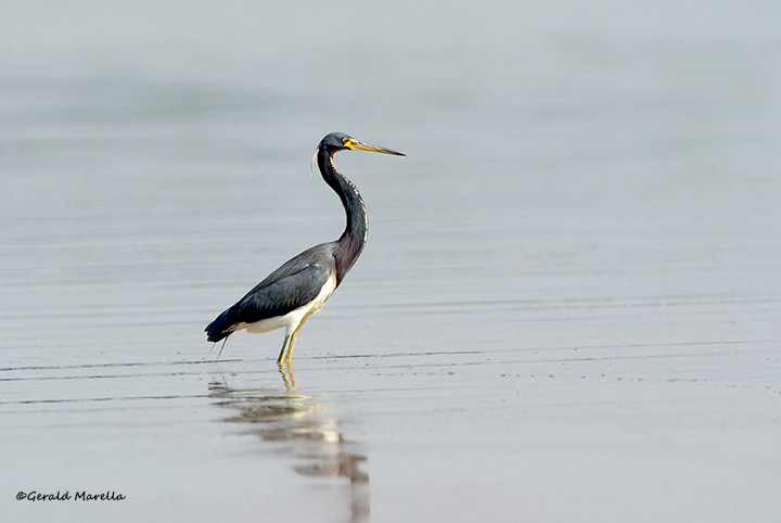
Tricolored Heron
‹ PreviousAvian GalleryNext ›

Tricolored Heron

by Jerry Marella

Gallery: AvianPosted May 18, 201371 views9 comments
I like this type of photo, but I never know if it works. It's like a bird landscape and my landscape skills are far from good so I have a hard time judging these things. I know I like them when I see what others have done.

This was at Ft. Desoto this past winter sometime.

EOS 1D
400 2.8 w/1.4 extender
ISO 250
1/1600 @ f6.3

Thoughts, comments, and critiques are appreciated.

Thanks for looking

Comments

9 comments
Comment posted by Stephen Kaluski on May 18, 2013 at 11:24 AM
Hi Jerry, I like the almost pastel colour of the BKD as it works well against the darker, somber colours of the subject. I might be tempted to give it a slight CW rotation, although 2.2 is spot on I might just work around 1.8, just a thought?

I think you may have an uncheck box for your colour profile (sRGB) as it shows untagged too???? :wavey:

TFS
Steve
Registered on March 25, 2007, 189 Posts, 1064 Comments
Comment posted by Jerry Marella on May 18, 2013 at 12:36 PM
Good thought, Steve. I never considered rotation since I thought the ripples were just ripples and not an indication of level. They may be, but the rotation will probably let the frame flow better.

I'll also check the profile. Thanks.
Registered on November 1, 2003, 142 Posts, 862 Comments
Comment posted by Nate Chappell on May 18, 2013 at 12:43 PM
I like the colors here Jerry, it's a solid shot of a Tricolored but as far as a bird landscape type shot I think it would have worked better if you had shot it as a vertical - if it was possible to get the full reflection of the bird. :toast:
Registered on February 1, 2006, 1158 Posts, 19528 Comments
Comment posted by Sharon Hallowell on May 18, 2013 at 2:25 PM
Nice bird for this type of shot. I agree with Nate that a vertical may have worked well also. I'm not getting a larger version to show up. Sharon
Registered on November 1, 2003, 392 Posts, 4810 Comments
Comment posted by Stephen Kaluski on May 18, 2013 at 3:04 PM
You are welcome Jerry, any queries on the settings let me know. :wavey:

Cheers
Steve
Registered on March 25, 2007, 189 Posts, 1064 Comments
Comment posted by Craig Strand on May 18, 2013 at 3:07 PM
Very nice as shown, the larger version is not any larger then this one. Were it mine I think I would try the already suggested vertical or cropped a bit off the left side and top, not eliminating any of the reflection. Still very nice as taken.
Registered on March 30, 2008, 416 Posts, 2885 Comments
Comment posted by Bill Leggett on May 18, 2013 at 3:31 PM
Nice work, Jerry. I think you have a good handle on the avian/landscape concept (at least for Ft Desoto). Agree that it needs some rotation, also a complete reflection would be more effective I think - Nate's suggestion for a vertical would help in that respect.
Registered on July 21, 2004, 706 Posts, 3233 Comments
Comment posted by Buck Ward on May 18, 2013 at 5:02 PM
Hi Jerry.

I'm a stickler for level. (I always have a bubble level on my camera.) In this case, the wavelets are not an indicator of level. Their not being parallel to the edge of the frame simply means that you weren't perpendicular to them. If the bird had been moving, creating ripples, the axis of the ellipse of the ripples is a good indicator of level. Also the reflection can be an indicator of level. Assuming your lens was approximately level, a point on the reflection should be vertically aligned with the corresponding point on the bird's body. With a long lens, even if the lens is slightly tilted downwards, the angle is small, and the reflection test, especially near the center of the image, works well. In this case, the reflection is a little too diffuse to pick a precise point, and you cropped the head in the reflection so we can't see the eye or bill. I'll be the contrarian here and say that this image doesn't look unlevel to me.

Regarding reflections: for me, the reflection should be all or nothing. If the reflection is good enough to include, all of it should be included. Even if the reflection is incomplete, I think it's a good practice to include space in the frame for it. If the reflection isn't good enough to include, or if you cant get all of it, then less than half the reflection should be shown. This, of course, is not a hard and fast rule - just a rule of thumb peculiar to me. You should follow your own sense of aesthetics.
Registered on December 8, 2003, 96 Posts, 1917 Comments
Comment posted by Jerry Marella on May 19, 2013 at 2:39 PM
Great feedback everyone, thank you. I think I miss some of the finer considerations in some situations. Probably concerned with getting a well exposed and in focus photo and not noticing a lot of other things. I'll look though the files from that trip and see if I have something that is a little more inclusive of reflections that still has a pleasant mood.

Thanks again. I appreciate the constructive critiques and your time.
Registered on November 1, 2003, 142 Posts, 862 Comments