Nature Photographers Network
This is the preserved archive of the original Nature Photographers Network. The community continues at naturephotographers.network.
Horseshoe Bend
‹ PreviousLandscape GalleryNext ›

Horseshoe Bend

by Walt Sterneman

Gallery: LandscapePosted May 18, 2013299 views11 comments
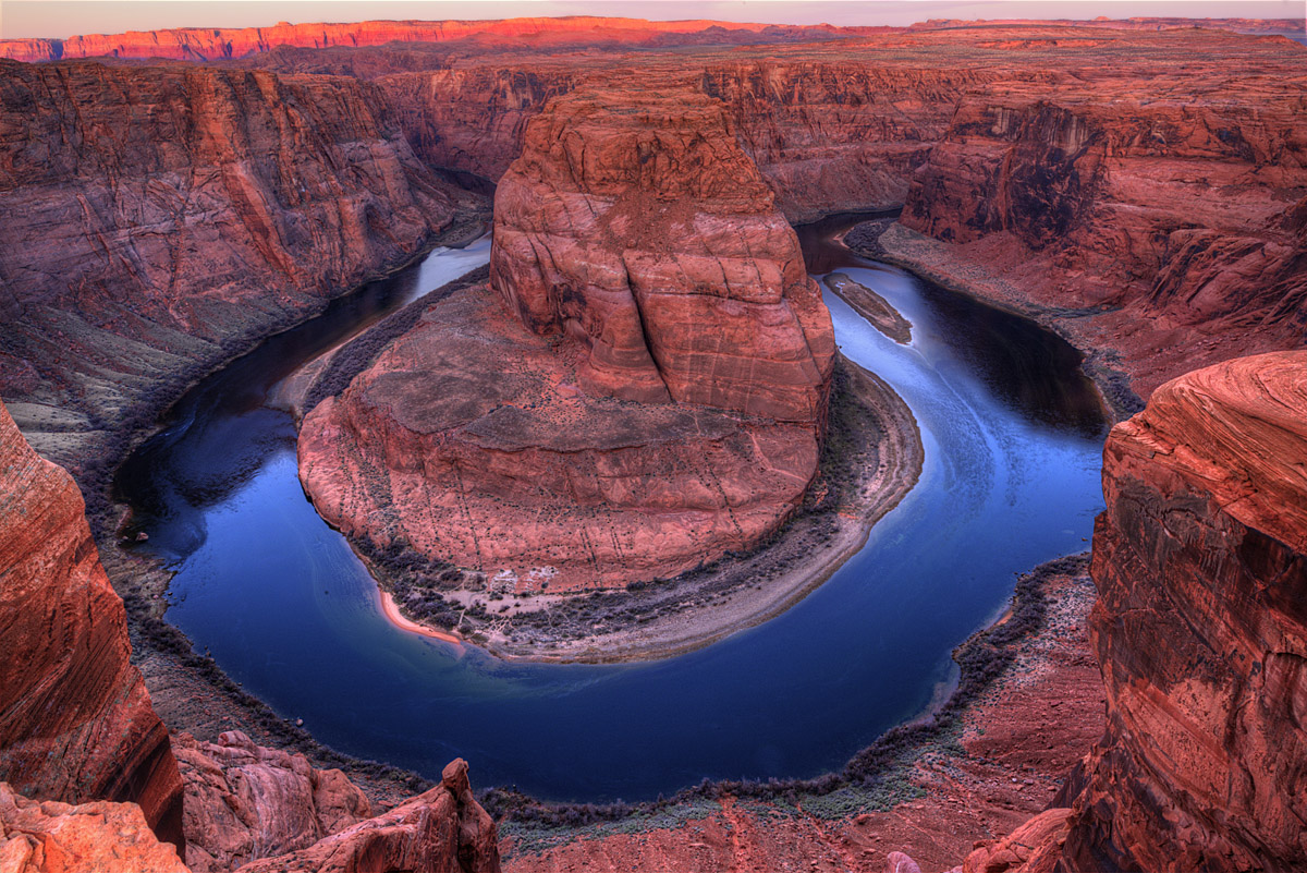
With the risk of posting another worn out iconic image, here is a shot I got of Horseshoe Bend early one morning. This is a two shot blend so I could get the lit up Vermillion cliffs in the background. Although the colors are strong here I actually had to de-saturate the rocks a bit. With the sun still below the horizon the rocks were glowing this shade of pink, but were much darker, but the camera slowed down the shutter speed and these wonderful colors came out. Is it still too much? Comments and suggestions are welcomed.

D800, 14-24mm f/2.8 lens at 22mm and f/22, 1/4 sec and 2 sec, ISO 100, tripod

Comments

11 comments
Comment posted by Ken Smith on May 18, 2013 at 8:58 PM
Some iconic shot!! They are popular and so be it. Wonderful colors and details. Inky blue water is a great contrast...and the little green showing near the shoreline adds much. I would say, the sacrifice in so much pink/red is in the horizon which is taking on a neon glow... that taints everything...I would go so far as to crop it out. Nice shot!
Registered on September 5, 2008, 449 Posts, 2444 Comments
Comment posted by Vance Gese on May 18, 2013 at 9:08 PM
Iconic or not, I'm loving the reds, lines and details in the rocks and the beautiful azure blues of the river. Spectacular in my opinion. I might try and decrease the brightness of the distant cliffs a bit more as they do draw the eye somewhat. Don't know if you have worked with Tony Kuyper's luminosity masks but Tony's "Triple Play" for highlights might tame those cliffs somewhat. Just an idea of course. Either way, a gorgeous image.
Registered on November 13, 2008, 298 Posts, 6629 Comments
Comment posted by Scott Fricke on May 18, 2013 at 9:52 PM
Wonderful image Walt, the colors of the foreground cliffs and of the water are very appealing. I'd agree the sunlit cliffs are still a bit over saturated and you may want to dial it back a bit. I think if you do that you'll have a real winner.
Registered on January 19, 2007, 133 Posts, 1448 Comments
Comment posted by Walt Sterneman on May 19, 2013 at 8:25 AM
Thanks for the insights. I did back off a little on the river area, but didn't even think too much about the Vermillion Cliffs being too bright, but I see it now and agree. Great suggestions.
Registered on March 24, 2010, 73 Posts, 1268 Comments
Comment posted by Paul Breitkreuz on May 19, 2013 at 10:49 AM
Very well captured composition, Walt. I would also address some of the color items mentioned, but heck, those are completely workable in PS now that you've got the shot, so to speak. I especially like the captures from this site where the "whole" curve is seen. Many have the lower potion chopped and feeling a bit incomplete. However, you've provided the entire viewable area from this perspective. Been here a couple times myself, although vertigo keeps me far from edge clinging as it were. :biggrin:
Registered on February 25, 2006, 525 Posts, 8448 Comments
Comment posted by Eva McDermott on May 19, 2013 at 1:47 PM
I like the fact that you captured the entire bend in your image Walt. I quite like the mix of reds and blues too. The hot cliffs in the background do raw my eye to them but as others have said, easily fixed.
Registered on January 4, 2009, 1015 Posts, 13229 Comments
Comment posted by Nick Bristol on May 19, 2013 at 7:07 PM
This really is an impressive view! The contrast of the blue water and nice reddish pink glow on the rock is quite striking. Very nice! :smile:

Nick Bristol
Lone Rock, WI
Registered on February 1, 2004, 752 Posts, 14140 Comments
Comment posted by Dennis Harding on May 19, 2013 at 7:42 PM
A very spectacular place and an excellent image Walt. But to me it feels like the image needs to be titled down on the right side a little?
Registered on January 19, 2011, 33 Posts, 408 Comments
Comment posted by Chris Chamberlain on May 19, 2013 at 9:40 PM
In my opinion, it's a little too red. I also think you need a bit more room for the sky. If you are going to include it, then make it look deliberate. In this case though, it works nicely with a crop to eliminate the sky all together. Nice light too!

Chris
Registered on March 13, 2007, 500 Posts, 8365 Comments
Comment posted by Chris Stenger on May 20, 2013 at 2:11 AM
Nice shot of a great location
Registered on May 9, 2013, 27 Posts, 163 Comments
Comment posted by Kirk Greene on May 21, 2013 at 3:49 PM
Iconic for good reason. I like everything about it except the bright cliffs. Tone them down a bit so they don't distract and you've got a great image.
Registered on May 12, 2004, 191 Posts, 1578 Comments