Nature Photographers Network
This is the preserved archive of the original Nature Photographers Network. The community continues at naturephotographers.network.
Cold Fire
‹ PreviousLandscape GalleryNext ›

Cold Fire

by Peter Coskun

Gallery: LandscapePosted June 8, 2013259 views18 comments
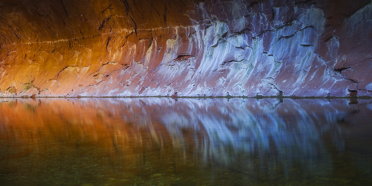
I got up this morning at 2am to make it to the trailhead at 4am (driving from PHX to Oak Creek Canyon) in hopes that the flowers would be prime as last weekend they showed life. It was without question one of the better displays I've seen from this region, but I always know that one of the payoffs getting here early, is that you get a seriously incredible glow on this canyon wall as the sun reflects off of opposing sandstone monoliths. I've photographed the glow many times, but I wanted to get more intimate with it and make it the main element in the image. I found that just at the end of the glow, were these interesting patterns on the wall that had really cool tones and they just contrasted so well with the warm glow that I was going crazy shooting various compositions with it. Ultimately, I settled on this panoramic. Curious to hear your thoughts on this? I've been working on more abstract stuff as of late and have found it to be a fun artistic learning process. LARGE VERSION INCLUDED!

Oak Creek Canyon

Canon 7d
Canon 17-40mm @40mm
f14
ISO 100
8 sec
CPL
Tripod

Comments

18 comments
Comment posted by Mark Metternich on June 8, 2013 at 5:33 PM
Sweet image in every respect Peter! :toast:
Registered on June 19, 2009, 276 Posts, 6240 Comments
Comment posted by Ted Gore on June 8, 2013 at 5:43 PM
It's fantastic! The glow looks great.

If I were to nitpick, it would be that the waterline isn't dead center. I instantly felt it. That's probably weird, and may just be me, but thought I'd put it out there. I was curious, and wondering if my mind was playing tricks on me. I took your large version into PS, and sure enough it was JUST off center. Haha. Sorry. :-/ But thought I would mention it.

Are those the actual colors of the walls... the blues and greens?
Registered on April 25, 2013, 36 Posts, 149 Comments
Comment posted by Peter Coskun on June 8, 2013 at 5:48 PM
Thanks Mark and Ted!

Ted, it is intentionally of center as the bottom was just blurred rocks with no reflection. The colors on that wall do have the blue and greens. Most of the adjustments were done in RAW.
Registered on October 31, 2011, 170 Posts, 1240 Comments
Comment posted by Nancy Lea Sandy on June 8, 2013 at 6:10 PM
Excellent abstract. Large version is simply stunning
Registered on January 24, 2011, 576 Posts, 6942 Comments
Comment posted by Doug Koepsel on June 8, 2013 at 6:50 PM
Peter, I like the contrast between the warmer and cooler wall sections. Maybe clone out the small floaty in the water on the far left side.
Registered on April 1, 2010, 196 Posts, 1592 Comments
Comment posted by Nathan Apodaca on June 8, 2013 at 7:09 PM
Wow! Beautiful glow. The reflection on the water combined with the rocks on the bottom makes the lower half almost as interesting as the top. Nicely done. If I were going to mention something, it would be that I feel this may be a bit oversaturated?
Registered on November 16, 2011, 67 Posts, 1127 Comments
Comment posted by Kane Engelbert on June 8, 2013 at 8:09 PM
I like the shot Peter alot. I certainly think its a keeper. Be careful satisfying your aggresive eye transitioning from warm golden glow to frosty cool. All these trained eyes residing here at NPN will have questions. Appears to be a WB blend maybe?

BTW, this place may be the next Subway for a while, go to the Rocky Mountain Forum to see what Zions Subway looks like these days... :frown:
Registered on June 14, 2009, 63 Posts, 291 Comments
Comment posted by Peter Coskun on June 8, 2013 at 8:29 PM
Thanks everyone.

Nathan- The scene itself was quite saturated. I only adjusted the saturation sliders in the RAW and not by too much as it would have blown some of the reds.

Kane- I see what you mean. I just like to experiment with different image ideas. Not sure what you mean with a white balance blend? This area doesn't seem to get as much attention from hikers surprisingly. Hopefully it stays that way, although that trail gets REALLY busy on the weekends and during peak fall colors.
Registered on October 31, 2011, 170 Posts, 1240 Comments
Comment posted by Eva McDermott on June 8, 2013 at 8:40 PM
Excellent mix of cool and warm tones Peter. I like the pano crop you selected.
Registered on January 4, 2009, 1015 Posts, 13229 Comments
Comment posted by Lon Overacker on June 8, 2013 at 8:53 PM
Peter,

This is awesome! I love this! Simple, yet so striking. The warm>cool gradation works beautifully too, IMHO. I think Kane's thought was that this could be a blend of 2 images, or double-processed - one with a cool WB and another with a warm WB, then blended together. Of course I wasn't there, but I personally didn't get the idea of a blend of WB. I'm just enjoying the color transition, reflection and beautiful simplicity of this scene.

Lon
Registered on November 24, 2006, 521 Posts, 19147 Comments
Comment posted by Richard Teller on June 9, 2013 at 1:06 AM
Very nice abstract in form and color. Well seen and photographed.
Registered on August 23, 2010, 1162 Posts, 6692 Comments
Comment posted by R.Bill Moser on June 9, 2013 at 6:10 AM
Beautiful colors and reflections. Well done :toast:
Registered on January 29, 2010, 285 Posts, 4281 Comments
Comment posted by Colin H Sillerud on June 9, 2013 at 5:15 PM
Big time shot man! Love it all - the color, the glow, the feel.
Registered on May 26, 2011, 17 Posts, 58 Comments
Comment posted by Kah Kit Yoong on June 9, 2013 at 8:24 PM
Beautiful colours but I'll bet only a large print will do justice to those textures in the wall. A very fine abstract.
Registered on September 27, 2006, 636 Posts, 10682 Comments
Comment posted by Shane McDermott on June 10, 2013 at 12:58 AM
Hi Peter

Interesting take on this place. I really like the gradual tonal gradation from the cool blues the the fire hot reds, obviously you did to. It was good to see you briefly.

Later,

Shane
Registered on November 12, 2007, 49 Posts, 1074 Comments
Comment posted by Chris Chamberlain on June 10, 2013 at 2:01 AM
Wonderful warm/cool contrast and abstract nature. It's amazing what light, or lack there of does to a subject.

Chris
Registered on March 13, 2007, 500 Posts, 8365 Comments
Comment posted by Joerg Bonner on June 10, 2013 at 9:12 AM
this is great! i love the glow and the colours in this shot!
Registered on September 5, 2011, 44 Posts, 221 Comments
Comment posted by Jimmy Gekas on June 10, 2013 at 1:21 PM
Very cool! I really like the simplicity of this, yet it's got a lot going on that you have to stare at to appreciate. Great colors. This will look great big. :toast:
Registered on July 26, 2007, 244 Posts, 2807 Comments