Nature Photographers Network
This is the preserved archive of the original Nature Photographers Network. The community continues at naturephotographers.network.
Painted Sunshine & repost
‹ PreviousFlora GalleryNext ›

Painted Sunshine & repost

by Dennis Plank

Gallery: FloraPosted June 9, 2013103 views13 comments
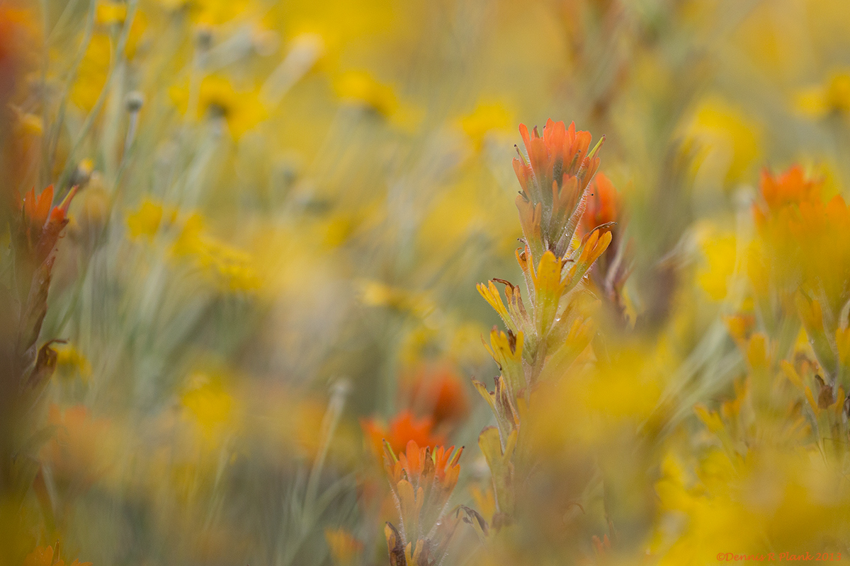
Actually Harsh Paintbrush (Castilleja hispida) and Oregon Sunshine (Eriophyllum lanatum) planted together in a bed a native plant nursery I was volunteering at yesterday. I decided to do a pseudo-cram and play with different points of focus in the bed. I liked this, but cropped it a bit to eliminate one distracting element and balance the composition.

5Diii, 180mm, f3.5 macro, tripod, f3.5, 1/4000, iso 640, Av mode with -1/3 compensation. Cropped to 11.9 MP. The only other processing was a very light sharpening to bring out the in-focus features.

Your comments and criticisms are always very much appreciated.

Thanks for looking,

Comments

13 comments
Comment posted by John Clulow on June 9, 2013 at 2:24 PM
To me, this has a dream-like quality with the extreme softness in the yet recognizable sun flowers contrasted against the crispness of the paintbrush where discrete dew drops are visible in the larger view. I also like the diagonal orientation of the subject leaning toward the right.

I think that it might have been even stronger had there been better color contrast between two orange portions of the subject; one at the bottom center and the other atop the one leaning to the right. My eye is attracted to red / orange in this, and having the sharp red-orange petals close to a very soft red-orange background petal detracts a little, perhaps, from the effect that might have been had otherwise.

The other thing I thought about was the bit of sharp red petal peeking in along the left edge. It may kind of balance the subject somewhat, but I tried a smaller 3:2 aspect ratio crop moved over to the right side or a 5:4 more centered, so that the subject starts at the bottom at roughly the left vertical third and goes right to roughly the right vertical third. You might want to consider a crop like this to see if you think it helps to simplify what it is you are going for.
Registered on November 1, 2012, 155 Posts, 1079 Comments
Comment posted by Ian Wolfenden on June 9, 2013 at 3:08 PM
A superb image, Dennis. Doubtless you could have processed this in a number of ways, but I really like the interplay of colour and especially of the sharp and soft elements, Free and airy, this is a delight for the eye !!
Registered on May 18, 2007, 1108 Posts, 7647 Comments
Comment posted by Roger Kirchen on June 9, 2013 at 5:19 PM
This image says "Spring" and "Sunshine". I like the airy feel that you have created. Interesting color on the Paintbrush. I usually see the Indian Paintbrush here, which has a deeper red color.
Registered on March 6, 2011, 95 Posts, 847 Comments
Comment posted by Bob&Charly Nelson on June 9, 2013 at 5:30 PM
I like this as is Dennis. There is enough to keep me just looking at everything in this image. Well thought out composition in my opinion.
Bob :wavey:
Registered on October 27, 2005, 289 Posts, 4202 Comments
Comment posted by Bill Fach on June 9, 2013 at 5:30 PM
Dennis: Really good selective focus and comp. Love the color of the paintbrush and the BG. I would almost certainly crop the orange on the left side and then print large.>=))>
Registered on November 1, 2003, 1805 Posts, 26981 Comments
Comment posted by Lorna Taylor on June 9, 2013 at 6:45 PM
Love the contrast of colour and the little peek a boo vignette with the cramming of the yellow flowers.
Registered on November 12, 2010, 254 Posts, 3083 Comments
Comment posted by scott lanz on June 9, 2013 at 9:00 PM
I'm with Bill on this one, Dennis. I like this a lot except for the orange/brown left edge. I think this is just too close to the edge, making the image look cut off. Otherwise, very nice.
Registered on November 14, 2003, 840 Posts, 12902 Comments
Comment posted by Dennis Plank on June 9, 2013 at 9:56 PM
Here's a version following suggestions to remove the orange on the left. I think it's an improvement. Thanks,

:wavey:
Registered on January 28, 2008, 1767 Posts, 23192 Comments
Comment posted by John&Patty Benway on June 10, 2013 at 7:01 AM
I think this is gorgeous Dennis, everything about it, I would definitely print and frame this. I'm sticking with your original post. Beautifully seen and presented.
John
Registered on May 12, 2006, 626 Posts, 8700 Comments
Comment posted by Nathan Buck on June 10, 2013 at 5:58 PM
Great colors and a very nice effect from the cram Dennis. I like the results.

Nathan
Registered on November 1, 2003, 1101 Posts, 13589 Comments
Comment posted by Nathan Buck on June 10, 2013 at 5:59 PM
Oh, and I prefer version 2 Dennis!

Nathan
Registered on November 1, 2003, 1101 Posts, 13589 Comments
Comment posted by Bill Fach on June 10, 2013 at 9:02 PM
Dennis: The repost is a home run IMO. >=))>
Registered on November 1, 2003, 1805 Posts, 26981 Comments
Comment posted by Albert Darmo on June 12, 2013 at 4:22 PM
Hi Dennis :wavey: Glad to get my server working. the repost is even better :eek: :jump: beautifully composed with awesome color :toast: :toast:
Albert Darmo
Registered on November 25, 2008, 1386 Posts, 11978 Comments