Gallery: LandscapePosted June 10, 2013278 views16 comments
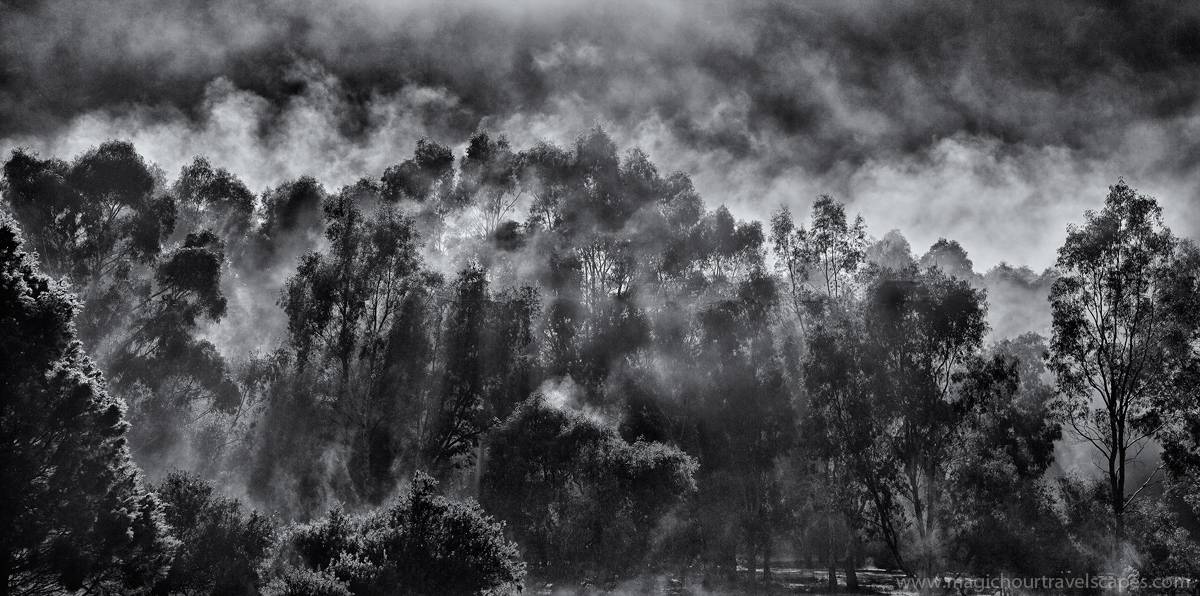
Grampians National Park, Australia
Morning sun burns away the frost on a frigid morning.
Canon 5DMkII, 24-105mm 4L
Comments
16 comments
Comment posted by Aaron Feinberg on June 10, 2013 at 5:08 AM
Well that's fun :)
aF
Registered on October 26, 2009, 399 Posts, 2789 Comments
Comment posted by John Clulow on June 10, 2013 at 10:48 AM
Very cool, especially in the larger view. I think this is great in B&W and the 2:1 aspect ratio gives it an expansive panoramic feel.
Registered on November 1, 2012, 155 Posts, 1079 Comments
Comment posted by R.Bill Moser on June 10, 2013 at 11:44 AM
This works well in black & white. I love this a lot. I am looking forward to our Australia trip in september visiting the Grampians
Registered on January 29, 2010, 285 Posts, 4281 Comments
Comment posted by Mark Metternich on June 10, 2013 at 1:23 PM
Wow that is one powerful light show there buddy! Drama!
Registered on June 19, 2009, 276 Posts, 6240 Comments
Comment posted by Lon Overacker on June 10, 2013 at 1:34 PM
Kah Kit,
Wow! This is quite amazing and also unique. Definitely must see the larger view to appreciate the drama and contrasts. Even besides the drama and light going on with the rising mist and morning sun, I find the patch of forest floor at the lower right to add quite a lot to this scene. Without it, we really have no context, no sense of place or scale, but just that sliver of ground on the right puts this all in perspective. No nits, all that's missing are some bold light rays streaking through the scene....
Awesome and compelling image.
Lon
Registered on November 24, 2006, 521 Posts, 19147 Comments
Comment posted by Jared Warren on June 10, 2013 at 3:54 PM
Woah- very cool and unique. Nice B+W choice with lots to keep the viewer engaged.
Registered on May 11, 2012, 84 Posts, 931 Comments
Comment posted by Nick Bristol on June 10, 2013 at 7:24 PM
Fantastic b&w image Kah Kit! The larger version is very cool looking.
Nick Bristol
Lone Rock, WI
Registered on February 1, 2004, 752 Posts, 14140 Comments
Comment posted by Eva McDermott on June 10, 2013 at 8:19 PM
Spectacular light Kah Kit and very beautiful. Love this.
Registered on January 4, 2009, 1015 Posts, 13229 Comments
Comment posted by Nancy Lea Sandy on June 10, 2013 at 9:03 PM
Very dramatic. I like the feeling of movement in the middle. Very nice b&w.
Registered on January 24, 2011, 576 Posts, 6942 Comments
Comment posted by Todd Liotine on June 11, 2013 at 12:05 AM
Kay, amazing display of light and well captured.
Registered on July 1, 2008, 131 Posts, 671 Comments
Comment posted by David Edwards on June 11, 2013 at 6:40 AM
The b&w contrast is excellent here. I thought it was a bush fire before reading your text. The larger version has lots of impact.
Registered on December 6, 2008, 142 Posts, 2623 Comments
Comment posted by Marc Adamus on June 11, 2013 at 11:11 AM
I think for me, personally, a smoother processing approach would work better here. In this rendition the contrasts seem to pop out so much they seem to add unnecessary complexity and make the scene appear more busy. Perhaps focusing on separating the beams more that are coming down through the trees and backing off the heavy contrast up top would work more fluidly. Hard to put it into words exactly, but I'd see a lot of potential here for something different in look/feel here if I were working the file. That of course could well be just a difference in artistic opinion and that's perfectly fine, but I thought I'd try to elaborate anyway. When I first look at this, it just seems a bit contrast-heavy in some areas and busy. After looking at the big one a while though, I find it a little more pleasing.
Registered on September 17, 2005, 780 Posts, 8091 Comments
Comment posted by Harry Lichtman on June 11, 2013 at 10:23 PM
Pretty wild - these scenes are one of my favorites and your choice of BW seems a good one. Intricate detail in the larger version. There is a blotchy feel to the image - maybe the darks are too dark? Normally in this type of image, the sun rays help separate the trees and create texture and form but there doesn't seem that much going on. I think you have done very well with the given lighting.
Registered on September 17, 2010, 304 Posts, 3507 Comments
Comment posted by Mike Dawson on June 11, 2013 at 11:37 PM
Impressive morning mist, nice work
Registered on February 4, 2006, 364 Posts, 8872 Comments
Comment posted by Stuart Williams on June 12, 2013 at 4:23 AM
very atmospheric. it looks a little too contrasty to my eye ...???
Registered on December 7, 2007, 247 Posts, 4792 Comments
Comment posted by Chris Chamberlain on June 12, 2013 at 11:36 PM
Wow, that is intense. I find the bold contrast and layers of light up top to be very dynamic. The trees and lower areas a bit too powerful in contrast though.
Chris
Registered on March 13, 2007, 500 Posts, 8365 Comments

Comments
16 commentsaF
Wow! This is quite amazing and also unique. Definitely must see the larger view to appreciate the drama and contrasts. Even besides the drama and light going on with the rising mist and morning sun, I find the patch of forest floor at the lower right to add quite a lot to this scene. Without it, we really have no context, no sense of place or scale, but just that sliver of ground on the right puts this all in perspective. No nits, all that's missing are some bold light rays streaking through the scene....
Awesome and compelling image.
Lon
Nick Bristol
Lone Rock, WI
Chris