Gallery: LandscapePosted June 11, 2013176 views6 comments
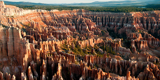
The classic shot of the Bryce Canyon Amphitheater about 2 min after sunrise, 5/29/2013.
Two questions:
1. Should ND gradient be added from top?
2. Should the sky be cropped out?
Comments
6 comments
Comment posted by Harry Lichtman on June 11, 2013 at 1:58 PM
I think if you crop the sky, no grad is needed and makes for a more interesting image all around. To compete with the visual interest of the spires, the sky needs to be somethings special and complimentary IMO. This sky doesn't add much, so I would concentrate on the canyon details. A variety of crops are available to give you the format ratio that you like. Very natural looking image - there is the temptation to go over the top with sat. on this and I like the restraint.
Registered on September 17, 2010, 304 Posts, 3507 Comments
Comment posted by Barry Vangrov on June 11, 2013 at 5:30 PM
Harry is right - definitely crop out the sky but leaving the trees on top of the canyon to show some context. I'd also burn-in the bright area to tone it down just a bit.
Registered on September 1, 2009, 148 Posts, 749 Comments
Comment posted by Ed Lowe on June 11, 2013 at 8:42 PM
I will have to second Harry's sound advice, Ted. The sky is not needed for this scene and I would also concentrate on the interesting shapes and colors of the canyon. This looks very promising if you crop out the sky.
Ed
Registered on February 7, 2004, 414 Posts, 7115 Comments
Comment posted by Patrick Nixon on June 11, 2013 at 11:46 PM
Eliminated the sky but I'm not sure I like the repost much better. Seem to lose the impression of space. Burned some areas, good suggestion.
Registered on June 26, 2006, 68 Posts, 154 Comments
Comment posted by scott lanz on June 12, 2013 at 9:00 PM
I prefer the repost mostly because of the darkened highlights, Patrick, but I like it without the sky. Of the two Bryce images you've posted, I do prefer the previous Bryce image, but both show the amazing landscape well.
Registered on November 14, 2003, 840 Posts, 12902 Comments
Comment posted by Lon Overacker on June 13, 2013 at 10:49 AM
Patrick,
Nice, classic view of Bryce. I think I might actually prefer this with the sky, but qualify it by saying as presented it still feels cramped up top. It's the situation where you either need a bit more (sky) or none at all. Unfortunately, cropping out the sky cramps it even more and I agree with you, the sense of space is lost and that little bit of blue (lake?) is more of an eye magnet now. I understand the desire to crop much of the sky originally because there's not much going on or adding to the scene, but just from a comp and balance perspective, if you're going to include the sky, then include enough. Not sure if I'm making sense....
In the end, the only suggestion for this one as presented is to burn down the upper canyon walls in the UL and to bring back just a little more comfort room in the sky.
Lon
Registered on November 24, 2006, 521 Posts, 19147 Comments

Comments
6 commentsEd
Nice, classic view of Bryce. I think I might actually prefer this with the sky, but qualify it by saying as presented it still feels cramped up top. It's the situation where you either need a bit more (sky) or none at all. Unfortunately, cropping out the sky cramps it even more and I agree with you, the sense of space is lost and that little bit of blue (lake?) is more of an eye magnet now. I understand the desire to crop much of the sky originally because there's not much going on or adding to the scene, but just from a comp and balance perspective, if you're going to include the sky, then include enough. Not sure if I'm making sense....
In the end, the only suggestion for this one as presented is to burn down the upper canyon walls in the UL and to bring back just a little more comfort room in the sky.
Lon