Nature Photographers Network
This is the preserved archive of the original Nature Photographers Network. The community continues at naturephotographers.network.
Epic Sunset Flakstak +
‹ PreviousLandscape GalleryNext ›

Epic Sunset Flakstak +

by Eva McDermott

Gallery: LandscapePosted June 15, 2013912 views20 comments
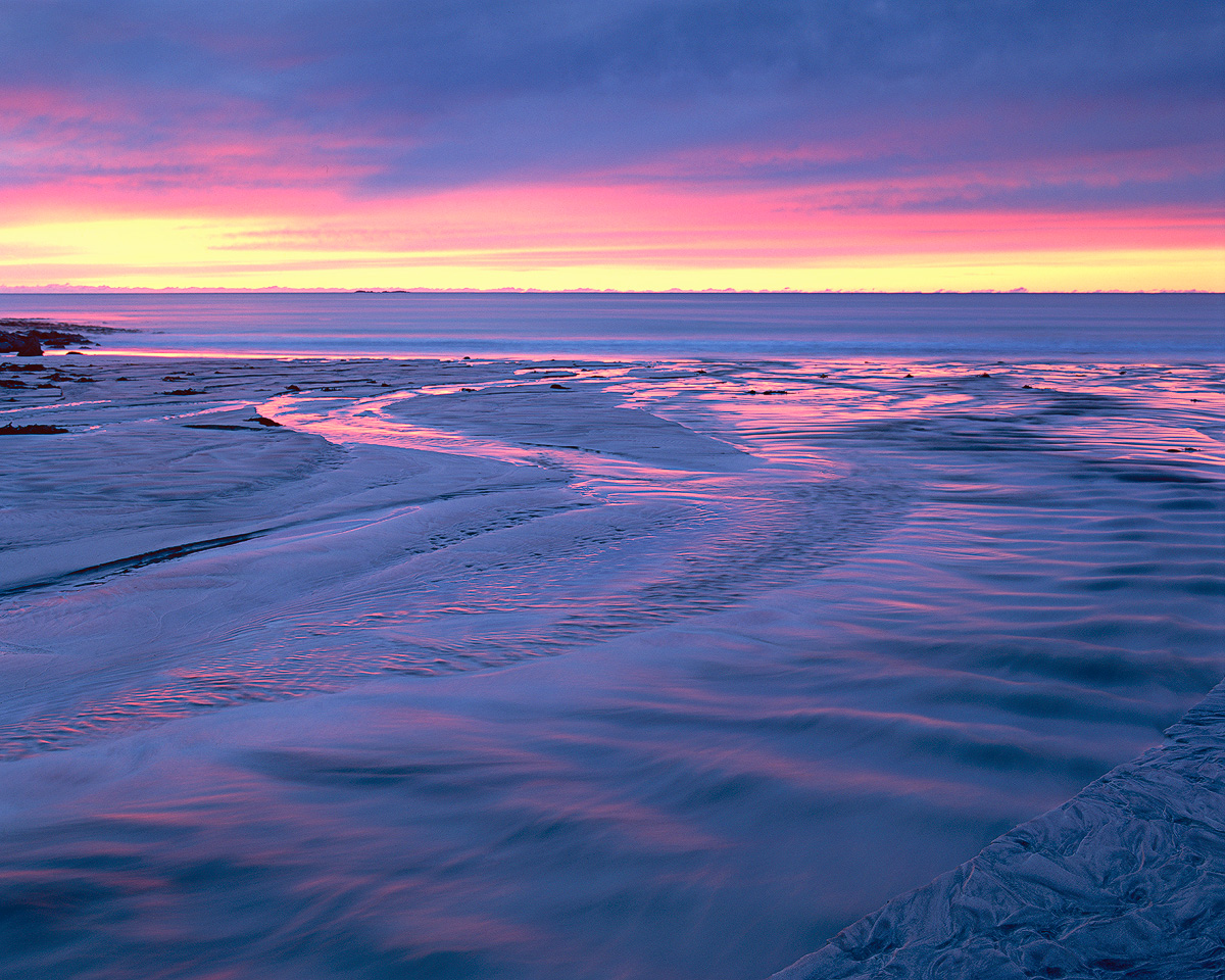
Flakstad, Lofoten, Norway

I should have posted this version the first time.... This is truer to the the Velvia 50 transparency as exposed in the camera.

Between the extraordinary color and flowing tidal streams we were standing in, this was an amazing night on this beach.

Pentax 67II
Pentax 67 55-100mm
Velvia 50
1.5-Stop HE Hitech Gradient

I used my usual scanning workflow..... Epson V750, betterscanning.con adjustable film holder with ANR glass, and Silverfast Ai 8 software.

Thanks for having a look again.

I think a few mentioned a crop from the left, but I decided not to do that.

Comments

20 comments
Comment posted by Michael Anderson on June 15, 2013 at 11:32 PM
Very cool composition and I love the Velvia. The alternating pink and blue tones are amazing.
Registered on January 31, 2006, 228 Posts, 3072 Comments
Comment posted by David Edwards on June 16, 2013 at 1:44 AM
This one looks even better Eva. Fabulous color. Would like to see one of your anemic digital files processed for comparison :smile:
Registered on December 6, 2008, 142 Posts, 2623 Comments
Comment posted by Roel Wijtmans on June 16, 2013 at 2:49 AM
I liked your other picture, but this one is even better on comparison. The colors are a bit more natural but still stunning!
Registered on September 30, 2012, 116 Posts, 2257 Comments
Comment posted by scott lanz on June 16, 2013 at 7:36 AM
I also prefer this version, Eva. The colors look more natural.
Registered on November 14, 2003, 840 Posts, 12902 Comments
Comment posted by Roger Kirchen on June 16, 2013 at 8:40 AM
Gorgeous composition and colors.
Registered on March 6, 2011, 95 Posts, 847 Comments
Comment posted by Carol Nichols on June 16, 2013 at 10:48 AM
Eva, did you take any images of this sunset with your DSLR that we could see as a comparison? I'm curious to know the effect that Velvia had on the colors here. I always read peoples' comments about Velvia, but since I never used it I'm not sure how much that film changes/enhances colors. Is it like taking a DSLR image and increasing the saturation in Photoshop? Or is it more like it changes the actual color?
Registered on November 7, 2007, 161 Posts, 1420 Comments
Comment posted by Eva McDermott on June 16, 2013 at 11:11 AM
Here is a digital version taken at a little before the Velvia version.
Registered on January 4, 2009, 1015 Posts, 13229 Comments
Comment posted by Peter Coskun on June 16, 2013 at 1:39 PM
That first version is very soothing and I like the comp and choice of SS. The colors of course are quite captivating. A lovely image all around!
Registered on October 31, 2011, 170 Posts, 1240 Comments
Comment posted by Carol Nichols on June 16, 2013 at 1:54 PM
Eva, thanks so much for posting the digital version. Comparing the two results is very interesting to me.
Registered on November 7, 2007, 161 Posts, 1420 Comments
Comment posted by Lon Overacker on June 16, 2013 at 1:59 PM
Ooh Eva, I'm really liking this one. Love the colors here and I like the sky better too. Interestingly, the little spit of land isn't bothering me as much as before, yet looking at the first posting, it seems the dark along the edge is about the same size. hmmmm..

thanks for posting the digital version. Colors are good too, but my observation is the fast shutter speed. I prefer the longer exposure and the affect on the water in the Velvia version.

@Carol - don't mean to answer the question for Eva, but thought I would give my thoughts. Something to consider here is that whatever is posted online whether it's film or digital, has been processing in one way or another. For film, not only is there processing, but there was a scanning step as well in which colors are altered just from the scan hw and sw. So the only way to effectively compare is by viewing a slide on a light table next to a RAW image on your monitor, which of course isn't an apples to apples comparison anyway. Most say that RAW images are flat and dull (but contain all the data to be brought out.) So in the end, most of what we see here being posted are the photographers interpretations of color, contrast and saturation. But clearly, Velvia and film in general all have their own characteristics from color reproduction, dynamic range, reciprocity, etc. etc. Just my .02.

Sorry Eva for jumping in. This one is beautiful.

Lon
Registered on November 24, 2006, 521 Posts, 19147 Comments
Comment posted by Gary McGhee on June 16, 2013 at 3:17 PM
Really nice colour Eva, especially in the reflected light in the tidal stream and wet sand.

Gary.
Registered on April 15, 2010, 142 Posts, 2416 Comments
Comment posted by Carol Nichols on June 16, 2013 at 5:45 PM
Lon, thanks for your explanation. I guess I was trying to understand why film photographers seem to love the color rendition of Velvia film so much. Although I've shot many film images, I never used Velvia, so I was trying to figure out what it did to a photo. I get the impression that it does to film what other photographers do in Photoshop to a digital file.
Registered on November 7, 2007, 161 Posts, 1420 Comments
Comment posted by Eva McDermott on June 16, 2013 at 5:45 PM
Thanks everyone.

Hey Lon, no problem and many thanks for providing the explanation.
Registered on January 4, 2009, 1015 Posts, 13229 Comments
Comment posted by Ben Horne on June 17, 2013 at 2:29 AM
Excellent work on the repost Eva. I like how you've taken some of the blue out, and the warm tones really pop.
Registered on August 27, 2009, 51 Posts, 959 Comments
Comment posted by Hamed Musharbak on June 17, 2013 at 3:26 AM
wonderful :toast:
Registered on June 1, 2009, 372 Posts, 2282 Comments
Comment posted by Youssef Ismail on June 17, 2013 at 3:28 AM
Eva,

I like this one better as well mostly due to the additional reflection of light on the standing waves in the creek. I also like the color in the sky better as well. Go with this one.
Registered on November 1, 2003, 474 Posts, 5555 Comments
Comment posted by Ian Cameron on June 17, 2013 at 4:37 AM
This is closer to my memory of that day Eva and I really like this presentation. It was a staggeringly beautiful evening.
Registered on August 6, 2004, 1125 Posts, 3318 Comments
Comment posted by Morris McClung on June 17, 2013 at 2:09 PM
Gorgeous pastels, Eva. The combination of the blues and pinks is wonderful. :toast:
Registered on May 7, 2007, 670 Posts, 19650 Comments
Comment posted by Nick Bristol on June 17, 2013 at 5:08 PM
Eva, I'm really enjoying this one. I think the Velvia colors look great and I love the feel this has. The colors make the difference in this one for me. It must have been great being there seeing and feeling this! :toast:

Nick Bristol
Lone Rock, WI
Registered on February 1, 2004, 752 Posts, 14140 Comments
Comment posted by Harry Lichtman on June 18, 2013 at 4:34 PM
I think I'm liking the initial post minus the rocks onthe far left horizon. The sky and water tend to be in harmony. In the second image, the sky seems blurred while the water is sharper. You can't beat the the color combination. Makes for a great abstract.
Registered on September 17, 2010, 304 Posts, 3507 Comments