Looking Thru +alt
by Lon Overacker
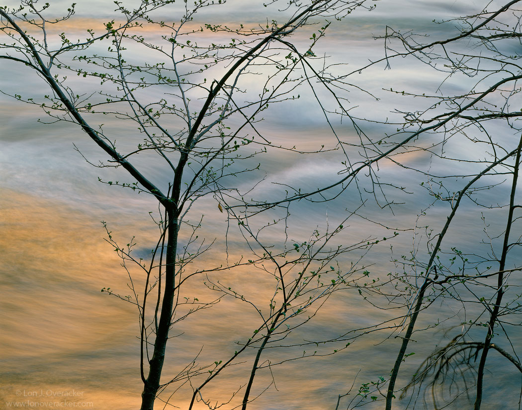
Thanks for your comments and critiques on the previous image. This one here was captured very near the "In the flow" tree at Happy Isles in Yosemite. As I've been visiting this area for many years not only watching the one tree "grow up," which also means that the alders and other trees and brush are growing up and consequently obscuring and blocking access to the water. So finally, I thought why not just embrace the chaos and mess blocking the water and concentrate on capturing the beautiful reflected light in the river. The tree and chaos up front don't really have any great structure, but I'm wondering if the light, color and flow of the water are enough to carry this?
I've also included 2 different versions. The larger view is the uncropped original (processed though) and I'll also post a second square cropped version. Do you have a preference? I've gone through 3 processing versions too, so would like to hear what you think about the color, saturation and processing in general.
4x5, Nikkor 300mm, V50, f/32 @2s
Tony Kuypers masks and actions.
Thanks!
Lon
edit: Any title suggestions welcome too!

Comments
23 commentsAs to the processing, this looks very natural. It's warm and refreshing at the same time. One thought I have is to silhouette the trees and "pop" the light a little more and see how that looks to you. Add to that: take the original, crop off the left to just a *smidge* past the fork in the first tree and scrub out the fir bough in the lower right.
Then I'd quickly go back and shoot some more of these!!
Gary.
just to add to the confusion...
Cheers,
Mike
Nick Bristol
Lone Rock, WI
Wow,...I love them all. but since we are spoiled with 3 diffrent choices I will go with this order:
1- The last small post
2- The original post
3- Second one (I think because the warm ray of BG color is at the edge of the frame).
As I say we are spoiled.
Thanks Lon for sharing them with us.
Mo
I am amazed you managed to give us 4 different photos to look at in one post
Of all the version posted, I like the very last repost. Here is what I think. On seeing the original post, I thought it was unbalanced with that big open reflected light area on the left. I think the tree branches make this work. Alone the trees are chaotic, with out the trees its just color on water. Together the dark branches set off the water and the light on it, and provide a veil of sorts that prevents you from getting to it, and we know how much we want what we can't have and this makes it all that much more appealing. So the original was unbalanced. The larger uncropped version still had the empty area on the left and in addition the blurred branches on the right. The square version did not help either as there was still that bare area which made it feel unbalanced again. Your final post, even though that great light has been heavily cropped, now is balanced across the frame and teases me with that light by preventing me access to it with the branches. I think I might agree with Catherine and add a little more contrast sending the branches into silhouette a little more and popping the light on the water.
well done Lon
- Dan
Ed