Nature Photographers Network
This is the preserved archive of the original Nature Photographers Network. The community continues at naturephotographers.network.
Autumn Oasis
‹ PreviousLandscape GalleryNext ›

Autumn Oasis

by Navin Sarma

Gallery: LandscapePosted June 21, 2013232 views15 comments
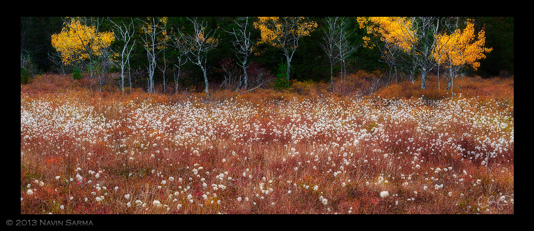
ONLY WAY TO VIEW IT IS LARGE. Compression hit this one hard.

A pleasant marsh I countered during the fall of 2011 in Blackwater Falls State Park. This was an image I played around with for way too long before finally deciding how to approach it.

C&C very welcome.

Comments

15 comments
Comment posted by Steve Zimic on June 21, 2013 at 10:23 AM
Lovely colors but I do wish I could see more of the trees in the background.
Registered on November 23, 2003, 176 Posts, 727 Comments
Comment posted by Navin Sarma on June 21, 2013 at 11:23 AM
Thanks Steve! The only thing above this little grove was gray sky. I thought interest laid more in the FG with the complementary autumn trees. Thank you for your thoughts.
Registered on July 17, 2011, 233 Posts, 1373 Comments
Comment posted by Phil Pogledich on June 21, 2013 at 12:18 PM
Beautiful image. I'd shave just a hair off the left side to eliminate that scraggly bush or tree at the edge of the frame. The composition works very well for me and I like the pano format.
Registered on August 24, 2009, 123 Posts, 3099 Comments
Comment posted by Marc Adamus on June 21, 2013 at 12:32 PM
Yeah, I figured you had good reason to crop it like that. The top does feel 'missing' to my eye as well, but being in these situations is compositionally challenging and I'm glad you shot it anyway because the layers down below do work so well together. It's really an excellent layered display.
Registered on September 17, 2005, 780 Posts, 8091 Comments
Comment posted by Navin Sarma on June 21, 2013 at 12:37 PM
Thank you for the additional thoughts, Phil and Marc. Does the FG look a little too orange/red for you?
Registered on July 17, 2011, 233 Posts, 1373 Comments
Comment posted by Phil Pogledich on June 21, 2013 at 3:10 PM
No, it doesn't feel too red at all.
Registered on August 24, 2009, 123 Posts, 3099 Comments
Comment posted by Chet Dowell on June 21, 2013 at 3:43 PM
This is a very appealing image for me. The contrasting color and textures are well captured.. I like the pano comp as well., nice work.
Registered on December 3, 2012, 237 Posts, 1171 Comments
Comment posted by Nathan Apodaca on June 21, 2013 at 5:57 PM
Wonderful colors. The reds look believable, yet very vibrant, which they could have been. I'm really enjoying this!
Registered on November 16, 2011, 67 Posts, 1127 Comments
Comment posted by scott lanz on June 21, 2013 at 6:46 PM
Excellent capture of fall in W. Va. The colors look good to me, and I like the well balanced pano comp with the emphasis on the foreground. :toast:
Registered on November 14, 2003, 840 Posts, 12902 Comments
Comment posted by Eva McDermott on June 21, 2013 at 8:09 PM
That foreground is amazing Navin! Love the autumn colors and also the detail in the larger version. Yup the top of the trees feel missing, but I love the color.
Registered on January 4, 2009, 1015 Posts, 13229 Comments
Comment posted by David Edwards on June 22, 2013 at 1:15 AM
A beautiful shot Navin. Wonderful color and atmosphere. The large version is awesome. I agree that it does feel somewhat cut-off at the top.
Registered on December 6, 2008, 142 Posts, 2623 Comments
Comment posted by Lon Overacker on June 22, 2013 at 1:44 PM
Navin,

Thanks for the explanation about the top; I too would have liked to have seen a little more breathing room for little trees, but we're often faced with choice we can't do much about. Plus, you clearly are emphasizing the field pods or whatever they are and so I really think this is a strong composition. It's not always about the trees eh? :biggrin:

I'm conflicted with the dark bg. On the one hand I like how it makes the trees and autumn foliage stand out, on the other hand, sometimes we just expect more detail. But that's minor.

An excellent take on a fall scene.

Lo
Registered on November 24, 2006, 521 Posts, 19147 Comments
Comment posted by Michael Anderson on June 23, 2013 at 9:05 PM
Navin, this is spectacular! Excellent composition, perfect light and processing and gorgeous colors. The panorama presentation is perfect for this scene.
Registered on January 31, 2006, 228 Posts, 3072 Comments
Comment posted by Kah Kit Yoong on June 25, 2013 at 6:30 AM
As already mentioned, it is a little compromised but still a wonderful shot.
Registered on September 27, 2006, 636 Posts, 10682 Comments
Comment posted by Navin Sarma on June 27, 2013 at 11:27 AM
Thanks, everyone for your comments. Glad you enjoyed it, since it was a difficult shot to crop. I don't think there is anything I can do to add room at the top except for a cloned extension of canvas (meh).

Thanks again for your suggestions! :toast:
Registered on July 17, 2011, 233 Posts, 1373 Comments