Nature Photographers Network
This is the preserved archive of the original Nature Photographers Network. The community continues at naturephotographers.network.
Sand pistol
‹ PreviousLandscape GalleryNext ›

Sand pistol

by Jared Warren

Gallery: LandscapePosted June 24, 2013251 views12 comments
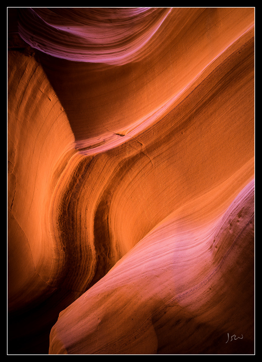
I haven't made a lot of abstract images, but made some attempts earlier this month in this canyon near Page, AZ. Does this one work for you? Any suggestions on comp, processing, etc., to take things up a notch?

5DIII, 24-105mm @ 40mm, f/14, 2.0 sec

Comments

12 comments
Comment posted by Richard Hartmann on June 25, 2013 at 1:09 AM
Love the contrast between the light and shadowed areas. It looks like light coming from two directions. Did you use a flash or reflector?
The shapes and lines are nice. I don’t know how to improve on this one.
Registered on January 15, 2009, 13 Posts, 772 Comments
Comment posted by Jared Warren on June 25, 2013 at 1:37 AM
Thanks, Richard. No flash or reflector (just canyon walls). Main processing adjustments were to boost contrast and clarity, and some selective burning. However, it's really interesting how the light changes over the course of the day. Here's essentially the same shot captured a few hours earlier (my wife actually preferred this one):
Registered on May 11, 2012, 84 Posts, 931 Comments
Comment posted by Lon Overacker on June 25, 2013 at 2:08 AM
Jared,

Wow, what a difference time can make eh? Interesting too how our wives/spouses often have such different tastes and perspectives. Of course being the photog side, I'm biased against the soft and beautiful light present here in this wonderful sandstone abstract. Just enough light to create the contrasts and a little rim lighting up top. Excellent.

The only minor thing I'm torn about is the empty LLC. It's not a big deal, and perhaps not an issue for others. Oh, and there's a tiny specular highlight in the ULC corner that detracts a bit; again, minor, but you might clone that out if you're printing.

Just love the soft light and color here.

Lon
Registered on November 24, 2006, 521 Posts, 19147 Comments
Comment posted by Joerg Bonner on June 25, 2013 at 5:56 AM
superb shot, jared! the comp is spot on and the soft glow is amazing! :eek:

i wasn't going to say anything else, but since you specifically asked for it: i would probably try adding a bit more contrast to bring out the lines in the foreground (mainly the brightest/magenta part).
Registered on September 5, 2011, 44 Posts, 221 Comments
Comment posted by scott lanz on June 25, 2013 at 7:37 AM
Works for me, Jared (the original, not the repost). Excellent flow, lines, shape and colors.
Registered on November 14, 2003, 840 Posts, 12902 Comments
Comment posted by Nick Bristol on June 25, 2013 at 9:25 AM
This is very nice Jared. I love the soft light, beautiful color and wonderful shapes. Clone out that bright speck in the ulc that Lon mentioned and that would be it for me. Well done!
The second post with the harsher light doesn't work nearly as well for me.

Nick Bristol
Lone Rock, WI
Registered on February 1, 2004, 752 Posts, 14140 Comments
Comment posted by Paul Breitkreuz on June 25, 2013 at 12:04 PM
I like this one as is, Jared. A slightly different composition from a slot here. :cool:
Registered on February 25, 2006, 525 Posts, 8448 Comments
Comment posted by Harley Goldman on June 25, 2013 at 12:41 PM
Real sweet image, Jared. It works beautifully for me. Wonderful colors, lines and light.
Registered on November 19, 2003, 586 Posts, 11271 Comments
Comment posted by Bill Chambers on June 25, 2013 at 3:52 PM
Perhaps you haven't made a lot of abstracts, but you made a darn nice one with this! Love the shapes, shadows, textures, curves, contrast - heck, I love it all. Excellent capture.
Registered on April 10, 2005, 753 Posts, 21216 Comments
Comment posted by Mike Dawson on June 25, 2013 at 10:08 PM
I like the first version best, more even tones and air of mystery, I do see a hotspot in the upper left that could be cloned out
Registered on February 4, 2006, 364 Posts, 8872 Comments
Comment posted by Mark Seaver on June 26, 2013 at 10:44 AM
The original post makes a wonderful abstract with all of the warm flowing lines. I like the strong contrast with the dark corners. Beautiful.
Registered on January 23, 2011, 1103 Posts, 17270 Comments
Comment posted by Morris McClung on June 26, 2013 at 12:53 PM
Excellent work. Great color and use of lines. :toast:
Registered on May 7, 2007, 670 Posts, 19650 Comments