Comment posted by John&Patty Benway on June 25, 2013 at 2:21 PM
Sweet shot Ian, really like the subtle color, bg and composition. Simply beautiful.
John
Registered on May 12, 2006, 626 Posts, 8700 Comments
Comment posted by scott lanz on June 25, 2013 at 6:50 PM
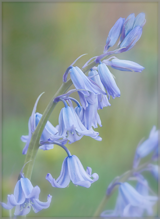
Beautiful, Ian. Artistic processing. I really like the soft colors.
Registered on November 14, 2003, 840 Posts, 12902 Comments
Comment posted by Philip Hodgkins on June 25, 2013 at 7:44 PM
A lovely wash of soft pastel colors. I don't know that the OOF flowers were necessary, but they don't detract. I like this a lot!
Registered on July 24, 2006, 2741 Posts, 12349 Comments
Comment posted by Albert Darmo on June 25, 2013 at 8:29 PM
Hi ian Beautifully composed, with sublime soft detail and color
Albert Darmo
Registered on November 25, 2008, 1386 Posts, 11978 Comments
Comment posted by Bob&Charly Nelson on June 25, 2013 at 9:42 PM
The light and the soft blues are wonderful Ian. Very well done in my opinion.
Bob
Registered on October 27, 2005, 289 Posts, 4202 Comments
Comment posted by Dennis Plank on June 25, 2013 at 10:20 PM
I love the separation and focus on this one, Ian. It has a very painterly quality. I'm glad you left in the oof blooms in the lower right corner. Extremely well done.
Registered on January 28, 2008, 1767 Posts, 23192 Comments
Comment posted by Morris McClung on June 26, 2013 at 1:12 PM
Pure art, pure art, pure art. And, a wow for good measure, Ian!
Registered on May 7, 2007, 670 Posts, 19650 Comments
Comment posted by Giuseppe Guadagno on June 27, 2013 at 3:44 PM
Ian, I love the delicate, soft feeling of this image, specially the beautiful low saturation of the colors. Excellent photo for me.
Take care.
Registered on February 3, 2007, 827 Posts, 5052 Comments
Comment posted by Yun Gao on June 27, 2013 at 8:43 PM
Gently soft and looks like a painting. A real joy to view, Ian.
Registered on September 11, 2012, 267 Posts, 1621 Comments
Comment posted by Gary Yeoh on June 28, 2013 at 7:00 AM
Ian:
I generally like the softness and the painterly mood of this image.
The blue bells looks a little wash-out on my uncalibrated screen and dialing back the highlight a little may help.
Registered on September 1, 2009, 588 Posts, 8184 Comments
Comment posted by Bill Fach on June 29, 2013 at 12:05 PM
Ian: Wonderful color palette and comp. I like this one a lot. >=))>
Registered on November 1, 2003, 1805 Posts, 26981 Comments
Comment posted by Larry Lynch on July 9, 2013 at 11:42 AM
This is just FINE!!! Love it.
Registered on September 16, 2006, 773 Posts, 9940 Comments

Comments
12 commentsJohn
Albert Darmo
Bob
Take care.
I generally like the softness and the painterly mood of this image.
The blue bells looks a little wash-out on my uncalibrated screen and dialing back the highlight a little may help.