Nature Photographers Network
This is the preserved archive of the original Nature Photographers Network. The community continues at naturephotographers.network.
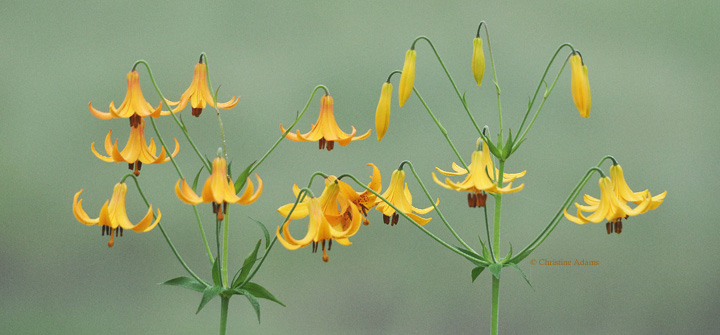
Canada Lilies, w/ repost
‹ PreviousFlora GalleryNext ›

Canada Lilies, w/ repost

by Christine Adams

Gallery: FloraPosted July 14, 2013149 views11 comments
With its simple background, I find this has a bit of Japanese art feel to it. But as I see it posted, it looks a bit dull? Even after the usual contrast and sharpening. Suggestions?

I took it with my Nikon D90 and 400mm with doubler.

Comments

11 comments
Comment posted by Ramamohan Pai on July 14, 2013 at 8:33 PM
Christine - Very pretty and deserves a large version !!. I agree with you that this has a Japanese Art Feel to it. What was the background ? Just curious.

The frame is so so good, that I wish there was a little more separation between the over lapping blooms (between the two main stems that is). But I will take it any day as presented :toast:
Registered on November 1, 2003, 550 Posts, 9037 Comments
Comment posted by Dennis Plank on July 14, 2013 at 11:26 PM
I do like the composition, Christine. I don't know what the color was in nature, but a bit more saturation to the flowers might make them pop more.

:toast:
Registered on January 28, 2008, 1767 Posts, 23192 Comments
Comment posted by Morris McClung on July 15, 2013 at 11:41 AM
Love the comp and color. Maybe try a mid-tones curve adjustment.
Registered on May 7, 2007, 670 Posts, 19650 Comments
Comment posted by Nathan Buck on July 15, 2013 at 6:08 PM
Way, way cool Christine. So well seen and executed. I agree about how it feels like Japanese art. Wonderful! I don't know how to add more punch to it (curves, contrast, etc) but I think it could use a little bit of extra contrast. (I also would not know why it looks dull unless there is something in your workflow that is taking the punch out of it.)

Nathan
Registered on November 1, 2003, 1101 Posts, 13589 Comments
Comment posted by Thomas Haney on July 15, 2013 at 6:15 PM
I really like this, but I know what you mean about it looking flat. Sometimes you just wish a photo was shot on Velvia slide film! Personally I would try converting this to B&W and playing around with it. The lines are what is special about this image, so that's what I'd try.
Registered on April 7, 2013, 138 Posts, 537 Comments
Comment posted by Philip Hodgkins on July 15, 2013 at 8:25 PM
The lines make this image, but it does feel a little flat. Upping the clarity and vibrance would work wonders.
Registered on July 24, 2006, 2741 Posts, 12349 Comments
Comment posted by Christine Adams on July 15, 2013 at 9:16 PM
Well, I played with this pic a bit more and here's my finished product.

@ Ram, the BG is a wet area with greenery. I, too, wish the two plants weren't quite so close together!
Registered on January 24, 2006, 119 Posts, 1871 Comments
Comment posted by scott lanz on July 15, 2013 at 9:32 PM
I like both versions, Chris. The second is more saturated, but I like the airiness of the first which goes with the subject. I'll take it a step further than Ram. What about an image of just a single stem, cropped appx square?

Edit: I, of course, did not mean cropping this one, but taking a new image, if possible.
Registered on November 14, 2003, 840 Posts, 12902 Comments
Comment posted by Mark Seaver on July 16, 2013 at 6:12 AM
The flowers are lovely and the background nicely complementary. The extra darkness and pop in the repost seems both good and bad to me. The pop works well, but the overall image is noticeably darker and I prefer the light airy feel in the original. I think some of the dullness is likely to be compression, where a larger version would let the details show through better. A single stem of these would be a nice image, but I don't see a crop from this one that would work because of the overlapping blooms in the middle. My other thought is that a mid-tone (or maybe greens only) contrast enhancement might let the flowers pop without the overall darkening.
Registered on January 23, 2011, 1103 Posts, 17270 Comments
Comment posted by Albert Darmo on July 17, 2013 at 10:53 AM
Hi Chris :wavey: Denis echoed my thoughts perfectly :toast:
Albert Darmo
Registered on November 25, 2008, 1386 Posts, 11978 Comments
Comment posted by Eirini Pajak on July 28, 2013 at 8:09 AM
I don't think it looks dull at all! I love the whimsical personality of the flowers that you captured here! I prefer your first post.
Registered on December 13, 2011, 216 Posts, 1671 Comments