Nature Photographers Network
This is the preserved archive of the original Nature Photographers Network. The community continues at naturephotographers.network.
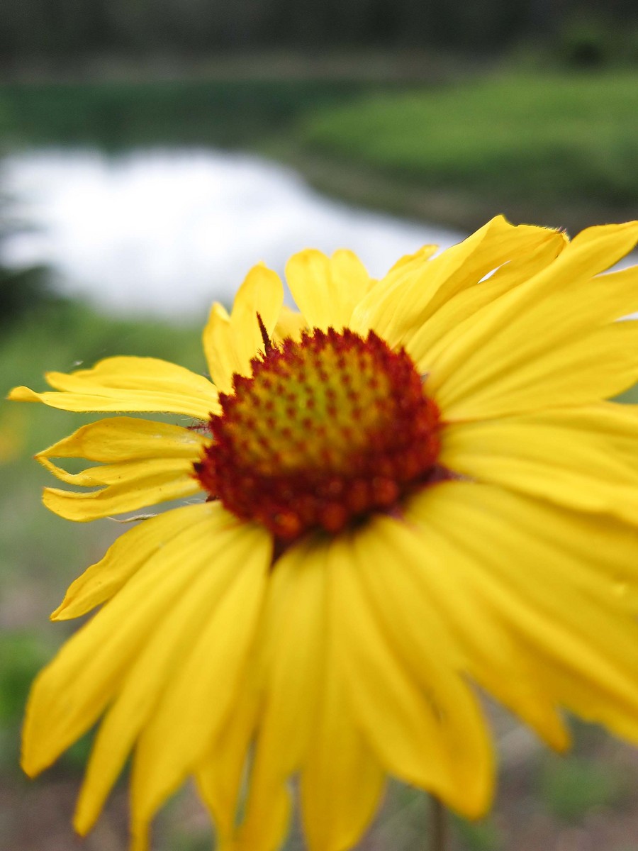
Glacier Sunflower
‹ PreviousFlora GalleryNext ›

Glacier Sunflower

by Diana Clinch

Gallery: FloraPosted July 21, 201350 views8 comments
ISO80 f2.0 1/500 Canon S95

As I start the process of getting real equipment and retiring my little trusted handheld digital, I'm learning about resolution and pixels and imaging, etc. So while I know the limitations of those features with this camera, composition can be found with any camera. So, that is the feedback I'm looking for overall.

I simply love this photo but my husband does not. Now that I'm posting, I'll let the community weigh in.

Photo taken in Glacier National Park.

Comments

8 comments
Comment posted by Ramamohan Pai on July 21, 2013 at 7:16 PM
Diana - Its always nice to experiment and I can see the merits behind the composition you were going for. I like being able to see the background/environment for this flower too.

On the flipside, I am struggling with the focus aspect here. The focus is beyond the center of the flower leaving a large out of focus area in the front of the frame. It usually does not work that well except in certain cases.

My approach here would have been to back off a bit, compose the whole flower in the frame and try to get frontal areas of the bloom also into good focus. That is not a critique on the photo per se, but just my preference.
Registered on November 1, 2003, 550 Posts, 9037 Comments
Comment posted by Philip Hodgkins on July 21, 2013 at 8:14 PM
I will echo Ram's observations. The idea of where to place the focus is paramount to the success (interest) of the photo. The question is, do you want the back petals to be where the viewer needs to put his/her attention? Because where the focus is, the eyes go.

To me, the lake in the background is superfluous. The subject of the photo should be the strongest part of the image and the BG just present, but with only subliminal interest. The background should support and direct the eye to the subject; it shouldn't be a distraction. If there were no other choice for the background, then fine. Truthfully, others may not have a problem with what you have for background. But the principal is sure—pay almost as much attention to your background as you do your subject, for different reasons. The subject sells, but the background can be a deal breaker. :smile:
Registered on July 24, 2006, 2741 Posts, 12349 Comments
Comment posted by Michael Cothran on July 21, 2013 at 8:44 PM
I agree with your husband. It does not appeal to me at all - the execution even less so than the concept. It's just too blurry, period. And it's not an attractive blur. As for the concept, I have seen more successful images with just a touch of something in-focus, but it's just not working here on any level for me. Sorry.
Keep shooting.
Registered on December 5, 2012, 31 Posts, 730 Comments
Comment posted by scott lanz on July 21, 2013 at 8:49 PM
I like the comp, Diana, specifically your choice to make the flower large but still include background. I personally have no problem with the flower being clipped because I tend to think it is good to get close to your subject, even if the edges get clipped. (Just be sure it that looks like it was intentional rather than by accident; this generally means don't clip just a tiny bit). I agree with Ram, however, about the point of focus ("POF" around here). I would personally put it at the front center, or at least center of the flower center, rather than at the rear (back petals) of the flower. As for the background ("BG"), I like the idea, and, as noted above, I like the comp. My problem is with the large, bright reflection of the sky in the water. In general, whether in floral or landscape images, you want to avoid large bright areas, like empty sky, which distract the eye from the subject(s) of the photo. A polarizing filter may have helped tone down the reflection, but it probably would not have eliminated it. :wavey:
Registered on November 14, 2003, 840 Posts, 12902 Comments
Comment posted by Diana Clinch on July 21, 2013 at 11:30 PM
I've pinned this to my office wall. Dead panned by the critics... good feedback as to why... but I still really like it. Onward.
Registered on July 17, 2013, 8 Posts, 35 Comments
Comment posted by scott lanz on July 22, 2013 at 1:01 PM
Don't take it hard, Diana. Everyone has posted images that they liked or were personal favorites which were then not as well received here (and vice versa, too). This happened to me a little while ago in the Landscape gallery. You asked for feedback and are open to suggestions, which is good. :smile:
Registered on November 14, 2003, 840 Posts, 12902 Comments
Comment posted by Morris McClung on July 22, 2013 at 2:42 PM
Not to pour salt on any wounds here, but I think the comments are dead on for this one. And, yes, we've all had images we were in love with that showed sometimes love is blind. :biggrin: I'm sure we'll see many more and better from you.
Registered on May 7, 2007, 670 Posts, 19650 Comments
Comment posted by Bob&Charly Nelson on July 23, 2013 at 1:29 AM
I think I might have reversed the plane of sharpness Diana, trying to keep the sharp in front. I also feel the BG competes with the subject.
Bob :wavey:
Registered on October 27, 2005, 289 Posts, 4202 Comments