Nature Photographers Network
This is the preserved archive of the original Nature Photographers Network. The community continues at naturephotographers.network.
Red Hibiscus
‹ PreviousFlora GalleryNext ›

Red Hibiscus

by scott lanz

Gallery: FloraPosted August 4, 2013200 views15 comments
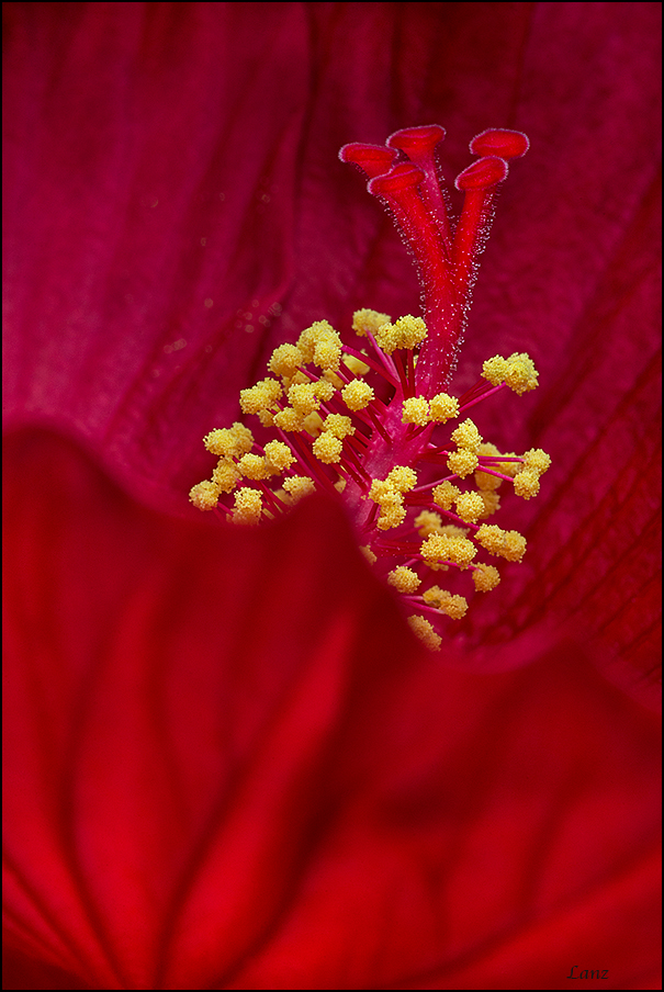
When I posted "Hibiscus" a few days ago, Ram commented that it was remarkable seeing how many different comps were possible with that flower. So, I thought I'd follow up with a completely different comp, this time using a red hibiscus. Let me know if this one works. Red Hibiscus, taken 7/21/13 at Fellows Riverside Gardens, Youngstown, with D600 and 150 macro at f32, 1/6 sec, iso 500. Comments, questions, and suggestions welcome. :wavey:

Comments

15 comments
Comment posted by scott lanz on August 4, 2013 at 12:01 PM
And here's a slight variation on the theme. This one shows a little less front petal, and a little more center. Preference?
Registered on November 14, 2003, 840 Posts, 12902 Comments
Comment posted by Morris McClung on August 4, 2013 at 4:55 PM
Fairly brilliant, Scott! :toast:
Registered on May 7, 2007, 670 Posts, 19650 Comments
Comment posted by Bill Fach on August 4, 2013 at 8:02 PM
Scott: Love the peeking over the fence POV and the color. Superb DOF control. I do prefer the second version. 2 thumbs up! >=))>
Registered on November 1, 2003, 1805 Posts, 26981 Comments
Comment posted by Richard Teller on August 4, 2013 at 10:03 PM
I like the second image best. Fine detail and dof.
Registered on August 23, 2010, 1162 Posts, 6692 Comments
Comment posted by Ken Smith on August 5, 2013 at 1:31 AM
2nd version for me too. Gives emphasis to the 'in focus' portion which seems to be the star of the show. Love the deep reds...
Registered on September 5, 2008, 449 Posts, 2444 Comments
Comment posted by Catherine Reilly on August 5, 2013 at 2:56 AM
Very cool to cram the flower onto itself, Scott! The softness of the front petal is not bothersome at all this way. Love how the center stands out from fg and bg. Unique look and very creative. Prefer the 1st version.
Registered on August 16, 2006, 603 Posts, 9192 Comments
Comment posted by Barb Pflaum on August 5, 2013 at 12:40 PM
Both versions are beautiful, but I prefer the first version. It gives more of a sense of the center peeking out from behind the petal, shows greater detail, has a very creative POV, and excellent DOF.
Registered on January 14, 2009, 316 Posts, 2724 Comments
Comment posted by Nathan Buck on August 5, 2013 at 1:46 PM
The original post here feels more mysterious to me, Scott. Both are excellent - and I envy you having this shot in your files. Wonderful!

Nathan
Registered on November 1, 2003, 1101 Posts, 13589 Comments
Comment posted by Roger Leekam on August 5, 2013 at 4:54 PM
I prefer the second crop, Scott. I find the first image somewhat overwhelmed by the large OOF area at the bottom. Lovely color.
Registered on May 28, 2009, 83 Posts, 646 Comments
Comment posted by Albert Darmo on August 5, 2013 at 10:41 PM
Hi scott :wavey: Each version has it's attributes. stunning and vivid color and detail. i prefer the first version :toast:
Albert Darmo
Registered on November 25, 2008, 1386 Posts, 11978 Comments
Comment posted by Yun Gao on August 6, 2013 at 8:10 AM
They all look nice, Scott. Gorgeous red. I like the second version. Roger expressed my thoughts perfectly. :toast:
Registered on September 11, 2012, 267 Posts, 1621 Comments
Comment posted by S Govindarajan on August 8, 2013 at 8:49 PM
Very captivating color scheme, Scott. I really like the details on the stamen. I prefer the second composition.
Registered on April 19, 2008, 115 Posts, 1921 Comments
Comment posted by scott lanz on August 8, 2013 at 10:28 PM
Final talley: original - 4 votes; repost - 6 votes. Thanks for voting/commenting. I only intended to save one, and it will be :confused:
Registered on November 14, 2003, 840 Posts, 12902 Comments
Comment posted by Bob Miller on September 29, 2013 at 10:26 PM
Wow. Love it! :toast: Like V1 better.
Registered on January 24, 2005, 152 Posts, 405 Comments
Comment posted by Howard Cheek on December 7, 2013 at 8:52 AM
Wow..The red/yellow combination is always a winner Scott!
Excellent in all respects, I prefer the second with less front petal :toast:
Registered on July 24, 2008, 1201 Posts, 10758 Comments