Gallery: Macro & Close-upPosted August 15, 2013109 views9 comments
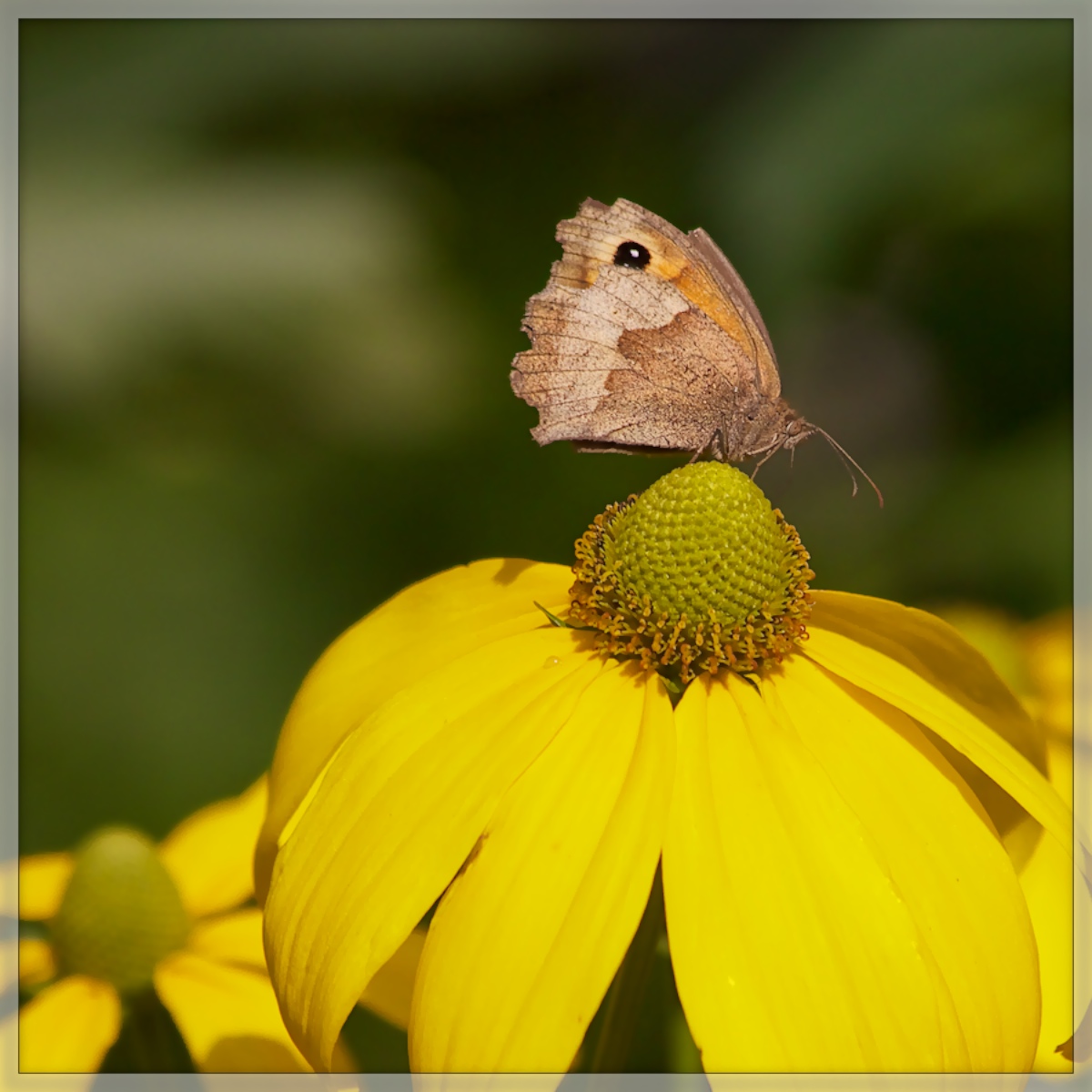
The cones of the rudbeckia flowers provide a substantial feeding ground for a range of insects - this is a Meadow Brown b/f.
Canon 7D, Tamron 55-200mm lens @ 200mm, 1/2500 sec @ f 7.1, - 1ev, ISO 500,hh.
Comments
9 comments
Comment posted by Roger Leekam on August 15, 2013 at 7:54 AM
Ian, I think that these insects must be difficult to get right because of their color & you have done it very well here. My taste would be to crop some off the bottom (maybe 1/4) as the expanse of the bright flower draws attention away from the insect which should be the focus. great BG.
Registered on May 28, 2009, 83 Posts, 646 Comments
Comment posted by Steve Zimic on August 15, 2013 at 8:31 AM
Ian,
Nice capture of this little guy and good choice with the -1ev as those yellow petals often get blown out without it. I agree with Roger to crop some of the flower perhaps from the left and bottom which would also remove that little brown petal in the LR corner.
Registered on November 23, 2003, 176 Posts, 727 Comments
Comment posted by scott lanz on August 15, 2013 at 9:00 AM
Nice capture, Ian. I like the brown/yellow combination with the nice muted bg. I'll disagree with the previous suggestions about cropping from the bottom. I like the inclusion of the oof twin flower in the llc. It gives the image balance, and I wouldn't want to crop the flower, so it's all or none. In fact, it looks like this was composed like a floral guy would compose the image with the emphasis on the flowers. The downside to the comp is that you now have the bf looking out of the frame, but cropping from the bottom would not help that. You could crop the left side and make this a vertical with the bf centered as an alternate image.
Registered on November 14, 2003, 840 Posts, 12902 Comments
Comment posted by Barb Pflaum on August 15, 2013 at 1:54 PM
Nice look at this bf with excellent detail and beautiful color! I like Scott's idea of a vertical comp, but I also like the image as is.
Registered on January 14, 2009, 316 Posts, 2724 Comments
Comment posted by Ian Wolfenden on August 15, 2013 at 3:56 PM
Picking up on Scott's suggestion I'm adding this vertical crop version to see what people think. I always hate losing flower petals but I guess sometimes you may have to ( smile !!! )
Registered on May 18, 2007, 1108 Posts, 7647 Comments
Comment posted by Philip Hodgkins on August 15, 2013 at 4:20 PM
Ian, I am going to be contrarian. I like the first image best (except maybe not the brown leaf in the LRC). Butterflies and flowers go together like peas and carrots. In my mind, given the subject line, the world and what's on top of it is the subject.
Registered on July 24, 2006, 2741 Posts, 12349 Comments
Comment posted by Ramamohan Pai on August 15, 2013 at 10:12 PM
Ian - The main subject here for me is the butterfly so I am perfectly OK with clipping the flower thereby aiding the composition. I really like the repost.
The original composition looks sub-optimal to me with more space behind instead of in the front but the repost balances it well by a stronger vertical crop.
Good work
Registered on November 1, 2003, 550 Posts, 9037 Comments
Comment posted by scott lanz on August 16, 2013 at 12:35 AM
Ian, I suggested the crop/vertical crop as an alternate image, not necessarily a better one, as I liked your original just fine. Seeing them both, however, I do prefer the second version. In addition to the comp which I prefer, it overall looks just a bit darker, which I like, and reduces the large light area in the ULC. Nice job on the rework.
Registered on November 14, 2003, 840 Posts, 12902 Comments
Comment posted by Albert Darmo on August 18, 2013 at 10:46 PM
Hi Ian Very good colors and detail. the vertical crop makes it even better
Albert Darmo
Registered on November 25, 2008, 1386 Posts, 11978 Comments

Comments
9 commentsNice capture of this little guy and good choice with the -1ev as those yellow petals often get blown out without it. I agree with Roger to crop some of the flower perhaps from the left and bottom which would also remove that little brown petal in the LR corner.
The original composition looks sub-optimal to me with more space behind instead of in the front but the repost balances it well by a stronger vertical crop.
Good work
Albert Darmo