Gallery: LandscapePosted September 1, 2013688 views11 comments
Ocean Point, Boothbay, Maine
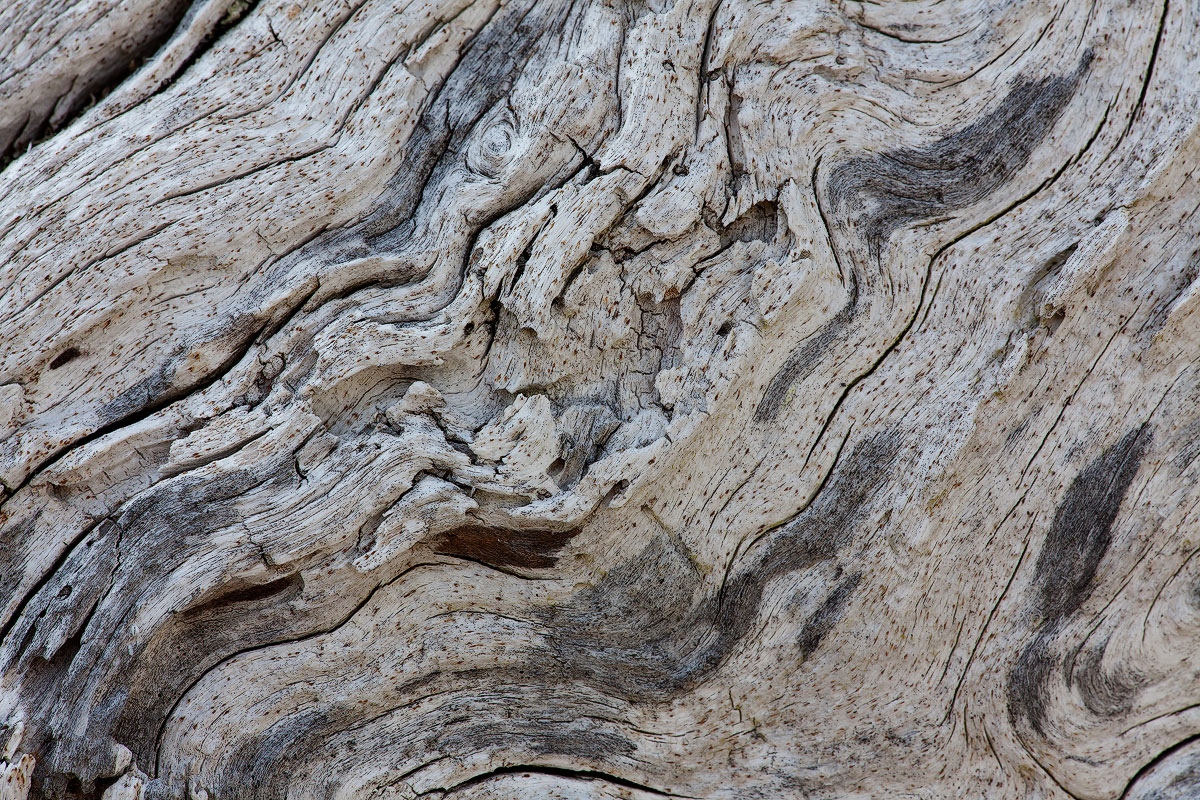
Weather worn wood in the rocks at Ocean Point.
Canon 5DM2
Canon 180mm f/3.5L
ISO100 1/50sec f/16
Comments
11 comments
Comment posted by Preston Birdwell on September 1, 2013 at 11:15 PM
I like this, Eva. Lots of nice curves and texture. If you have Tony Kuyper's actions, you might try the TK-Narrow Midtones action on a curves layer to boost the contrast just a bit. There's a lot of nice detail here that really comes out in the large version.
I really love old, weathered wood--it has such great character.
--P
Registered on November 1, 2003, 471 Posts, 5188 Comments
Comment posted by Eva McDermott on September 2, 2013 at 1:21 AM
Thanks Preston. Here is a version where I used TK's expanded midtones action.
Registered on January 4, 2009, 1015 Posts, 13229 Comments
Comment posted by Stuart Williams on September 2, 2013 at 2:37 AM
eva, the re-post is meatier, so much so it is almost edible. nonetheless, it seems strangely flat for something with so much texture ...? not sure what to do about it??
Registered on December 7, 2007, 247 Posts, 4792 Comments
Comment posted by John&Patty Benway on September 2, 2013 at 3:33 AM
Eva, the re post definitely made a big difference, I like this very much, I think I'm going to look into Tony Kuyper's actions. Fine work.
John
Registered on May 12, 2006, 626 Posts, 8700 Comments
Comment posted by Nick Bristol on September 2, 2013 at 9:46 AM
Hi Eva, The repost really made a difference for me. Wonderful lines and textures in this old weathered wood with lots of great character as Preston mentioned. Very nice!
Nick Bristol
Lone Rock, WI
Registered on February 1, 2004, 752 Posts, 14140 Comments
Comment posted by Preston Birdwell on September 2, 2013 at 10:48 AM
Eva, the repost looks much, much better.
Just another thought...Do you have TK's Saturation and Vibrance Masks actions? If so, you could use them to bring up the reds just a bit to give them more pop. You wouldn't want to push them too far, though.
I really like this image!
--P
Registered on November 1, 2003, 471 Posts, 5188 Comments
Comment posted by Roel Wijtmans on September 2, 2013 at 10:52 AM
Nice abstract, especially the repost!
Registered on September 30, 2012, 116 Posts, 2257 Comments
Comment posted by Richard Teller on September 2, 2013 at 1:20 PM
I like the second post better. The first one seems a little flat compared to the second. Great textures and designs and nice color in the second one.
Registered on August 23, 2010, 1162 Posts, 6692 Comments
Comment posted by Morris McClung on September 2, 2013 at 3:35 PM
The repost does work better. A nice study in texture and line.
Registered on May 7, 2007, 670 Posts, 19650 Comments
Comment posted by Daniel & Loana on September 2, 2013 at 4:18 PM
Very nice lines and texture, Eva. The repost works much better.
D&L
Registered on October 7, 2008, 166 Posts, 3044 Comments
Comment posted by Bill Chambers on September 3, 2013 at 9:19 AM
The repost is so much better. Hard to go wrong with weathered wood, and this one is a definite winner. Lots to look at here and to enjoy.
Registered on April 10, 2005, 753 Posts, 21216 Comments

Comments
11 commentsI really love old, weathered wood--it has such great character.
--P
John
Nick Bristol
Lone Rock, WI
Just another thought...Do you have TK's Saturation and Vibrance Masks actions? If so, you could use them to bring up the reds just a bit to give them more pop. You wouldn't want to push them too far, though.
I really like this image!
--P
D&L