Nature Photographers Network
This is the preserved archive of the original Nature Photographers Network. The community continues at naturephotographers.network.
Crimson Morning w/Repost
‹ PreviousLandscape GalleryNext ›

Crimson Morning w/Repost

by Zack Clothier

Gallery: LandscapePosted September 4, 2013816 views17 comments
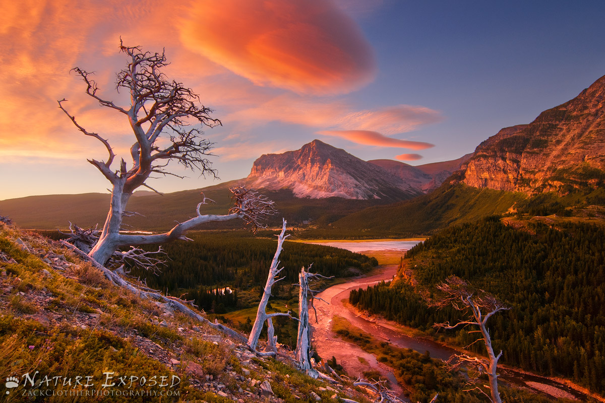
The weather called for clear skies but when I awoke that morning in Many Glacier I could see some interesting clouds moving in from the northeast. I headed up the hill in the dark, the winds were gusting to at least 50mph, almost knocking me over a couple of times. When I reached this spot I hunkered down, trying to stay out of the wind.

When the light finally came most of the best looking lenticular clouds were behind me, glowing very intensely. Not having a composition in that direction I decided to stick with my original plan. I wish the clouds would have moved to the right some more, I am not sure about the empty space there, but hopefully there is enough going on elsewhere in the frame that this isn't a big deal.

I removed a lot of the red cast in post, still feels a bit to red, wanted to get your opinions first though.

Larger version included.

Tech Stuff:
4 images were used to create the final image, and some of these were double processed before blending. An exposure taken at ISO 800 was used to blend in the landscape, the wind was blowing so hard that I was unable to get a sharp image at 1/3 Sec @ ISO 200.

Comments

17 comments
Comment posted by Shane McDermott on September 4, 2013 at 12:28 PM
This is a very appealing scene and composition with many differently elements coming together dramatically! Well executed.

Shane :toast:
Registered on November 12, 2007, 49 Posts, 1074 Comments
Comment posted by Navin Sarma on September 4, 2013 at 1:02 PM
Hey Zack... sorry there aren't more comments here to help guide you. The light on the mountains and the left tree are fantastic. I think you could always wish for something more, like the clouds to the to the right, but on the other hand the deep blue sky is a nice contrast with the otherwise red color. Your processing looks spot on to me, I don't think it's too red. I might have wished for it without that tree in the bottom right side, but seems like too much of a job to really worry about
Registered on July 17, 2011, 233 Posts, 1373 Comments
Comment posted by Phil Pogledich on September 4, 2013 at 4:34 PM
This is excellent. The red of the gravel riverbank seems a little strong to me, but otherwise the color and luminosity appear just fine. Fantastic scene.
Registered on August 24, 2009, 123 Posts, 3099 Comments
Comment posted by Jeffrey Sipress on September 4, 2013 at 4:43 PM
Good work, good morning hike, good photo. That's what it takes sometimes. Nothing to complain about here.
Registered on February 17, 2004, 236 Posts, 1197 Comments
Comment posted by Peter Coskun on September 4, 2013 at 4:52 PM
I shot my favorite image from my trip just below those trees. This is one of the best spots in my opinion for sunrise. You were gifted with INCREDIBLE light and of course this classic comp. The bottom right tree is a bit distracting since it is cut off, but not a deal breaker by any means. I'm not sure if you have a shot taken a few steps back and a little lower to get the tree completely in the frame and not have the mountain centered? If so, I think it would flow a little better and give better balance to the scene. Just my 2 cents. This is a great image regardless!
Registered on October 31, 2011, 170 Posts, 1240 Comments
Comment posted by Floris van Breugel on September 4, 2013 at 5:45 PM
Really incredible light, Zack! I like most of the components of the composition, except the three smaller trees. They grab a lot of attention with their bright white/blue trunks, and kind of block the view of the river/mountain. I think Marc Adamus got away with this same composition because those trees don't stand out so much when backlit with sunset.. not sure if there's anything you could really do about it, though.
Registered on December 19, 2008, 306 Posts, 4840 Comments
Comment posted by Nick Bristol on September 4, 2013 at 6:38 PM
Zack, This is very nice and I really enjoy the view. I think the colors look great and love those clouds. I might wish the lower tree wasn't there as Navin mentioned but I'm fine with it as is too. Very nice work on this! :smile:

Nick Bristol
Lone Rock, WI
Registered on February 1, 2004, 752 Posts, 14140 Comments
Comment posted by Jeremy Kessler on September 4, 2013 at 8:38 PM
Beautiful Image Zach. This comp has become so common that it looses a little appeal for me, but we've all got those images :wink: Get a chance to shoot any other comps?

Red looks fine to me.

How's the smoke situation in Cooke?
Registered on September 13, 2007, 36 Posts, 1283 Comments
Comment posted by Eva McDermott on September 4, 2013 at 8:39 PM
Gorgeous color and light Zack. The S curve works well as a lead in. Astounding color and light. The tree on the lower right is a slight distraction but I wound not remove it.
Registered on January 4, 2009, 1015 Posts, 13229 Comments
Comment posted by Kane Engelbert on September 4, 2013 at 11:16 PM
That's a serious red glow to deal with in post processing. It's one of those scenes you jump up and down for while shooting, but in the end you end up blending so many images to control the reds...it turns into a nightmare blend. That's ok, that's what we do.. we blend right? Blend until we get it right. And I think you have done a darn good job of handling the reds in this one. If it were me, I would keep reprocessing this one until it's just right. Maybe this is one you go back to in winter when things slow down.
Registered on June 14, 2009, 63 Posts, 291 Comments
Comment posted by Zack Clothier on September 5, 2013 at 12:07 AM
Thanks for the comments thus far everyone.

Here's a repost with less red in the riverbank (thanks for the suggestion Phil), and the trees have been slightly toned down so as to not draw as much attention, thanks Floris.

Jeremey, unfortunately the best light didn't last to long and I did not shoot any other comps that morning. I scoured the area the day before looking for something different but in the end chose this classic comp. As far as the smoke goes it hasn't been to bad up here actually, considering the amount of fires burning in the area. We've had some good rains and cooler temps the last couple of days which has helped keep the smoke down in the park also.

Peter: I did shoot some other comps that include that tree in the lower right but felt that the wider angle didn't work as well as a whole. In the end I chose the more intimate crop because I thought there was to much empty space on either side of the trees with the wider composition.

Registered on January 28, 2010, 343 Posts, 2257 Comments
Comment posted by Marylynne Diggs on September 5, 2013 at 12:55 AM
I agree that the blue "empty space" provides a nice color balance. That said, if you want to reduce the amount of empt sky, a slight crop to just above/right of the small notch on the ridge (a sliver, really) might be more satisfying for you.
Registered on December 14, 2010, 122 Posts, 1034 Comments
Comment posted by Kah Kit Yoong on September 6, 2013 at 10:27 AM
A spectacular image. The tree in the bottom right doesn't bother me at all and the repost has a slightly more natural feel.
Registered on September 27, 2006, 636 Posts, 10682 Comments
Comment posted by Bill Chambers on September 6, 2013 at 11:01 AM
Great shot. On my uncalibrated work monitor the original looks great. I'll compare the two on my "real" monitor tonight. I love the composition, even with the extra small trees; after all, that's nature. Excellent capture.
Registered on April 10, 2005, 753 Posts, 21216 Comments
Comment posted by James Fougère on September 6, 2013 at 2:15 PM
I agree that your corrections do look more natural. As for the smaller dead trees in the middle of the image, they are a distraction, but what can you do... The giant centre cloud is dominating and unique...

Nice Sunrise :biggrin:
Registered on October 25, 2010, 41 Posts, 831 Comments
Comment posted by Hamed Musharbak on September 8, 2013 at 2:59 AM
awesome :toast: :toast: :toast:
Registered on June 1, 2009, 372 Posts, 2282 Comments
Comment posted by Brad Clinch on September 8, 2013 at 11:52 AM
I agree that the repost is an improvement on an already excellent image. The red river bank in the original didn't bother me, but I can see how it looks even better in the repost. The toning down of the lower right trees was very effective, making them no longer a significant distraction. Excellent work.
Registered on January 5, 2013, 37 Posts, 261 Comments