Nature Photographers Network
This is the preserved archive of the original Nature Photographers Network. The community continues at naturephotographers.network.
B&W Buckscape (repost)
‹ PreviousWildlife GalleryNext ›

B&W Buckscape (repost)

by Jenaya Launstein

Gallery: WildlifePosted September 4, 2013181 views7 comments
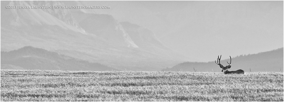
Ok, I took into consideration some your comments on this image. We cropped out the sky and some mountain, and converted it to black and white. I gotta say, those were some great suggestions because I love the resulting image! Thanks for your input everyone!

Thanks for lookin'! :wavey:

Nikon D7100
Nikkor AF-S 300mm f/4 IF-ED lens
ISO 400
1/1250sec @ f/6.3
Converted from RAW using Phase One Capture One Pro 7
Nik Viveza in PS5
Silver Efex pro

Comments

7 comments
Comment posted by Thomas Haney on September 4, 2013 at 7:59 PM
Beautiful shot Jenaya, I didn't see the original but I love the look and feel of this one.
Registered on April 7, 2013, 138 Posts, 537 Comments
Comment posted by Peter Cross on September 4, 2013 at 10:24 PM
Standout image, Jenaya. Amazing how many different comps you can get from one image. I really like how you've cropped this. Much more powerful. But I think I prefer the color over the B&W. Regardless, both are well done. Now as to this buck--he must have access to a really great food source as when I first looked at the original, I thought it was an elk. Impressive.
Registered on April 3, 2010, 271 Posts, 1342 Comments
Comment posted by Martin Dunn on September 5, 2013 at 3:11 AM
Good job with the re-working of your shot Jenaya.
I much prefer the new crop although I would like to see it in colour rather than B+W. :toast:
Registered on February 20, 2013, 198 Posts, 1011 Comments
Comment posted by Brad Hill on September 5, 2013 at 4:34 PM
Hi Jenaya,

Interesting approach to "solving" the issues mentioned on the previous version. I think now I'm feeling less bothered by the weakness of the background. But...now that the colour difference is gone between foreground and background (and you don't have the strong band of colour along the bottom), I'm wondering if the fairly extreme pano crop is really needed or beneficial (I'm trying to look at this image on it's own - not simply how it compares to the previous iteration)? I'm thinking a crop at the "t" in launsteinimagery.com (removing about a third of left side of the image) might make a stronger image? I realize that this might represent a pretty major crop from the original...

Hope this makes some sense to you...cheers...

Brad
Registered on May 29, 2007, 431 Posts, 6061 Comments
Comment posted by Vincent Grafhorst on September 6, 2013 at 1:07 AM
Way to go; I definitely prefer this over the original. :toast:
Registered on February 24, 2006, 504 Posts, 7203 Comments
Comment posted by Richard Teller on September 6, 2013 at 4:58 PM
I like you approach, but I think I agree with Brads comments. It sounds like you all had a great trip.
Registered on August 23, 2010, 1162 Posts, 6692 Comments
Comment posted by Gary Gulash on September 7, 2013 at 11:47 PM
Hi Jenaya. The form of the mountains in the background is a lot more aesthetic in my opinion in this photo. I agree with Brad that the extreme pano is probably overkill here though. Going black and white gives the impression that the foreground grass could be natural prairie, a good thing. :smile:
Registered on January 28, 2005, 879 Posts, 12098 Comments