Nature Photographers Network
This is the preserved archive of the original Nature Photographers Network. The community continues at naturephotographers.network.
Pacific Coast Dreams
‹ PreviousLandscape GalleryNext ›

Pacific Coast Dreams

by Todd Bloomquist

Gallery: LandscapePosted September 7, 2013160 views9 comments
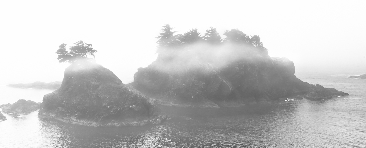
A recent trip to Brookings, OR, found us in the cool Pacific Coast mist. This photo was shot with a Canon 5D (mark I) and my trusty 24-105L lens. ISO 100, 35mm, f/11, 1/320 sec. Handheld.

I lightened the image a bit in Lightroom to accommodate the grayness of the mist and I liked the pano crop because of the island shape.

I like the way the mist rolls over the islands but I would appreciate any insights to improve it.

Thanks,

Todd

Comments

9 comments
Comment posted by Dan Kearl on September 7, 2013 at 8:48 PM
I would like to see a color version.
As is, a bit of contrast would add to the image I think.
Registered on September 2, 2013, 209 Posts, 1514 Comments
Comment posted by Patricia Brundage on September 7, 2013 at 9:13 PM
The subject is wonderful as well as the fog surrounding the islands. The conversion to black and white could stand a bit more contrast. It is almost one tone throughout, especially with the mist. Also, imho the large black frame is overpowering the image. I would also like to see the color version for comparison.
Registered on March 23, 2006, 1111 Posts, 6531 Comments
Comment posted by Brian Donovan on September 7, 2013 at 10:03 PM
I like the pano crop for this image...seems to work well with the shape of the islands. I agree with what's been said about more contrast, as there seems to be a fair amount of light and gray mid-tones.
Registered on August 29, 2013, 11 Posts, 40 Comments
Comment posted by David Chauvin on September 8, 2013 at 2:39 PM
A dreamy scene,,,,,,I would like to see a bit more room all around, but still very nice.
Registered on August 5, 2004, 1007 Posts, 5595 Comments
Comment posted by Preston Birdwell on September 8, 2013 at 7:24 PM
A bit more contrast would be nice. However, you don't want to lose the sense of light. The high key effect is good, and I like the concept. Just don't go too far.

--P
Registered on November 1, 2003, 471 Posts, 5188 Comments
Comment posted by Todd Bloomquist on September 14, 2013 at 3:56 PM
Thanks, everyone, for your very helpful comment. I played with the tone a bit and gave a little more space on the top and bottom of the crop to see what that would look like. I will add a color version of it as well. Todd
Registered on January 21, 2012, 10 Posts, 51 Comments
Comment posted by Todd Bloomquist on September 14, 2013 at 3:57 PM
Registered on January 21, 2012, 10 Posts, 51 Comments
Comment posted by Todd Bloomquist on September 14, 2013 at 4:01 PM
Registered on January 21, 2012, 10 Posts, 51 Comments
Comment posted by Todd Bloomquist on September 14, 2013 at 4:02 PM
Here is the color version. I didn't change anything to the color sliders in Lightroom, just the contract. Let me know what you all think. Todd.
Registered on January 21, 2012, 10 Posts, 51 Comments