Nature Photographers Network
This is the preserved archive of the original Nature Photographers Network. The community continues at naturephotographers.network.
Strata
‹ PreviousLandscape GalleryNext ›

Strata

by Vance Gese

Gallery: LandscapePosted September 23, 20131,672 views15 comments
Thanks much everyone for the comments on my first attempt at b/w. Really appreciate the feedback and all the great suggestions for processing b/w digitally.

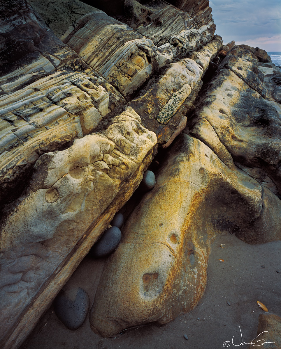
This is some interesting sandstone layers found along the Olympic Coast that I was able to photograph this past July. Tried to emphasize the neat angles of the rock layers and the stones caught between them, using a wide angle lens. Tilts and swings of the front standard were both used to get everything as much in focus as possible before stopping down. Would appreciate your thoughts and ideas on this image.
4x5, 75mm, no filters. Provia 100F, M1 scan.

Large image provided is much better.

Thanks.

Comments

15 comments
Comment posted by Mark Metternich on September 24, 2013 at 12:01 AM
The rocks in the cracks and the left to right eye flow make this work for me. Nice job. :toast:
Registered on June 19, 2009, 276 Posts, 6240 Comments
Comment posted by Nick Bristol on September 24, 2013 at 7:52 AM
Vance, This is really an interesting shot. Like Mark I like the flow and think the rocks in the cracks add a nice touch. When you look at the large version one can really appreciate the beautiful colors and layers in this sandstone, and the textures are fantastic! I like this! :smile:

Nick Bristol
Lone Rock, WI
Registered on February 1, 2004, 752 Posts, 14140 Comments
Comment posted by Chet Dowell on September 24, 2013 at 8:53 AM
very strong picture energized by the lines and textures. Love the blues and gold colors and the sea- shaped rocks nesting in the cracks. Well done!! :toast: Chet
Registered on December 3, 2012, 237 Posts, 1171 Comments
Comment posted by Bob Miller on September 24, 2013 at 12:17 PM
Nice colored layering and detail.
Registered on January 24, 2005, 152 Posts, 405 Comments
Comment posted by Preston Birdwell on September 24, 2013 at 12:18 PM
Vance,

The lines, as well as the color and contrast are really nice. I am having some trouble with the upper right corner--the line of the primary light colored fin leads my eye right to it, thus distracting me from the other parts of the scene. The light and textures are wonderful.

--P
Registered on November 1, 2003, 471 Posts, 5188 Comments
Comment posted by Jared Warren on September 24, 2013 at 2:07 PM
Lots to love about this one. I like the comp, lines, and color. Lots of interesting detail. Works really well for me. :toast:
Registered on May 11, 2012, 84 Posts, 931 Comments
Comment posted by Nathan Apodaca on September 24, 2013 at 2:25 PM
Veeery cool... :biggrin:
Registered on November 16, 2011, 67 Posts, 1127 Comments
Comment posted by Phil Pogledich on September 24, 2013 at 3:59 PM
This works very nicely. The sandstone layers are an interesting subject, as you note, with strong patterns and lots of great features like the embedded rocks. The upper RHC works for me but I think the shot would also be quite strong--and obviously more abstract--without it.
Registered on August 24, 2009, 123 Posts, 3099 Comments
Comment posted by Ian Cameron on September 24, 2013 at 7:18 PM
Nice rocks Vance and I like the way they loom towards me.
Registered on August 6, 2004, 1125 Posts, 3318 Comments
Comment posted by Vance Gese on September 24, 2013 at 10:34 PM
Thanks everyone for the comments. Went back and forth on that bit of sky and surf in the upper right. Tried to darken it somewhat in one edit but ended with halos along the edge of rock. Think I will try again though as I see how it does draw the eye too much.
Thanks again.
Registered on November 13, 2008, 298 Posts, 6629 Comments
Comment posted by Lon Overacker on September 25, 2013 at 4:55 PM
Gorgeous Vance! The colors are striking and the comp excellent with all the strong lines leading through the image. Toss in some trapped rounded stones and this is even better. I'm even liking the inclusion of the bg/sky which adds depth and context, sense of place. You've kept just enough of it to know it's intentional rather than a little corner that should be cropped out. Well done!

Lon
Registered on November 24, 2006, 521 Posts, 19147 Comments
Comment posted by Harley Goldman on September 25, 2013 at 6:13 PM
Beautiful colors, lines and detail. I go back and forth with the bit of sky, but it bothers me more in the small version than the large, so no real detraction. The image works real well for me.
Registered on November 19, 2003, 586 Posts, 11271 Comments
Comment posted by Eva McDermott on September 25, 2013 at 7:47 PM
Wonderful perspective Vance. Again I love the mix of gold and subtle blues. The rocks in the crack add a lot of interest.
Registered on January 4, 2009, 1015 Posts, 13229 Comments
Comment posted by Albert Darmo on September 26, 2013 at 10:05 AM
Hi Vance :wavey: I agree with Eve about the fine perspective here. i find the color and form of the sandstone layers fascinating :smile:
Albert Darmo
Registered on November 25, 2008, 1386 Posts, 11978 Comments
Comment posted by Bill Reid on September 27, 2013 at 7:00 PM
Wonderful tones, textures and colors in this Vance and just a great comp. The large view is wonderful. :toast:
Registered on January 27, 2013, 65 Posts, 2460 Comments