Nature Photographers Network
This is the preserved archive of the original Nature Photographers Network. The community continues at naturephotographers.network.
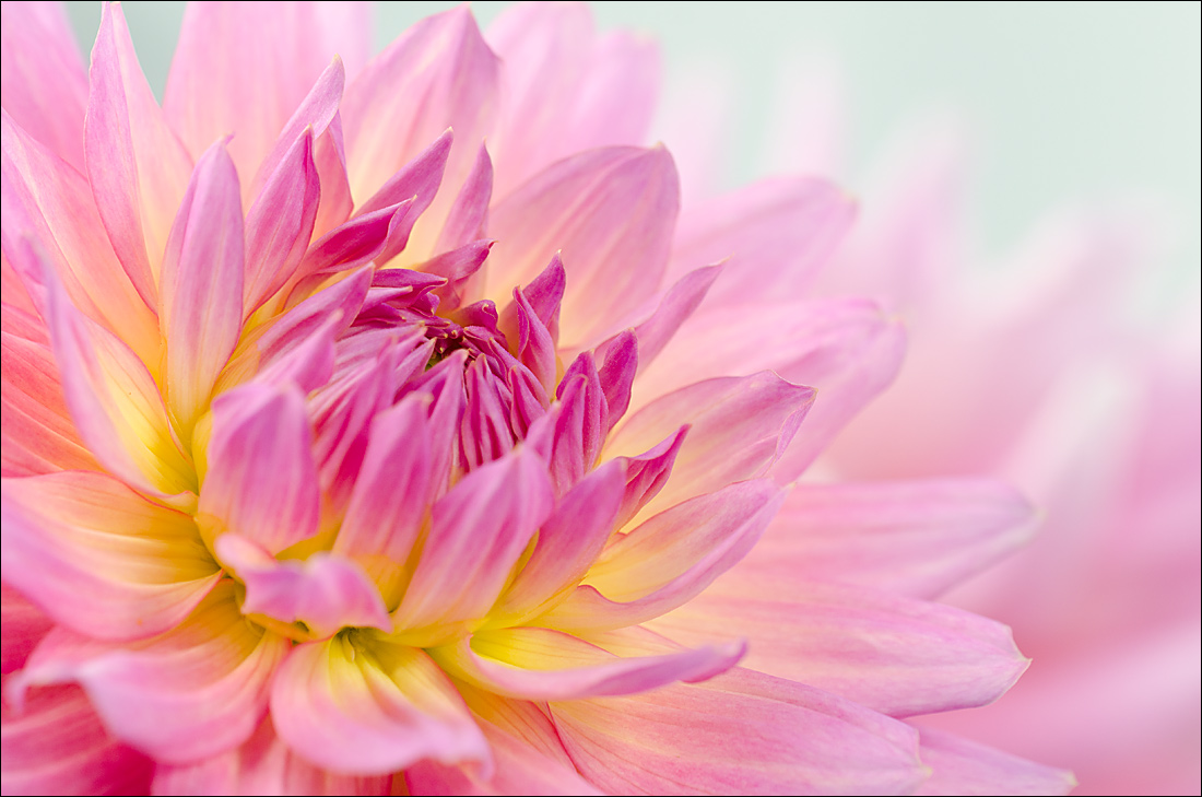
Dahlia - 3 versions
‹ PreviousFlora GalleryNext ›

Dahlia - 3 versions

by Nathan Buck

Gallery: FloraPosted October 6, 2013292 views15 comments
Hi all.

I am looking for honest opinions on this photo. I am printing some more greeting cards. I wonder...1) Do you like it at all? 2) Do you like one version better than another?

Earlier this year I sold about 90 greeting cards to my favorite florist for them to upsell arrangements with. They called me the other day, needing more...:smile: So I am trying to find some new images to use. I just happened to take this photo last week.

Any and all thoughts/suggestions appreciated. Thanks!

Nathan

Nikon D7000, Sigma 180 macro, tripod, ISO 400, f4

This one was fun. To get the light that I wanted, I set my shutter to be in self timer mode. I then would press the shutter button (sort of holding a reflector), hold up a diffuser with my left hand, and then position the reflector with my right hand. :smile:

Comments

15 comments
Comment posted by Nathan Buck on October 6, 2013 at 11:25 PM
Version 2.

Pretty similar specs. (#7289 for my records)

Nathan
Registered on November 1, 2003, 1101 Posts, 13589 Comments
Comment posted by Nathan Buck on October 6, 2013 at 11:26 PM
Annnnnd version 3.

Same specs. (#7283 for my records).

Nathan
Registered on November 1, 2003, 1101 Posts, 13589 Comments
Comment posted by Nancy Lea Sandy on October 7, 2013 at 9:43 AM
I like the first version for a greeting card, although they are all equally lovely. The fading color on the 1st seem better positioned to me. Dahlias are so beautiful close up and you've captured this one perfectly.
Registered on January 24, 2011, 576 Posts, 6942 Comments
Comment posted by Ken Smith on October 7, 2013 at 1:36 PM
Hi Nathan, I like the third best...then the second...then the first. The first has the cyan tint...esp noticable in the urc. The second is cleaned up....and the third best yet, ...but, I like the third which seem to have a bit better application of a shallow dof...that creates a smoother 'feel', in my opinion. Hey congrats...on the sale surge! One of these days I gotta try to market my stuff....
Registered on September 5, 2008, 449 Posts, 2444 Comments
Comment posted by Ian Wolfenden on October 7, 2013 at 2:32 PM
While all are indeed lovely, Nathan, I must vote firmly for the first. The higher contrast appeals to my eye - I just love the variations in depth, the fading into infinity from the beautifully sharp centre. That one for me is absolutely top notch !!!
Registered on May 18, 2007, 1108 Posts, 7647 Comments
Comment posted by Carol Nichols on October 7, 2013 at 5:07 PM
I firmly vote for the first image. I like the cyan tint in the URC. Just gorgeous! :toast:
Registered on November 7, 2007, 161 Posts, 1420 Comments
Comment posted by Sanjay Sundaram on October 7, 2013 at 5:29 PM
Nathan, My vote is for the third one. The lighter color is more airy and bright and the DoF seems to work better for me. Ideal, I think for a greeting card. Great work on the Dahlia. Lovely composition and color.

Sanjay
Registered on April 9, 2013, 107 Posts, 725 Comments
Comment posted by scott lanz on October 7, 2013 at 7:13 PM
Gorgeous work, Nathan. All three would do well for your purposes. My personal, subjective preference is #1, but only slightly over #3. I like the slightly tinted or darker bg in #1, but I also prefer the pof (more focus on the front petals) in #3 vs #1. Can't go wrong with either, however.
Registered on November 14, 2003, 840 Posts, 12902 Comments
Comment posted by Philip Hodgkins on October 7, 2013 at 8:00 PM
Nathan, I like #3 best, but all of them are good. And yes, I like them very much! I am wondering if a bit more High Key would work better for a greeting card? :toast:
Registered on July 24, 2006, 2741 Posts, 12349 Comments
Comment posted by Bill Fach on October 7, 2013 at 9:08 PM
Nathan: I'll take one of each :wink: I love this kind of working a subject. I like the bolder color in #1 and the lighter mood of #3. # 2 is a fine compromise. Really well conceived and superbly executed. 2+2+2 thumbs up! >=))>
Registered on November 1, 2003, 1805 Posts, 26981 Comments
Comment posted by Ramamohan Pai on October 7, 2013 at 9:27 PM
Nathan - I am willing to bet that the general audience (your Post Card buying people that is) would like the solid punchy colors in the first one. I personally like the more airy pastel shades in the 3rd one. 2nd one is a decent compromise. I also notice that in #3 the frontal petals are more in focus compared to the rest - not sure its meaningful but an observation nevertheless.

Good Luck selling those cards :cool:
Registered on November 1, 2003, 550 Posts, 9037 Comments
Comment posted by Giuseppe Guadagno on October 8, 2013 at 5:17 PM
Nathan, all splendid photos; my favorite is the first. Bravo.
Cheers.
Registered on February 3, 2007, 827 Posts, 5052 Comments
Comment posted by Scott Fricke on October 11, 2013 at 1:20 PM
First, I do like it a lot. And I would pick #3 for the greeting card. I like the softer color at the center of the flower and the brighter/whiter background in the URC.
Registered on January 19, 2007, 133 Posts, 1448 Comments
Comment posted by Morris McClung on October 12, 2013 at 3:12 PM
I'll just ditto Bill on this. Knock down gorgeous image. :toast:
Registered on May 7, 2007, 670 Posts, 19650 Comments
Comment posted by Pat Sampson on October 16, 2013 at 2:58 PM
Nathan,

I realize I'm late but I'm with Ian on this. The first is the strongest for me although all are gorgeous.

pat
Registered on May 19, 2007, 953 Posts, 15989 Comments