Nature Photographers Network
This is the preserved archive of the original Nature Photographers Network. The community continues at naturephotographers.network.
Seaside Colors & Re-post
‹ PreviousLandscape GalleryNext ›

Seaside Colors & Re-post

by Harry Lichtman

Gallery: LandscapePosted October 7, 2013181 views13 comments
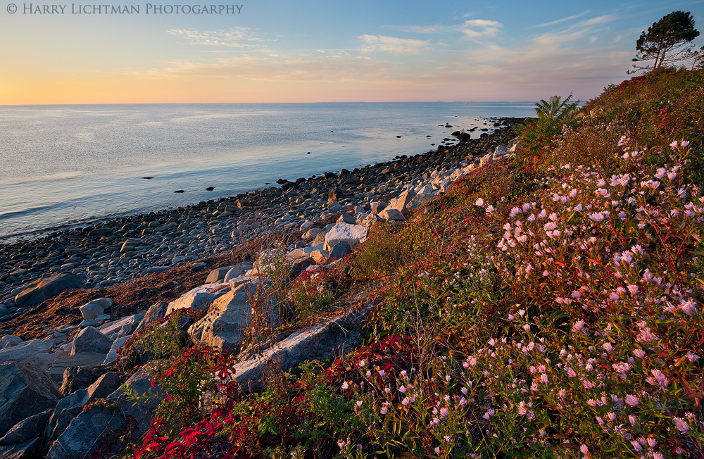
I've spent some time the last few days tracking down the autumn displays along the NH coast. The late blooms and autumn colors of poison ivy and some other ivies make it a great time of year. I tied to find some complimenting skies along the way. Breezy conditions and close focusing distance to the flowers required several images stacked @ f11 ISO 1250 using a 17-40 lens. Manual alignment and hand blending since swaying movement of the flowers was in the range of inches. I tried to approximate positioning when the slices were taken to make assembling the final image easier - but overall pretty time consuming. But with today's technology and software, at least the image is possible today under the conditions I was given.

Comments, impressions welcome.

Comments

13 comments
Comment posted by Philip Hodgkins on October 7, 2013 at 7:20 PM
Well balanced image with good detail (must have been a pain to blend!). Lovely evening light. A solid image.
Registered on July 24, 2006, 2741 Posts, 12349 Comments
Comment posted by Dan Kearl on October 7, 2013 at 7:33 PM
It is an attractive photo and scene and the sky is very nice.
I might correct the distortion of the tree in the right upper corner.
I think a bit of movement in the flowers would not have been bad...
Registered on September 2, 2013, 209 Posts, 1514 Comments
Comment posted by Eva McDermott on October 7, 2013 at 8:38 PM
Gorgeous color Harry. I still have not made a trip to the NH coast .... believe it or not. As Dan mentioned, The distortion is a little bit of an issue with the tree in the upper right but not a deal breaker. I think your blend is spot on.
Registered on January 4, 2009, 1015 Posts, 13229 Comments
Comment posted by Harry Lichtman on October 7, 2013 at 8:55 PM
Thanks for the feedback - I did some distortion correction with the horizon, but I felt I was a bit limited with room in that corner, so I decided to leave as is - until now. I will see what I can do with. Thanks! I do like this version better.
Registered on September 17, 2010, 304 Posts, 3507 Comments
Comment posted by Eva McDermott on October 7, 2013 at 9:53 PM
I think your repost is much better distortion wise Harry.
Registered on January 4, 2009, 1015 Posts, 13229 Comments
Comment posted by Navin Sarma on October 7, 2013 at 10:28 PM
Nice view. Repost has a little calmer feel as the distortion was addressed. Love the layering all the way into the horizon. Nice work, Harry!
Registered on July 17, 2011, 233 Posts, 1373 Comments
Comment posted by Nathan Apodaca on October 8, 2013 at 11:04 AM
The repost looks great. Those are nice colors, and the overall mood is quite relaxing! Nice job with the blend...

I'm curious... How do you guys deal with the poison ivy (off trail and such)? Me being from Colorado, I don't have to worry about it much, so when I am in Eastern U.S, I get paranoid about where I'm stepping. :biggrin:
Registered on November 16, 2011, 67 Posts, 1127 Comments
Comment posted by Nick Bristol on October 8, 2013 at 12:08 PM
What a beautiful scene, Harry! Great colors and I love the calming mood. Your repost works great! :toast:

Nick Bristol
Lone Rock, WI
Registered on February 1, 2004, 752 Posts, 14140 Comments
Comment posted by Bill Reid on October 8, 2013 at 1:36 PM
Very peaceful scene Harry with great colors and nice layers. Second version looks great.
Registered on January 27, 2013, 65 Posts, 2460 Comments
Comment posted by Harry Lichtman on October 8, 2013 at 3:26 PM
Navin - You just have to keep an eye out and know what it looks like and avoid it. Rarely do I see it in the mountains of NH, but lots of it around the seacoast. While some people don't get much of a reaction, I've gotten it pretty bad doing non-photo related activities, like grabbing a football out of the bushes.
Registered on September 17, 2010, 304 Posts, 3507 Comments
Comment posted by Mark Seaver on October 8, 2013 at 4:34 PM
What a great combination of reds and blues supported by the gentle orange along the horizon. The tree at the top "feels" distorted to me, but that's a minor distraction on a great image.
Registered on January 23, 2011, 1103 Posts, 17270 Comments
Comment posted by Nancy Lea Sandy on October 8, 2013 at 11:35 PM
the re-post is lovely. Beautiful colors and mood.
Registered on January 24, 2011, 576 Posts, 6942 Comments
Comment posted by Mark Metternich on October 12, 2013 at 11:31 AM
Great shot Harry! I love the balance between the pink on the right and the ocean on the left! :toast:
Registered on June 19, 2009, 276 Posts, 6240 Comments