Nature Photographers Network
This is the preserved archive of the original Nature Photographers Network. The community continues at naturephotographers.network.
Japanese Garden
‹ PreviousFlora GalleryNext ›

Japanese Garden

by Ian Wolfenden

Gallery: FloraPosted October 9, 2013156 views9 comments
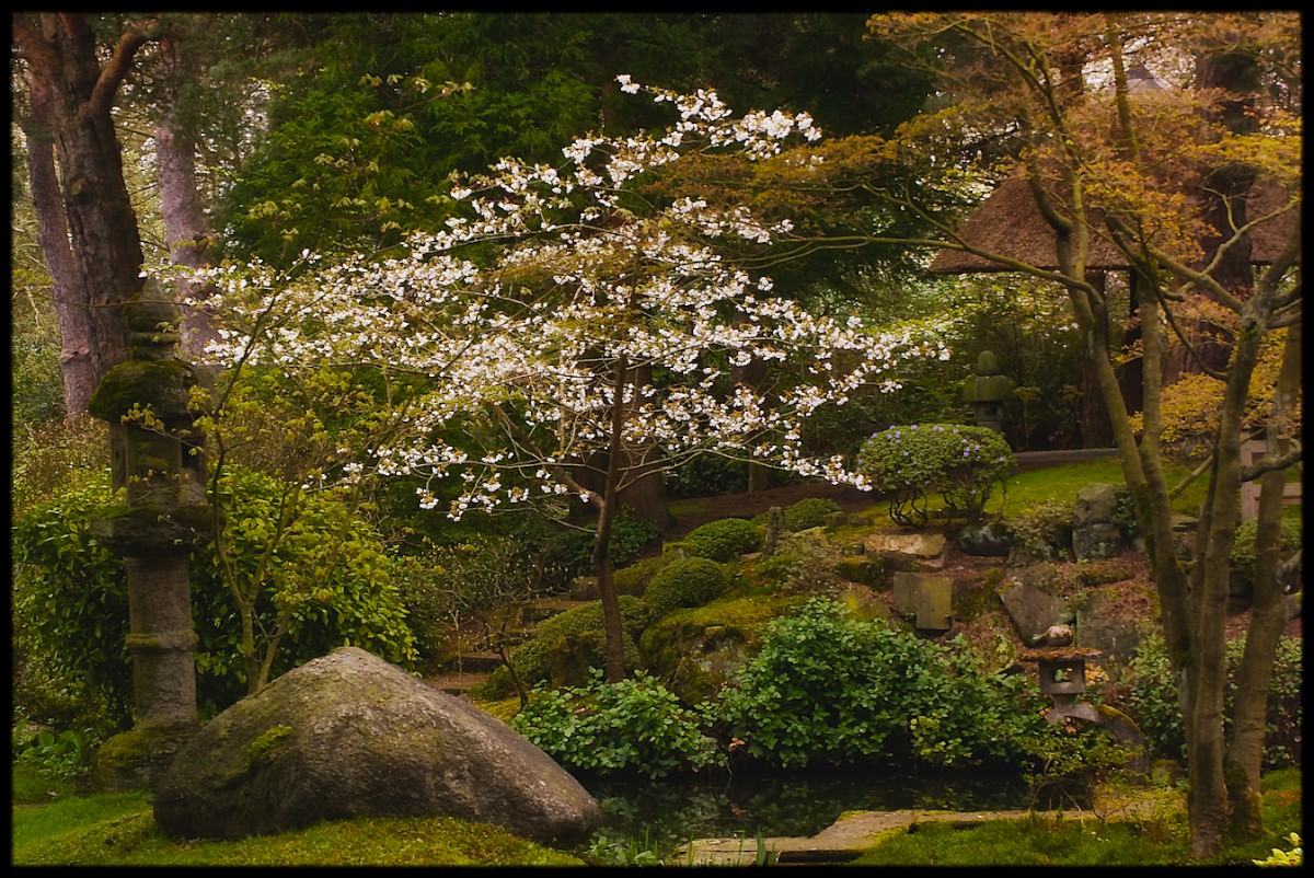
I posted a first version of this image over a year ago in Gary's ` favourite garden ' thread. Have been reworking it, trying to capture better the mood of this historic garden - one constructed by Japanese gardeners in the grounds of an English country house around 100 years ago.

I am posting a colour version, with some added glow, and a b & w version with some film grain and a touch of lavender toner. executed in Perfect Photo suite 7. Apologies for some blown whites in the colour version - having added a comment I could not delete and redo.

This is a bit of an experiment for me - would very much welcome any comments or suggestions.

Canon 400D, Tamron 55-200mm lens @ 55mm, 1/13 sec @ f11, ISO 400, hh.

Comments

9 comments
Comment posted by Ian Wolfenden on October 9, 2013 at 12:35 PM
The b & w version
Registered on May 18, 2007, 1108 Posts, 7647 Comments
Comment posted by Bill Fach on October 9, 2013 at 2:03 PM
Ian: I really like the color version. What a beautiful and tranquil place. 2 thumbs up!
Registered on November 1, 2003, 1805 Posts, 26981 Comments
Comment posted by Philip Hodgkins on October 9, 2013 at 3:49 PM
The color version for me, Ian. The B/W needs more tonal contrast. The blown whites are a non-issue for me.
Registered on July 24, 2006, 2741 Posts, 12349 Comments
Comment posted by scott lanz on October 9, 2013 at 9:07 PM
Color for me as well. Beautiful Japanese gardenscape, Ian. I think you captured the mood very well. The white dogwood adds a lot to the scene. The whites in the dogwood look absolutely fine to me.
Registered on November 14, 2003, 840 Posts, 12902 Comments
Comment posted by Ramamohan Pai on October 9, 2013 at 9:09 PM
Ian - Love the color version !!. Not enough tonality in the B&W conversion.

I like how you placed the tree centrally making it dominant in the frame.
Registered on November 1, 2003, 550 Posts, 9037 Comments
Comment posted by Lucy VanSwearingen on October 10, 2013 at 2:55 PM
I agree with the others. the color version has a nice mood and the b/w, definitely, needs more tonal contrast.
Registered on May 23, 2009, 800 Posts, 2042 Comments
Comment posted by Nancy Lea Sandy on October 10, 2013 at 6:55 PM
Another vote for the color. This is so pretty and peaceful. I love the mood you captured
Registered on January 24, 2011, 576 Posts, 6942 Comments
Comment posted by Ken Smith on October 11, 2013 at 12:37 AM
Color is my fav. I like the darken'd warm gold that sets the background to make the white pop. I almost want a little bigger frame to capture more of the trees and foreground that seems cropped a tad tightly. Nice shot.
Registered on September 5, 2008, 449 Posts, 2444 Comments
Comment posted by Pat Sampson on October 16, 2013 at 1:39 PM
Ian,

This is another vote for the color. I love your composition, the light and the mood you've created. Wonderful arrangement of physical elements in the scene and your comp conveys that. I'd love to see this one printed large. I think I could get lost in it.

pat
Registered on May 19, 2007, 953 Posts, 15989 Comments