Nature Photographers Network
This is the preserved archive of the original Nature Photographers Network. The community continues at naturephotographers.network.
Coral Pink Dunes (+RP)
‹ PreviousLandscape GalleryNext ›

Coral Pink Dunes (+RP)

by Jared Warren

Gallery: LandscapePosted October 11, 2013258 views20 comments
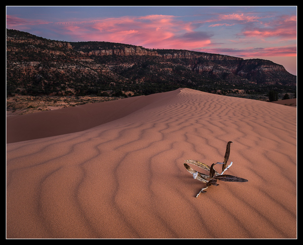
This started as a vertical comp of about 4 focus-stacked images, plus a darker exposure for the sky. I wanted to emphasize the lines in the sand, but didn't end up liking the composition a lot and decided to crop as landscape. The dried plant was repositioned to this spot, which I guess may be frowned upon by some, but there it is. :) C&C much appreciated!

Comments

20 comments
Comment posted by Jared Warren on October 11, 2013 at 3:23 PM
Here is the initial version in portrait orientation. The foreground feels too empty to me, but I do like the lines. I probably should have set up closer to the dried plant to bring it down in the frame, but the light was fading and it didn't happen. Your thoughts?
Registered on May 11, 2012, 84 Posts, 931 Comments
Comment posted by Brian Donovan on October 11, 2013 at 3:52 PM
Good job blending these images Jared. Looks very natural to my eye. I think I like the landscape composition better than the vertical as well. The leading lines in the sand are really strong in the vertical orientation, but the dried plant seems too central in the shot.
Registered on August 29, 2013, 11 Posts, 40 Comments
Comment posted by Navin Sarma on October 11, 2013 at 4:12 PM
Jared - awesome light and comp. The landscape works well as the shape in the foreground is more prominent and striking for me. Love the colors as well. Nice work
Registered on July 17, 2011, 233 Posts, 1373 Comments
Comment posted by Ron Pullen on October 11, 2013 at 4:37 PM
Love the leading sand lines, as far as the twig, as long as it was native to where you were, I have no problem with adding it to the scene. I do think the square crop works best because of the position of the twig. Had it been lower in the full vertical I would have preferred that framing. :toast: Ron
Registered on December 18, 2005, 74 Posts, 1413 Comments
Comment posted by Eva McDermott on October 11, 2013 at 4:44 PM
I like your original landscape post Jared. The composition is more harmonious with the plant in the lower right corner. Fantastic color.
Registered on January 4, 2009, 1015 Posts, 13229 Comments
Comment posted by Lucy VanSwearingen on October 11, 2013 at 4:48 PM
Beautiful capture! I'll bet you looked around a while, before finding a foreground subject. Certainly couldn't have placed it there, unless you wanted to photograph your footprints. :biggrin:
Registered on May 23, 2009, 800 Posts, 2042 Comments
Comment posted by Jeffrey Sipress on October 11, 2013 at 5:48 PM
Nice image from a place where it is challenging to get good landscapes. I'd say a foreground element such as you wanted to have here often enhances an image, but this dried out specimen is simply not attractive.
Registered on February 17, 2004, 236 Posts, 1197 Comments
Comment posted by John Mumaw on October 11, 2013 at 6:11 PM
Both of them are strong compositions, but I also slightly prefer the first image. However, I have to agree with Jeffrey about the plant. It's not that attractive and serves more as an impediment to the eye as it flows with the lines in the sand rather than as a compelling foreground. I hope you got some images without it.
Registered on September 9, 2005, 62 Posts, 2289 Comments
Comment posted by Marylynne Diggs on October 11, 2013 at 6:49 PM
The landscape composition makes the sky color a bigger element, and it also drawsmore attention to the plant and its shadows, which echo the shadows of sand ripples. Very nice.
Registered on December 14, 2010, 122 Posts, 1034 Comments
Comment posted by Stan Rose on October 11, 2013 at 9:37 PM
I dont care about how pretty or not it is--but the plant just looks out of place here, even if i hadnt read your comments. I like the landscape thought. I also prefer the vertical.
Registered on September 15, 2005, 836 Posts, 17099 Comments
Comment posted by Nancy Lea Sandy on October 11, 2013 at 11:20 PM
I am another who prefers the vertical version. The color in the clouds is wonderful and the textures and patterns in the sand are strong enough I don't think you needed the plant at all.
Registered on January 24, 2011, 576 Posts, 6942 Comments
Comment posted by Roel Wijtmans on October 12, 2013 at 2:30 AM
Though one to choose. I prefer the first version, but I would probably prefer the vertical if the plant would not have been there. Maybe you have one of those too? I like the pattern in the sand a lot.
Registered on September 30, 2012, 116 Posts, 2257 Comments
Comment posted by Bill Reid on October 12, 2013 at 10:27 AM
Nice sky and wonderful lines in the dune Jared. I like the vertical version better minus the plant as it seems distracting to me. Great job on this.
Registered on January 27, 2013, 65 Posts, 2460 Comments
Comment posted by Morris McClung on October 12, 2013 at 12:21 PM
Lovely light and color, and the comp works very well.
Registered on May 7, 2007, 670 Posts, 19650 Comments
Comment posted by Mark Metternich on October 12, 2013 at 12:42 PM
Really cool image Jared. I like the vertical one best. Great line and color. :toast:
Registered on June 19, 2009, 276 Posts, 6240 Comments
Comment posted by Hamed Musharbak on October 12, 2013 at 1:09 PM
nice light on the Dunes, lovely image Jared
Registered on June 1, 2009, 372 Posts, 2282 Comments
Comment posted by Preston Birdwell on October 12, 2013 at 8:16 PM
Roel wrote: "Though one to choose. I prefer the first version, but I would probably prefer the vertical if the plant would not have been there. Maybe you have one of those too? I like the pattern in the sand a lot. "

I agree with Roel's comment. The plant really doesn't work here, since it distracts from the wonderful lines and textures in the sand. The background and sky look very nice in both versions.

--P
Registered on November 1, 2003, 471 Posts, 5188 Comments
Comment posted by Jared Warren on October 13, 2013 at 1:14 AM
Thanks for the very helpful feedback. Sadly, I didn't have this same comp (with the best light) without the dried plant. You live and learn I guess. I don't have a lot of experience with the cloning/healing tools in photoshop but gave it a shot. Kicked my butt pretty much - trying to perfectly match the smooth gradations of sand, light, texture, lines, was beyond my current skill. Maybe someday I'll revisit when my cloning/healing skills are better. Anyhow, here's the vertical version without the plant, with a few further adjustments. Final thoughts?
Registered on May 11, 2012, 84 Posts, 931 Comments
Comment posted by Nick Bristol on October 13, 2013 at 12:32 PM
Hi Jared, I love the light, lines and wonderful textures this has. Your vert comp works great for me. Looks like the last vert comp with the cloning worked out pretty nice (at least at this size) :smile: It is a wonderful scene.

Nick Bristol
Lone Rock, WI
Registered on February 1, 2004, 752 Posts, 14140 Comments
Comment posted by Peter Nievaart on October 13, 2013 at 1:30 PM
The last one is indeed the best, Jared. The plant would have worked in regular sand an a bit more to the front but the one without draws attention to the texture. Beautiful!
Registered on June 21, 2013, 8 Posts, 75 Comments