Nature Photographers Network
This is the preserved archive of the original Nature Photographers Network. The community continues at naturephotographers.network.
Autumn Color
‹ PreviousLandscape GalleryNext ›

Autumn Color

by Nick Bristol

Gallery: LandscapePosted October 25, 2013515 views25 comments
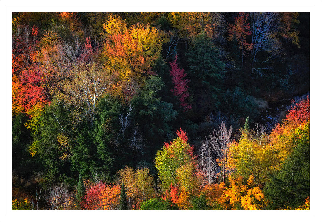
This is a picture I made a couple of weeks ago while I was in the Porcupine Mountains Wilderness Area of Upper MI. After shooting the sunrise I waited for the early light to reach in to the Valley below me. The Carp River flows through here as it runs from the Lake of the Clouds and heads for Lake Superior. I enjoyed the light, shadows and wonderful fall colors in this area on a beautiful autumn morning. Thanks for looking and for all of your comments on my last post! Larger version included. 5D3, 70-300L @128mm, iso 400, f/11 at 1/30 sec.

Comments

25 comments
Comment posted by Harry Lichtman on October 25, 2013 at 11:56 AM
Beautiful banding of warm colors off set by the cool shadow between Like the mix during all stages of leaf turn. Might warm up the shadow a tad as the shaded birch look a bit too cyan for me. Nice abstract you created.
Registered on September 17, 2010, 304 Posts, 3507 Comments
Comment posted by Karsten Wrobel on October 25, 2013 at 12:08 PM
simple yet very effective comp... the colours are just beautiful
Registered on November 1, 2008, 117 Posts, 851 Comments
Comment posted by Ed Lowe on October 25, 2013 at 12:31 PM
These fall colors are a real visual treat, especially in the large version, Nick. The light is gorgeous and the diagonal flow to this really sets those bands of color off. Beautiful image.

Ed
Registered on February 7, 2004, 414 Posts, 7115 Comments
Comment posted by Joseph Campisi on October 25, 2013 at 12:31 PM
Gorgeous tapestry of color Nick! I agree with Harry about the cyan, but that's minor an an easy fix. Good eye here!
Registered on November 24, 2008, 304 Posts, 3211 Comments
Comment posted by Bill Chambers on October 25, 2013 at 1:12 PM
Beautiful Nick. Intense color but not overstated. Nice shadow detail too.
Registered on April 10, 2005, 753 Posts, 21216 Comments
Comment posted by John&Patty Benway on October 25, 2013 at 1:53 PM
Gorgeous view Nick, beautiful light and color. I like this alot. Beautifully presented.
John
Registered on May 12, 2006, 626 Posts, 8700 Comments
Comment posted by Nick Bristol on October 25, 2013 at 2:10 PM
Thanks guys for your comments. I wondered about the bluish tint on the bare birch trees in the deep shadows and how it would work. I left it that way because it seemed like that was what I saw it like while I was there, but maybe a little adjustment on that would be the way to go. I think I will make a large print with this (maybe 30 x 45) and I do want to get it right. Appreciate your input on this! Cheers, Nick
Registered on February 1, 2004, 752 Posts, 14140 Comments
Comment posted by Chris Stenger on October 25, 2013 at 3:36 PM
Beautiful image; well done!
Registered on May 9, 2013, 27 Posts, 163 Comments
Comment posted by Michael Cothran on October 25, 2013 at 3:50 PM
I love the colors here. Personally, I would keep the bluish tint in the shadows. From an artistic view, it contrasts and compliments the warmer colors of the foliage. From a realistic view, the neutral colors in the deep shadows would probably have been distinctly blue or cyan, being only lit by the blue sky. Either way I like it as is.
Registered on December 5, 2012, 31 Posts, 730 Comments
Comment posted by Chet Dowell on October 25, 2013 at 4:34 PM
Very nice perspective, Nick and such brilliant color. Love it! Great job. Chet
Registered on December 3, 2012, 237 Posts, 1171 Comments
Comment posted by Jared Warren on October 25, 2013 at 6:39 PM
Love that color! Comp works well, as does the different perspective. Very nice!
Registered on May 11, 2012, 84 Posts, 931 Comments
Comment posted by Mark Seaver on October 25, 2013 at 7:26 PM
The colors are terrific and the diagonal comp. works very well. Neat shot, Nick.
Registered on January 23, 2011, 1103 Posts, 17270 Comments
Comment posted by Brian Schrayer on October 25, 2013 at 8:12 PM
Wow, more amazing fall color!! I just commented on Peter Coskun's photo that I need to add Oak Creek to my ever growing list of fall color destinations and now I'm adding upper MI!! Too much color not enough time off!!

It goes without saying that this is a beautiful image between the amazing color and the diagonal formed by the contrasting shadow areas which provide a nice counterpoint to the brilliant color. :toast:
Registered on May 28, 2004, 114 Posts, 2890 Comments
Comment posted by Scott Smorra on October 25, 2013 at 8:44 PM
Nice mix of colors here Nick. I like how you used the shadow area here to create two triangles of color. The larger version looks great.
Registered on November 2, 2009, 161 Posts, 2143 Comments
Comment posted by Paul Breitkreuz on October 26, 2013 at 12:59 PM
Psychedelic.....great array of wonderful fall colors here, Nick. Lighting looks perfect overall for this capture, although, the shadowed canyon is dark in areas, it's not inked up at all. A good sign of nice exposure latitude. Very nice scene. :cool:
Registered on February 25, 2006, 525 Posts, 8448 Comments
Comment posted by Nick Bristol on October 26, 2013 at 1:09 PM
Thanks guys! Appreciate all of your thoughts on this! I think I will be working on printing this later today so looking forward to seeing it on paper...I hope :smile:
Registered on February 1, 2004, 752 Posts, 14140 Comments
Comment posted by Zack Clothier on October 26, 2013 at 1:29 PM
Beautiful display of color and light, Nick. Some of the reds look pretty hot, but they can be tricky to deal with..
Registered on January 28, 2010, 343 Posts, 2257 Comments
Comment posted by Gary McGhee on October 26, 2013 at 2:14 PM
Nature has produced some wonderful colour here Nick and you have captured it beautifully.

Gary.
Registered on April 15, 2010, 142 Posts, 2416 Comments
Comment posted by Richard Teller on October 27, 2013 at 6:58 AM
The colors here are so vibrant. Very well captured. I miss this. Out here we get yellow and that is about all.
Registered on August 23, 2010, 1162 Posts, 6692 Comments
Comment posted by Nick Bristol on October 27, 2013 at 8:58 AM
Zack, Gary and Richard, Thanks much for your comments! Nick
Richard, I sure would miss these colors too if I were someplace to far from them. Come visit if you like.. :smile: Nick
Registered on February 1, 2004, 752 Posts, 14140 Comments
Comment posted by Mark Metternich on October 27, 2013 at 1:02 PM
Comp is nice and I love the color explosion here Nick!

My gut reaction is I would take saturation down in layer "color made" a bit. I think it would still have the same impact maybe 5-10 pts lower.
Registered on June 19, 2009, 276 Posts, 6240 Comments
Comment posted by Nick Bristol on October 27, 2013 at 4:38 PM
Thanks Mark for your thoughts and suggestion. Zack thought the reds might be a bit hot too so I'll give it a try. This is a pretty cool place and the color in the U.P. can be awesome. I love it up there. I did lower the overall saturation by 6 points in this version. Not sure if we will be able to see the difference here but I think it will show a little. May have helped too... :smile: Cheers, Nick
Registered on February 1, 2004, 752 Posts, 14140 Comments
Comment posted by Wayne Jones on October 28, 2013 at 9:13 PM
Wow, that's what I call gorgeous color! Love the wonderful mix of different hues. The comp, looking down on the trees shows them off well, with just the right level of detail in the shadows. I think the repost does look even better, too. It should make a great large print.
Registered on April 18, 2007, 953 Posts, 6435 Comments
Comment posted by Morris McClung on October 29, 2013 at 3:14 PM
Just a fantastic mix of colors, Nick! Gorgeous image! And, your comp makes it all come together beautifully. Superb work. :toast:
Registered on May 7, 2007, 670 Posts, 19650 Comments
Comment posted by Nick Bristol on October 29, 2013 at 6:15 PM
Thanks Wayne and Morris. Glad you guys enjoyed it! Nick
Registered on February 1, 2004, 752 Posts, 14140 Comments