Nature Photographers Network
This is the preserved archive of the original Nature Photographers Network. The community continues at naturephotographers.network.
Pastel Forest
‹ PreviousLandscape GalleryNext ›

Pastel Forest

by Thomas Haney

Gallery: LandscapePosted November 8, 2013269 views7 comments
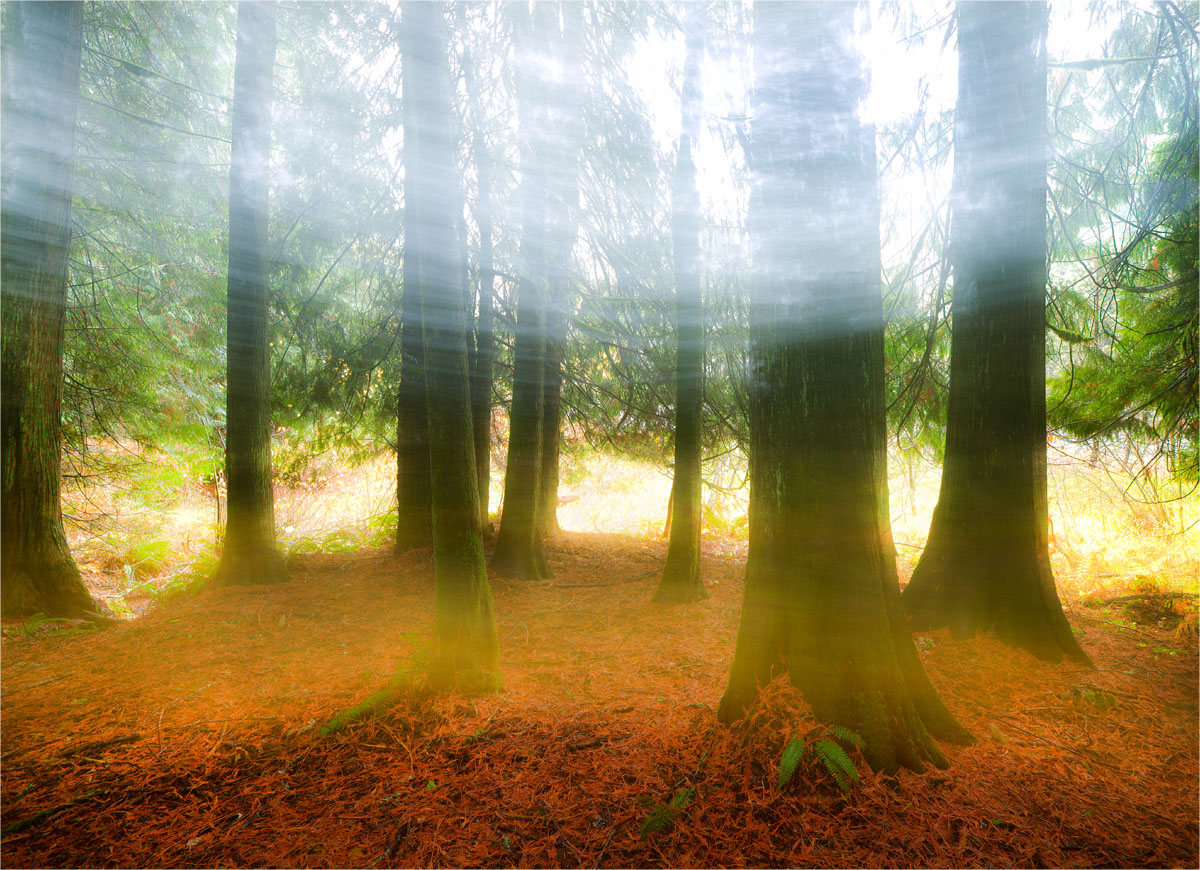
I'm interested in what you all think of this one. I haven't really done much creative shooting in my time, I guess I've always felt like more of a journalist than an artist when it comes to photography, but lately i've been more interested in influencing the outcome of an image. This was a twenty second photo, and about 15 seconds in a started moving the camera quickly from side to side, and tilted up slightly to get the light from the sky lower in the frame, and the light from the area beyond the trees into the foreground.

Canon 5d Mark iii, 16-35mm lens, 20 seconds at f/11, ISO 50, Gitzo 6x Tripod

Comments

7 comments
Comment posted by Greg AshworthFanch on November 9, 2013 at 7:46 AM
I think it is great that you are trying new things, and let yourself be an artist. The picture; I like the look of the trees and the color of the forest floor. The big swath of white is a bit distracting for me. I think there is potential in this concept though.
Registered on December 14, 2012, 55 Posts, 67 Comments
Comment posted by Morris McClung on November 9, 2013 at 10:47 AM
Looks like wraiths streaking through the forest. Cool shot.
Registered on May 7, 2007, 670 Posts, 19650 Comments
Comment posted by Nancy Lea Sandy on November 9, 2013 at 11:20 AM
Pretty cool. I like the streaky fog (or clouds or whatever) They look like a veil across time. Fg color is a little intense for the mystical mood, IMHO but that's just my take. Nice work.
Registered on January 24, 2011, 576 Posts, 6942 Comments
Comment posted by Stan Rose on November 9, 2013 at 12:13 PM
I agree with the others, on both counts (the color being too intense for mysticism; the whites a bit overdone) The scene has some good balance though--just needs refinement. You could post in PA too for a slightly different perspective.
Registered on September 15, 2005, 836 Posts, 17099 Comments
Comment posted by Lucy VanSwearingen on November 9, 2013 at 12:17 PM
The mood you've created is terrific!
Registered on May 23, 2009, 800 Posts, 2042 Comments
Comment posted by Bill Reid on November 10, 2013 at 11:04 AM
Very cool idea Thomas. I too agree about the whites being too bright and the colors. But I think with some playing this could be a very interesting scene. Kudos for thinking out of the box.
Registered on January 27, 2013, 65 Posts, 2460 Comments
Comment posted by Kah Kit Yoong on November 12, 2013 at 3:53 AM
I love this. My reservation only being the overly bright whites. I think going with a cooler balance in the top 1/3 might also be interesting.
Registered on September 27, 2006, 636 Posts, 10682 Comments