Gallery: Macro & Close-upPosted December 3, 2013323 views10 comments
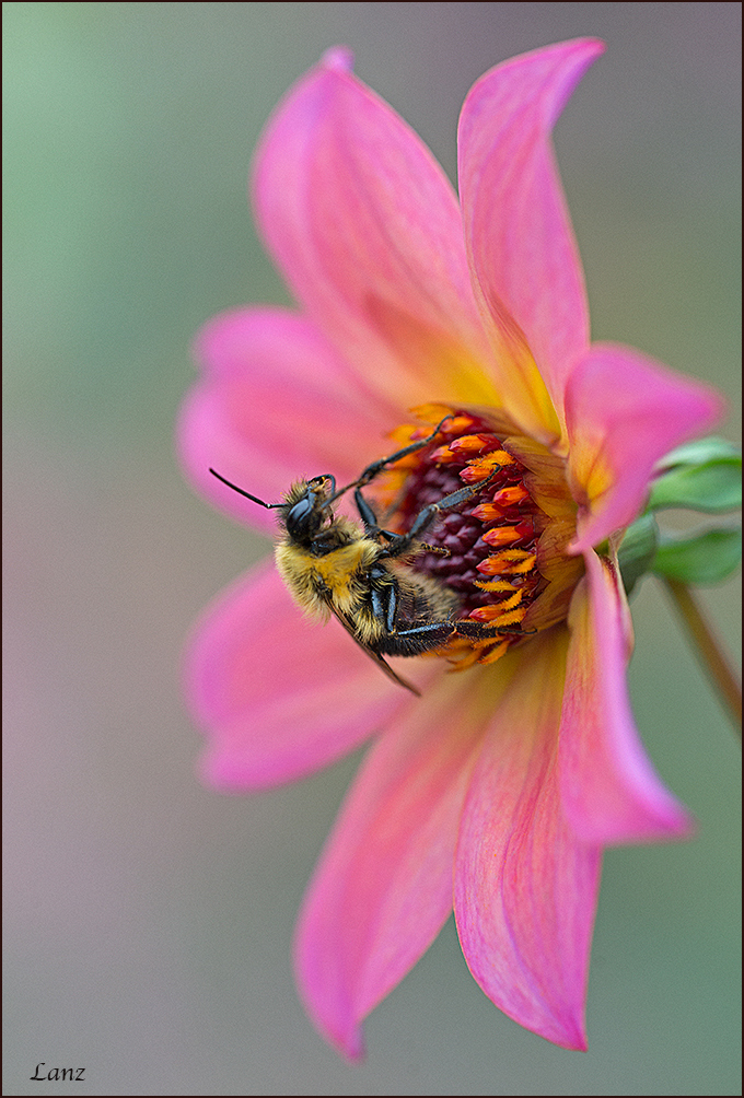
Same dahlia as posted in flora + a bee. D600, 150 macro, iso 500, 1/160, tripod. This comp/orientation is as taken. I'll post it rotated 90 cw as well for comparison/comment. Thanks for looking. Suggestions, questions and other comments welcome.
Comments
10 comments
Comment posted by scott lanz on December 3, 2013 at 8:05 AM
Here it is rotated and slightly cropped from the top. Preference?
Registered on November 14, 2003, 840 Posts, 12902 Comments
Comment posted by Howard Cheek on December 3, 2013 at 9:19 AM
You really know how to compose an attractive frame Scott.
This flower and 'Addabee' frame has great esthetic appeal, and maximizes the best of both worlds (flora & macro).
Nicely done!
PS - I prefer the vertical because it seems to balance the two subjects equally.. But that's just me.
The horizontal seems to give the flower an edge
Registered on July 24, 2008, 1201 Posts, 10758 Comments
Comment posted by Ramamohan Pai on December 3, 2013 at 10:19 PM
Scott - I like both versions but prefer the vertical as it seems to me more usual orientation. Like your choice of DOF - the Bee looks great while the flower playing a great supporting role.
Registered on November 1, 2003, 550 Posts, 9037 Comments
Comment posted by Ingrid Vekemans on December 4, 2013 at 10:12 AM
Nice and sharp shot, beautiful colours. The original composition looks more natural to me.
Grt, Ingrid.
Registered on August 2, 2010, 138 Posts, 780 Comments
Comment posted by Mark Seaver on December 5, 2013 at 10:44 AM
Cool how the bee's colors match the flower, Scott. I really like how you've let the colors shine without them getting over saturated and the contrast between the flower and the gentle wash of color in the background. The vertical "feels" more right to me.
Registered on January 23, 2011, 1103 Posts, 17270 Comments
Comment posted by Roberto Facchini on December 5, 2013 at 10:55 AM
Very beautiful. super colors and sharpness. I prefer the vertical version.
Registered on November 15, 2012, 35 Posts, 202 Comments
Comment posted by Roger Kirchen on December 5, 2013 at 7:48 PM
Beautiful colour and composition. I much prefer the vertical image. The angle at which the stem enters into the frame and the hanging bee create a tension that is offset by the smooth petals. The is a smooth color wash at the left reflecting the petals also balances the tension. Beautifully done. Sharp details and excellent placement of DOF.
Registered on March 6, 2011, 95 Posts, 847 Comments
Comment posted by Mike Ramy on December 7, 2013 at 1:21 PM
Hey Scott,
Man you got some very Cool Colors in this one and a good look at the Bee. The DOF really makes the in-focus elements POP.
The vertical is hands down the way to go and has a much more natural feel to it.
Registered on June 16, 2012, 567 Posts, 2809 Comments
Comment posted by Marylynne Diggs on December 12, 2013 at 8:11 PM
Great colors and sharpness. I prefer the vertical. It seems more natural and "explains" the bee's raised front legs (it's hanging a bit). Spectacular color here as well.
Registered on December 14, 2010, 122 Posts, 1034 Comments
Comment posted by Bill Fach on December 14, 2013 at 2:48 PM
Scott: Freaking spectacular! Perfect DOF management and a superb BG and comp. >=))>
Registered on November 1, 2003, 1805 Posts, 26981 Comments


Comments
10 commentsThis flower and 'Addabee' frame has great esthetic appeal, and maximizes the best of both worlds (flora & macro).
Nicely done!
PS - I prefer the vertical because it seems to balance the two subjects equally.. But that's just me.
The horizontal seems to give the flower an edge
Grt, Ingrid.
Man you got some very Cool Colors in this one and a good look at the Bee. The DOF really makes the in-focus elements POP.
The vertical is hands down the way to go and has a much more natural feel to it.