Gallery: LandscapePosted January 12, 2014284 views10 comments
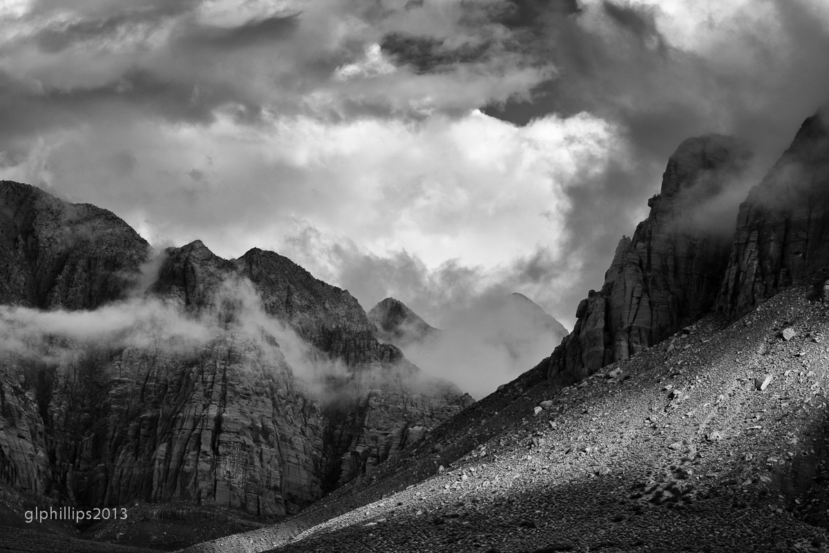
I liked the way the light, terrain, and clearing clouds all seem to rise together. Taken from our patio in Ivins in late November.
iso 100, 100mm, f/16, 1/125
comments and critiques greatly appreciated.
Comments
10 comments
Comment posted by John Williams on January 12, 2014 at 3:48 PM
Fascinating swirl of light Gary. It's a dramatic image, but not easy to find a footing in; it's almost a cross between an abstract and a vista. Nice choice to go with BW.
Registered on September 6, 2007, 221 Posts, 5985 Comments
Comment posted by Chet Dowell on January 12, 2014 at 5:01 PM
Great job of catching the drama and energy of this mountain scene! Nice light. Well done. Chet
Registered on December 3, 2012, 237 Posts, 1171 Comments
Comment posted by Rick Turner on January 12, 2014 at 6:11 PM
Very nice view from the patio. I am envious. Good tonal range but my eye just bounces around and around looking for s place to land and focus on and I just cannot find it.
On my trips last year Utah is one diverse and beautiful place. You live in a wonderful environment.
Registered on February 18, 2012, 534 Posts, 2755 Comments
Comment posted by Richard Teller on January 12, 2014 at 6:22 PM
I like the composition here and the B&w works well, but in this scene I find myself wanting to see the color. Well photographed.
Registered on August 23, 2010, 1162 Posts, 6692 Comments
Comment posted by Richard Castillo on January 13, 2014 at 1:59 AM
Yes, there's definitely a powerful sense of rising movement in this image! I love it! I can see how the eye can be looking for a focus to rest at in this image, though I could also see that as an artistic intention, as well, sort of turning the idea on it's head, and intending to not readily let the eye rest, and instead to keep it moving, emphasizing and deepening the sense of movement within the image.
I think my eye maybe found some rest in the area just below the top of the frame, and about a third of the way in from the right hand side. If you'd like to emphasize this you could always, as you already know, try to increase some contrast, or structure, or clarity, or something else, or a combination of things to make that area pop and stand out just enough. And maybe burn in some, in the foreground in the lower right hand side, too. But those are just some ideas, best taken with a grain of salt
Beautiful Image as is!
Registered on October 20, 2013, 9 Posts, 37 Comments
Comment posted by Morris McClung on January 13, 2014 at 12:38 PM
A classic landscape look to this one. Especially the light spreading across the foreground. I prefer more contrast, but that's just my preference. This has a nice range of tones to it. Well done.
Registered on May 7, 2007, 670 Posts, 19650 Comments
Comment posted by Mark Seaver on January 14, 2014 at 10:54 AM
Neat how you used the different textures and lighting to create a strong sense of depth. Well seen.
Registered on January 23, 2011, 1103 Posts, 17270 Comments
Comment posted by Bill Reid on January 14, 2014 at 1:48 PM
Nice depth and range of tones in this Gary. I like the fore ground light a lot. Nice patio view.
Registered on January 27, 2013, 65 Posts, 2460 Comments
Comment posted by Harley Goldman on January 14, 2014 at 6:22 PM
That is a mighty fine view out the back patio! And a real nice image from there as well. I really like the streak of light on the right fore. Good choice to go with B&W, as it works very well here.
Registered on November 19, 2003, 586 Posts, 11271 Comments
Comment posted by Tim Mulholland on January 25, 2014 at 4:09 PM
I'm jealous of your backyard - I wish that I had one like it! Nice capture...
Tim!
Registered on April 24, 2006, 14 Posts, 139 Comments

Comments
10 commentsOn my trips last year Utah is one diverse and beautiful place. You live in a wonderful environment.
I think my eye maybe found some rest in the area just below the top of the frame, and about a third of the way in from the right hand side. If you'd like to emphasize this you could always, as you already know, try to increase some contrast, or structure, or clarity, or something else, or a combination of things to make that area pop and stand out just enough. And maybe burn in some, in the foreground in the lower right hand side, too. But those are just some ideas, best taken with a grain of salt
Beautiful Image as is!
Tim!