Nature Photographers Network
This is the preserved archive of the original Nature Photographers Network. The community continues at naturephotographers.network.
April 2014 GOTM
‹ PreviousGallery of the Month GalleryNext ›

April 2014 GOTM

by Vance Gese

Gallery: Gallery of the MonthPosted March 3, 20142,476 views26 comments
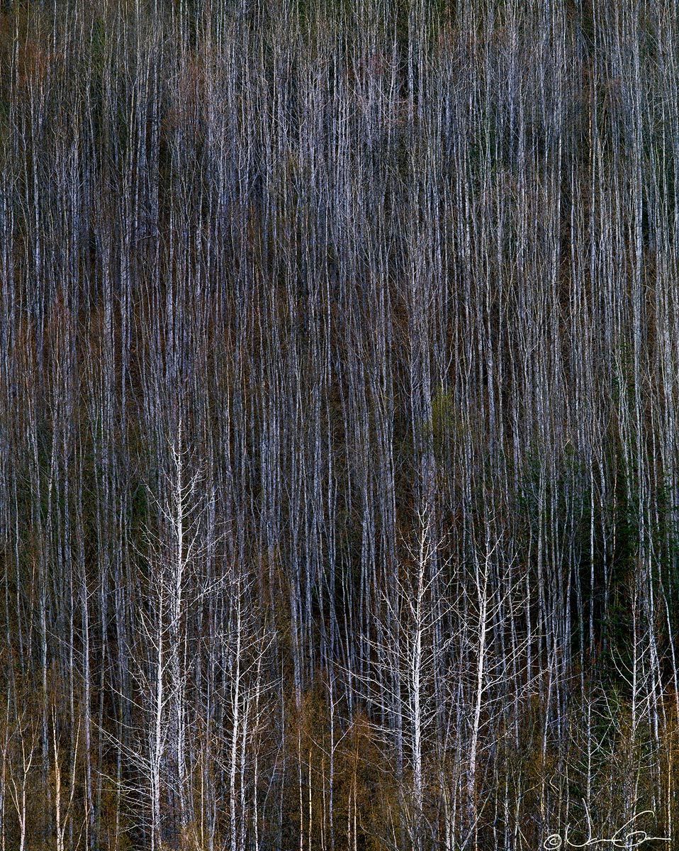
Woven Hillside

Would appreciate your thoughts on this image, made a number of years ago one April in the Matanuska Valley of Alaska. Some of the aspens had retained last year's leaves through the winter. Worked a great deal with contrast in PS to bring out the intricacies of the pattern of aspens on the hillside. Hope it looks okay.
4x5, 600mm, Velvia. Flatbed scan, Tony Kuyper's always valuable masks and others.

Please view the large size image.

Thanks.

Comments

26 comments
Comment posted by Matt Anderson on March 3, 2014 at 8:23 PM
Very nice!
Great textures and framing Vance.
Registered on September 6, 2007, 346 Posts, 2696 Comments
Comment posted by Philip Hodgkins on March 3, 2014 at 9:08 PM
Wonderful textures with the vague shrubbery underpainting it> Love it! :toast:
Registered on July 24, 2006, 2741 Posts, 12349 Comments
Comment posted by Eva McDermott on March 3, 2014 at 9:30 PM
Hi Vance - Love the tapestry like imagery. Wonderful textures and detail especially when viewed in the larger verion. I am sure a large print of this would look amazing. I always meant to ask you what scanner you use for your flat bed scans.
Registered on January 4, 2009, 1015 Posts, 13229 Comments
Comment posted by Chris Chamberlain on March 3, 2014 at 9:40 PM
Hey,
I love the graphic nature of this. Almost tapestry like. The colors are interesting as well. All the fine vertical lines make a nice contrast to the forms of the trees in the foreground. Nice!

I'm looking at this on my new Dell 30" Ultrasharp Monitor, and it's ultrasharp, in a good way!

Chris
Registered on March 13, 2007, 500 Posts, 8365 Comments
Comment posted by Bill Chambers on March 3, 2014 at 10:36 PM
Wow, this has to be seen LARGE. What an image you managed to capture here Vance. You really have to study and get your mind working here to fully appreciate the entire scene and processing. What I really love about this are the subtle variety of colors lurking within the trees. A real winner!
Registered on April 10, 2005, 753 Posts, 21216 Comments
Comment posted by Rick Turner on March 3, 2014 at 11:55 PM
Nothing too nit and all this is is simply stunning in simplicity. :toast:
Registered on February 18, 2012, 534 Posts, 2755 Comments
Comment posted by Vance Gese on March 4, 2014 at 12:22 AM
Matt, Phil, Eva, Chris, Bill, and Rick, thank you for all the great comments. Very much appreciate your thoughts.

Eva, I use a Microtek M1 flatbed scanner. It uses a glassless film carrier which I thought was a real advantage over the Epson V750. But I'll be honest with you, I get a lot of scan lines and artifact and overall have never been very happy with the results I get. I works adequately for small prints though.

Thanks again everyone.
Registered on November 13, 2008, 298 Posts, 6629 Comments
Comment posted by Joseph Campisi on March 4, 2014 at 12:34 AM
Very impressionistic image Vance. Love the patterns, almost mesmerizing. Different and unique... :smile:
Registered on November 24, 2008, 304 Posts, 3211 Comments
Comment posted by gary phillips on March 4, 2014 at 1:23 AM
Wow, Vance. The large view is phenomenal. I've been reading quite a bit about, how in many circles, landscape photography has not been accepted as art. It must have it's own category , and may not be mixed in with real art. This photograph defies that logic. The graphic nature, the subtle tones, the complexity of it's design and the skill of it's maker all elevate this to art in every sense of the word. Amazing.
Registered on October 24, 2013, 185 Posts, 4136 Comments
Comment posted by Ian Cameron on March 4, 2014 at 4:26 AM
Lovely Vance, my kind of image. I did actually wonder if backing off on the sharpening a touch would improve the quality of the fine detail - it seems a tiny bit scratchy both large and small, though I suspect this has suffered a little in the down rezzing for web.
Registered on August 6, 2004, 1125 Posts, 3318 Comments
Comment posted by Chet Dowell on March 4, 2014 at 7:36 AM
Beautiful, subtle coloration and nice lines and textures. The composition is what makes it very special. Great work, Vance. Chet
Registered on December 3, 2012, 237 Posts, 1171 Comments
Comment posted by Richard Castillo on March 4, 2014 at 9:13 AM
I'm very much enjoying the strong design, with new meaning arising out of it. Awesome!
Registered on October 20, 2013, 9 Posts, 37 Comments
Comment posted by Doug Roane on March 4, 2014 at 9:41 AM
I think the processing and graphic design is excellent here, Vance. Compositionally, though, I would like to see the bottoms of the more prominent trees.
Registered on December 12, 2008, 213 Posts, 2226 Comments
Comment posted by Bill Reid on March 4, 2014 at 10:16 AM
Great details and colors in the large version Vance and a very strong feel to the lines in this. Wonderfully done image. :toast:
Registered on January 27, 2013, 65 Posts, 2460 Comments
Comment posted by John Williams on March 4, 2014 at 11:09 AM
This is one of those images I can imagine hanging framed in a fine-art gallery, where I pause and really stare for awhile. The abstract quality of the thinner trunks broken by the trees at the bottom takes just a minute to figure out, and then quite a few more just to absorb. I've come back to it several times now, and each time it grows on me. Truly masterful.

:toast: :toast:
Registered on September 6, 2007, 221 Posts, 5985 Comments
Comment posted by Louis Pattis on March 4, 2014 at 11:17 AM
Woven simplicity, a perfect image for a multi section canvas print, you decide how to divide it, but I want one.
Registered on March 30, 2012, 0 Posts, 164 Comments
Comment posted by Nick Bristol on March 4, 2014 at 12:58 PM
I really like this image, Vance. Looks like it would make a beautiful fine art print! :toast: :toast:

Nick Bristol
Lone Rock, WI
Registered on February 1, 2004, 752 Posts, 14140 Comments
Comment posted by David Chauvin on March 4, 2014 at 5:14 PM
Fantastic! The detail and texture grab my attention but the amazing color keeps pulling me deeper and deeper. This is one that probably needs to be printed large to fully appreciate. Beautifully composed and processed. :cool: :cool: :cool:
Registered on August 5, 2004, 1007 Posts, 5595 Comments
Comment posted by Harley Goldman on March 4, 2014 at 5:42 PM
Excellent! Great comp and image.

I saw your comments about the M1. I bought two of them and had the worst time with color fringing where there should not have been any. I returned both and went with the Epson 750, which gives me pretty dang good results.
Registered on November 19, 2003, 586 Posts, 11271 Comments
Comment posted by Paul Breitkreuz on March 4, 2014 at 8:11 PM
I get a lot of scan lines and artifact and overall have never been very happy with the results I get


First and foremost Vance, I really like this image posted here all the way around. I guess I got a real eye bulge when I saw 600mm lens listed......ooooofta, that's one big reacher with LF gear.

As for the M1. I own the predecessor the i900. I have had this unit for what seems like eons now. I was wondering if some of your streaking issues are similar to mine. If I have any fussing with my scanner at all I found years ago it was an easy fix. I merely slide the film holder out of the lower open bay area and a gentle use of compressed air to remove debris that might be most anywhere on the scanning element and such. To date, it has worked every time without a hitch.
I just thought I'd mention this from someone who uses the scanner at least once a week and more. :cool:
Registered on February 25, 2006, 525 Posts, 8448 Comments
Comment posted by Jared Warren on March 4, 2014 at 11:37 PM
Great lines and textures. Really makes me want to reach out to touch it. Well seen! :toast:
Registered on May 11, 2012, 84 Posts, 931 Comments
Comment posted by Stuart Williams on March 6, 2014 at 3:41 AM
vance - this has a super graphic feel too it. i cannot help wishing for slightly more at the bottom ... ??
Registered on December 7, 2007, 247 Posts, 4792 Comments
Comment posted by Bill Leggett on March 6, 2014 at 12:15 PM
Very nice work, Vance. The closer growth against the almost impressionistic look of the aspens on the hillside is a subtle but interesting contrast.
Registered on July 21, 2004, 706 Posts, 3233 Comments
Comment posted by Mark Metternich on March 9, 2014 at 5:13 PM
Amazing work on this site! Sweet texture and line.
Registered on June 19, 2009, 276 Posts, 6240 Comments
Comment posted by Tim Mulholland on March 13, 2014 at 4:23 PM
Stark simplicity - beautiful

Tim!
Registered on April 24, 2006, 14 Posts, 139 Comments
Comment posted by Nick Bristol on March 13, 2014 at 5:08 PM
Vance, Congrats on the WP! This really is one fantastic picture! :toast: Cheers, Nick
Registered on February 1, 2004, 752 Posts, 14140 Comments