Nature Photographers Network
This is the preserved archive of the original Nature Photographers Network. The community continues at naturephotographers.network.
The Martian Warship
‹ PreviousLandscape GalleryNext ›

The Martian Warship

by Sairam Sundaresan

Gallery: LandscapePosted March 28, 2014296 views16 comments
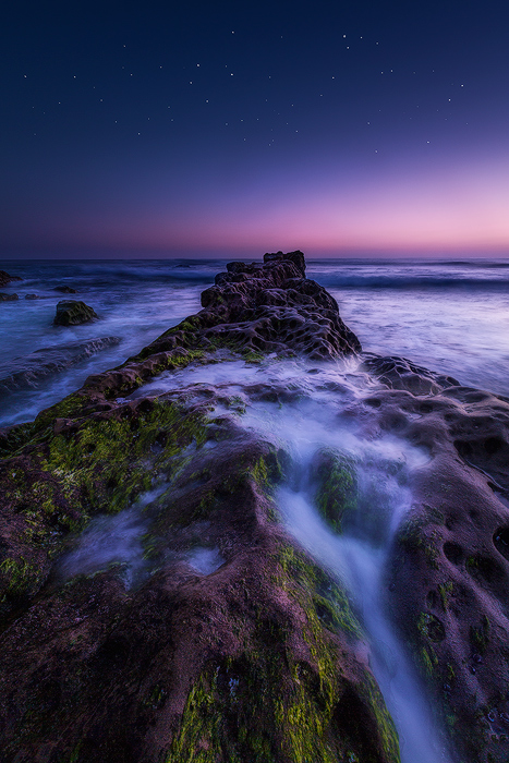
One of those images where I'm never really sure if it's bright enough or dark enough. I was hoping the wonderful folks at NPN could give me wise counsel.

I took this shot sometime last week, and basically, it's a blend of two exposures, taken an hour apart. The first was a twilight shot of the scene, and the second one for the stars. I wanted to convey a sense of time in this image, and hope it renders well on the screen.

Please see the larger version in the comments, Forgot to put it up with the actual shot.

As always, your comments and feedback are very much appreciated!

Sairam :smile:

Comments

16 comments
Comment posted by Sairam Sundaresan on March 28, 2014 at 11:53 AM
Larger Image (Compressed)
Registered on March 14, 2013, 100 Posts, 643 Comments
Comment posted by Nathan Apodaca on March 28, 2014 at 5:09 PM
Tough one to critique... First of all, however, I like this a lot. Nice, wide range of colors. It's hard to determine how the overall brightness is, mostly because of the white background here. Right off, I'd say it was about right, but now I'm actually wondering if it couldn't go a hair darker, especially the lower half. Either way, I am enjoying this one a lot. I haven't done many shots like this, but can appreciate well done images like this one!
Registered on November 16, 2011, 67 Posts, 1127 Comments
Comment posted by Kah Kit Yoong on March 28, 2014 at 6:11 PM
Beautiful and otherworldly. I think you've got the lighting levels perfect. The magenta on the foreground seems just a bit strong for me but I would say it's too over the top either.
Registered on September 27, 2006, 636 Posts, 10682 Comments
Comment posted by Sairam Sundaresan on March 28, 2014 at 11:43 PM
Thanks guys!
Nathan, like I said before, I never really knew if it was "Dark" enough, but at the same time, I didn't want to lose the shadows.
Kah, I thought the magenta shade enhanced the overall mood of the shot, but if it's way too much, then I could tone it down :wink:
Registered on March 14, 2013, 100 Posts, 643 Comments
Comment posted by Wesley Picotte on March 29, 2014 at 1:14 AM
Wow. Really interesting image. And beautiful.

FWIW, I enjoy the contrast between the very gentle twilight hues in the sky and the much less gentle texture of the rock. There's also a nice connection between the two in terms of the colors they share. But, my reaction to this image is that I want "less".

Less foreground would potentially give the horizon twilight -- which is a really appealing portion of the image, for me -- more presence. Or, less starry sky -- maybe just a hint -- would tie the foreground and twilight colors together more tightly and add to the mystery of this image. All theoretical, of course; I'd have to play with crops...

Between the two images you posted, I like the second one (larger) more because it's more saturated. Maybe a bit much in the foreground rocks and algae or whatever the green plants life is -- which looks a bit electric / contrasty -- but not by much.

All in all, really intriguing!
Registered on December 10, 2013, 4 Posts, 40 Comments
Comment posted by Jose Fernandez on March 29, 2014 at 7:31 AM
Excellent composition with an beautiful transition between heaven and land
Registered on July 25, 2011, 77 Posts, 172 Comments
Comment posted by Jared Warren on March 29, 2014 at 10:57 AM
Sairam, I think you executed this really well. Light levels look very good to me (just right if viewed on appropriate dark background). As others have said, it has a very otherworldly feel to it. I'm on the fence about the center-heavy composition. Overall, a great image!
Registered on May 11, 2012, 84 Posts, 931 Comments
Comment posted by Nick Bristol on March 29, 2014 at 1:00 PM
Sairam, This is really cool looking! For me the light levels look great just as you have it and I love the colors. Your comp works nicely for me as well. I also agree with the others on the otherworldly feel. Nice work on this! :smile:

Nick Bristol
Lone Rock, WI
Registered on February 1, 2004, 752 Posts, 14140 Comments
Comment posted by Sairam Sundaresan on March 29, 2014 at 9:07 PM
Thanks for the detailed feedback Wesley, appreciate it! I'd actually like to play with some crops as well :wink:

Thanks Jose :smile:

Jared, I did try to add other elements in for a more off center composition, but they all seemed to distract. I felt that the main central foreground rock acted well as a leading line to the stars. Thanks! :smile:

Thanks very much Nick! :toast:
Registered on March 14, 2013, 100 Posts, 643 Comments
Comment posted by Eva McDermott on March 30, 2014 at 1:30 AM
I do think these needs to be viewed against a dark background. I agree your image is otherworldly. I don't mind the centered composition and thinks it works well here. Your choice of shutter speed also works very well.
Registered on January 4, 2009, 1015 Posts, 13229 Comments
Comment posted by Sairam Sundaresan on March 30, 2014 at 2:52 AM
thanks very much Eva! :smile:
Registered on March 14, 2013, 100 Posts, 643 Comments
Comment posted by Zack Clothier on March 30, 2014 at 11:46 AM
I think the light levels look good for print, going to dark and it'll just leave everything muddy. Nice work on the processing.
Registered on January 28, 2010, 343 Posts, 2257 Comments
Comment posted by Sairam Sundaresan on March 30, 2014 at 5:58 PM
Thanks very much Zack! That's exactly what I was worrying about. I hate the muddy look!
Registered on March 14, 2013, 100 Posts, 643 Comments
Comment posted by Ben Horne on March 30, 2014 at 11:04 PM
The composition and processing work for me, and I think one very important thing for this composition is the fact that the rocks poke above the horizon. That important element is what ties the foreground to the background. Without it, this would likely feel like two different photos in an almost 50/50 split.

At first I thought the magenta was a bit strong, but the longer I look at it, the more normal it seems. I would be tempted to try going a bit away from magenta and a bit more blue, but the magenta does help give a sense of depth to the foreground rocks, and ties it to the last/first glimmer of light in the background.
Registered on August 27, 2009, 51 Posts, 959 Comments
Comment posted by John Williams on March 30, 2014 at 11:54 PM
What Eva said. All this lacks is a dark background. Color should be rich like this at twilight, beautiful.
Registered on September 6, 2007, 221 Posts, 5985 Comments
Comment posted by Sairam Sundaresan on March 31, 2014 at 4:17 PM
Interestingly Ben, that echos my thought process when I was composing this in field. A separation between the rock and the horizon line didn't feel right. The magenta looks right when I see it against a dark background, but against white, it initally appears overdone. :smile:

Thanks John! :smile:
Registered on March 14, 2013, 100 Posts, 643 Comments