June 2014 GOTM
by William Bickle
Outstanding
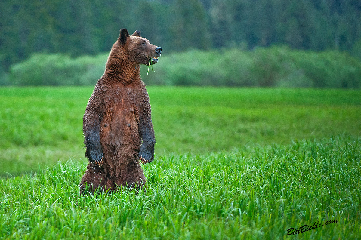
Springtime early morning in the Khutzeymateen, was presented with this Spectacular Wild Female Grizzly. Her Twin Yearlings are inland. She was at ease with my presence and not threatened but wanted to make a dominant Statement! This lactating female was standing in the estuary grasses looking alert for intruders, showing-off her 5" Claws that had grown all winter to this impressive display. The claws like all bears do not retract and will wear down in length during her clamming and foraging in the warmer season. It's breeding season in the Khutzeymateen and she is looking-out for Bear intruders. Her keen sence of smell &
hearing will warn her of these intruders.
The young may stay with her for several seasons, until they will move out on their own. Was raining during this time of year with Glaciers melting into the estuary . But I was So Pumped did not even notice the Constant All Day rains.
Natural Light, Not Baited, Not Set-Up, Not Lured-In.
Rain was our constant companion with the sun breaking through briefly only one day.
Location: Khutzeymateen Grizzly Bear Sanctuary in Northern BC Canada
The Bears are Wild and Not contained
Camera: Nikon D 700
Lens: Nikon VR F2.8 70-200, @ 200mm. HandHeld in Floating Zodiac boat, VR normal mode
Exposure: Manual, F2.8 with -.67Meter Compensation & 1/500 Speed, ISO 1000
Not Lured in or Baited, C&C appreciated.
Bill

Comments
17 commentsNice shot of that great mom, but have to say the greens on this one are kinda off the charts (to the point where I think they detract from the image). I know they're REALLY vivid in there (remember I was beside you when you shot this!), but I think it would help quite a bit to desaturate the greens a bit (or a lot
Cheers...
Brad
Well at least from my perspective this is WAY more accurate and WAY more aesthetically pleasing - well done...
Cheers...
Brad
Max
I respectfully disagree with the other comments. I like the saturated version, even if it does look enhanced. On my first look, the colors didn't distract me. I saw the image as an interpretation of the artists vision of the scene. The grass hanging out of her mouth and the rich green color told me a story, that she is trying to pack on some after winter weight, and those greens look very appetizing. I agree that the desaturated version is more 'real' looking, but that doesn't influence me. I'm new to wildlife critique, so take that into consideration, but as photographers, if all we're doing is constantly trying to recreate the scene exactly as it was, would we throw out all Ansel Adams B&W landscape photos? An extreme analogy, I know. I'm sure that Brad and the others aren't saying that, but I feel that many times, nature/wildlife photographers get too stuck on reality on every single shot, with too little room for some interpretation or enhancement to tell a story about the scene.
Now, I'm not usually a fan of HDR and Photo Art with crazy colors, just not my style, but the processing here works for me. The bumped down version is nice, but the original saturated version tells me more about the scene.
Lastly, I'm thankful we can have differing opinions and share them here.
My 2 cents.
You bring up some interesting points in your discussion. It's my view there's TONS of room to interpret and express your own vision of a scene beyond presenting highly (or over) saturated colour. Lens choice, framing, composition, aperture choice (and DoF), shutter speed, white balance, exposure tweaks and more are all up to the photographer's discretion and all of them can play a role in altering the presentation of the scene. I've always felt that the "you can do anything to an image as long as it's done in-camera" (and not in post-processing) viewpoint to be completely illogical and on the ludicrous side - we start manipulating a scene the minute we pick a camera up. I don't think I've taken a shot - or taken one "somewhere" in processing - in the last 10 years that completely replicates nature (and it's probably impossible to do).
Colour presentation as seen online is a precarious debate because we're all seeing the image a little differently (based on the calibration - or lack thereof - of the viewer's display). All I can say here is that on the two monitors I checked the colours in the original scene appeared very over-saturated and distracted ME. But totally fine if others think differently. I personally feel that the real trick to post-processing is to find ways to make the image look as good as it can without it appearing unnatural and simply "computer enhanced" or worse yet "Photoshopped" (I hate that word!).
One further point: As someone who has spent a lot of years teaching photography, I have noticed something interesting lately - novices who go out into the field and are disappointed with nature itself (and, to be incredibly blunt, most landscapes) because what they see isn't nearly as "punchy" as the pictures they've seen of it (i.e., it doesn't measure up to the photos!). Not sure if you've ever been to the slot canyons in the desert SW of the US - but if you have what you see there doesn't even begin to measure up to the crazy colours you see in images of them that are posted online or seen in print. And, these same novices have gone away disappointed in their "bland" photos.
Do we have a responsibility at some level to present nature more accurately? I dunno...and I definitely don't know who would enforce that! But to me nature is beautiful as presented and making it look like the strip in Vegas doesn't "enhance it", it degrades it (BILL - I'm not talking about your shot here).
But different strokes for different folks!
Thanks for expressing your viewpoint...cheers...
Brad
This Image was processed by me several weeks ago, before I had calibrated my Monitors. I should have Reviewed this Image before posting here and I would have seen the Imbalance.
The Khutzeymateen Grizzly Bear Sanctuary in Northern British Columbia Canada has some of the MOST saturated colours I have ever seen in Nature. You really can not believe the True Colours there until you experience them First-Hand. The Valley is Pristine with natural , uninhibited, Highly Oxygenated growth!:) The grasses are washed Four times daily with the 6 hour In & 6 hour out tides. Tides are in excess of 25 feet during the seasons, depending on the Moon position. I think the combination of Salty inbound & Fresher water outbound tides assist the growth? Grasses at this time of year are growing Very fast with New Growth daily, and are Submerged in total at High Tide, leaving small Island like patches.
I enjoy the Feedback & the Observations by all , Because we all have our personal preferences!:)
Thanks for sharing
Bill
Alan's questions/comments are excellent and appreciated Brad's response. Personally, I think you are both correct. The original has merit as is, very punch colours and strikes a cord with me too, though I do think it is somewhat over saturated. I do find the repost a bit flat in tone and somewhat lacking in saturation; something midway between the two versions might be the solution based on what I'm seeing.
Again Bill, NICE shot. Saturation preference aside, that is an awesome capture.
Feel free to poke, prod, question, debate, etc., to your heart's content. Even if we don't agree the discussion along the way will provoke thought and bring issues to light that may be new to many. Everyone benefits.
Cheers...
Brad
PS to Bill: Sorry about the side-track...but just look at all the comments on your shot!
I prefer the less saturated image, but I have to admit, I fall on the side of keeping the colors pretty natural.
Thank you, Brad, for your comment. Well said.
The first image struck me right away as a bit too saturated, while the 2nd image seems just right. As Brad noted, this is a great topic of discussion, how close do we keep it to natural. I, at least, am a nature photographer. It IS reality, and I only feel right in getting wild and crazy with color, saturation, contrast, etc, if I'm really trying to create the MOOD that existed at that time, as opposed to the exact scene.
Personally, I feel it's important to keep it real, and I agree with what Brad said about people being disappointed that nature is not as pretty as all the nature pictures they have seen! More than once, I have been in Denali National Park, looking at Mt McKinley, and someone makes a comment that it's not as nice as they've seen in all the pictures. I honestly feel that photographers have an obligation to keep their images pretty doggone close to what it really was. Otherwise, to me, you can't really call it nature photography, (but you can call it art). Oh boy, does that ever spark a debate sometimes!
I guess it comes down to what you think your purpose is. Sure, I like to get beautiful pictures, but it's just as important to me that it be true to what I saw. I suspect that I am in the minority, however, as over the years (7+) that I have been on NPN, saturation of images has increased substantially. Same thing with HDR; I see stuff that is very un-real. Sure you can see the detail in the shadows. So? Once again, it all comes down to what your purpose is.
Good question, Alan.
I prefer to present my images as near to the reality I remember, but lets face it you can now do what you like in PS.
The pose is wonderful, as for the colour I would prefer somewhere betewen the two posts.