Nature Photographers Network
This is the preserved archive of the original Nature Photographers Network. The community continues at naturephotographers.network.
Tulips 4
‹ PreviousFlora GalleryNext ›

Tulips 4

by Nathan Buck

Gallery: FloraPosted April 28, 2014189 views15 comments
Hi all.

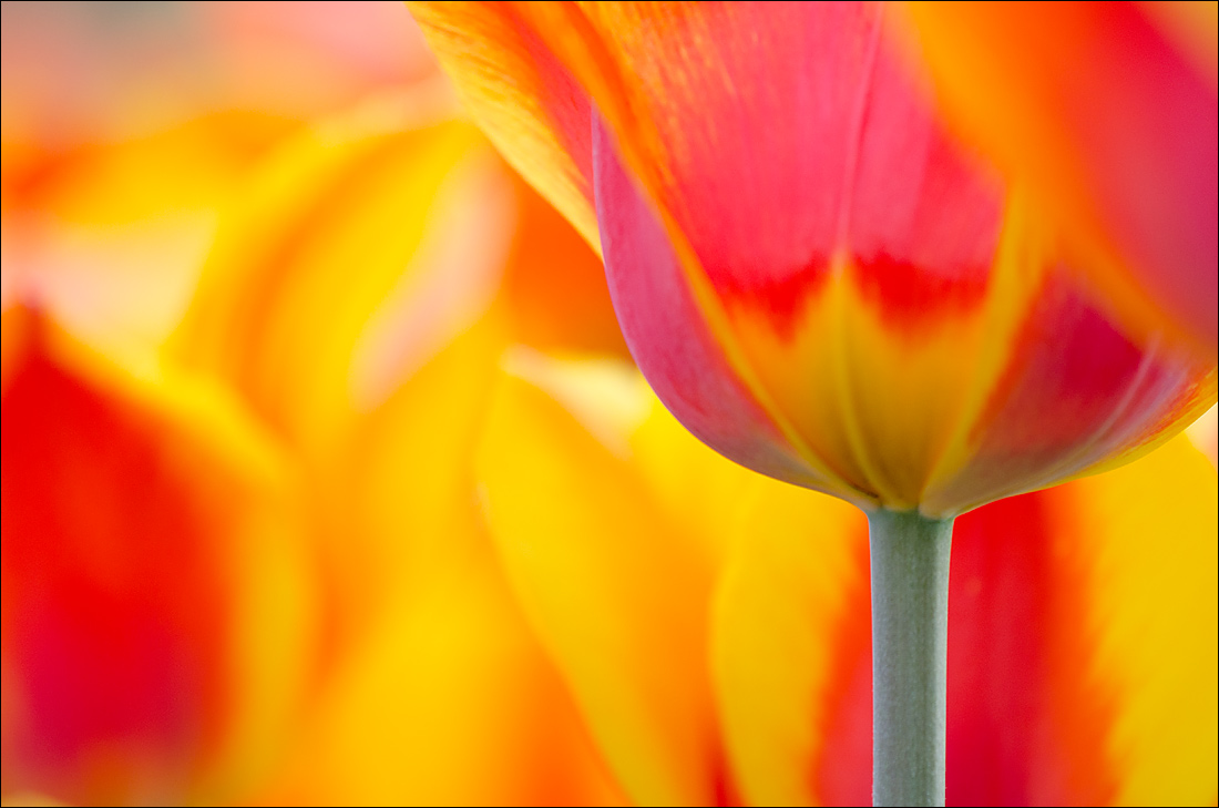
When I was wandering around our local gardens at Thanksgiving Point in Lehi, UT, I noticed an area that they had planted with some very large, very vibrant tulips. I went down and took as many different comps as possible as the sun was setting.

Specific question: Is the petal coming in from the top right a shot killer?

Thanks for your honest thoughts!

Nathan

Nikon D7000, Sigma 180 macro, handheld lying on the ground, ISO 400, f4ish

Comments

15 comments
Comment posted by Michael Lowe on April 28, 2014 at 1:01 PM
I certainly don't think it's a shot killer. In a perfect world it probably shouldn't be there, but to tell you the truth, I didn't even notice it until I read your comments. I was to busy exploring the amazing, vibrant color. It kind of mirrors the diagonal lines of the petals. :toast:
Registered on February 11, 2004, 777 Posts, 5252 Comments
Comment posted by Keith Bauer on April 28, 2014 at 2:08 PM
Sweet shot. Love the vibrant colors and composition. Your specific question: It would be better without it, but certainly not a shot killer.
Registered on November 20, 2003, 458 Posts, 4836 Comments
Comment posted by Jim Hackley on April 28, 2014 at 4:03 PM
Wonderful perspective and low angle composition. The petal in the upper right is no big deal to me as my eye went from the stem and then to the center of the image to check out those flowing colors. Well done Nathan.
Registered on September 17, 2009, 302 Posts, 5535 Comments
Comment posted by Bob/Charly Nelson on April 28, 2014 at 7:14 PM
WOW, in your face color! There's not a thing I don't like. Superb work.
Bob :wavey:
Registered on January 29, 2014, 35 Posts, 398 Comments
Comment posted by Ken Smith on April 29, 2014 at 12:01 AM
Hi Nathan, I’ll be the party pooper…the urc is a detractor…preventing this from getting enlarged and on the wall. A critical part of this photo are the lines or outline of the front tulip…esp the stem… Your eye follows that stem up…to the oops, in my opinion. Hey…it does have a lot of cool blends in the bokeh or b/g. Try cropping the top at just above the yellow ptn and crop the rt side to exclude that petal. And your stem becomes more dominant and interesting.
Registered on September 5, 2008, 449 Posts, 2444 Comments
Comment posted by Gary Yeoh on April 29, 2014 at 5:49 AM
Nathan:

I tend to agree with Ken's assessment. Overall, the bg bokeh is great and the stem certainly provides an anchor. Would be nice to follow the petals right out tot he RUC rather than blurred out by the petal.
Registered on September 1, 2009, 588 Posts, 8184 Comments
Comment posted by Lorna Taylor on April 29, 2014 at 3:01 PM
A stunning feast of colour , love the DOF choice !
Registered on November 12, 2010, 254 Posts, 3083 Comments
Comment posted by Lucy VanSwearingen on April 29, 2014 at 5:15 PM
Oh Nathan! Pure Eye Candy :toast: :toast:
Registered on May 23, 2009, 800 Posts, 2042 Comments
Comment posted by Nathan Buck on April 29, 2014 at 5:26 PM
Thanks for all of your honest thoughts. I like the bokeh enough that I am going to try to clean up that corner a bit with a combination of cropping and cloning. If I get something that I like, I will post it back here for thoughts.

Thank you very much!

Nathan
Registered on November 1, 2003, 1101 Posts, 13589 Comments
Comment posted by scott lanz on April 30, 2014 at 1:55 AM
Too bad about the encroaching petal, Nathan. I think with some cropping and cloning, this fine image can be salvaged.
Registered on November 14, 2003, 840 Posts, 12902 Comments
Comment posted by Sanjay Sundaram on April 30, 2014 at 3:03 AM
Beautiful image Nathan! Just an explosion of color with the stem to hold the abstract together. The oof petal does bother me a bit. Would love to see your fix to an otherwise spectacular image.

Sanjay
Registered on April 9, 2013, 107 Posts, 725 Comments
Comment posted by Albert Darmo on April 30, 2014 at 3:23 PM
Hi Nathan :wavey: looks good in the regular version,, but the large version, or printed large would make the petal a shot killer. the colors and light are truly amazing :smile:


Albert Darmo
Canada
Registered on November 25, 2008, 1386 Posts, 11978 Comments
Comment posted by Mark Seaver on April 30, 2014 at 7:09 PM
I like the "peek-a-boo" sense that the petal on the right adds. In fact, I wish it came down a bit further. Strangely, I find the oof red area on the left distracting. I wonder about a subtle desaturation there or maybe a crop.
Registered on January 23, 2011, 1103 Posts, 17270 Comments
Comment posted by Ian Wolfenden on April 30, 2014 at 9:37 PM
A great blaze of colour swirling across the frame - gorgeous, Nathan !! I guess I would prefer it without the corner petal, yes, but the overall effect remains powerful nonetheless.
Registered on May 18, 2007, 1108 Posts, 7647 Comments
Comment posted by John Williams on May 3, 2014 at 2:19 AM
Not a killer, but if forced to choose I like your more recent post.
Registered on September 6, 2007, 221 Posts, 5985 Comments