Nature Photographers Network
This is the preserved archive of the original Nature Photographers Network. The community continues at naturephotographers.network.
Fire Storm + Repost
‹ PreviousLandscape GalleryNext ›

Fire Storm + Repost

by Sairam Sundaresan

Gallery: LandscapePosted May 4, 2014273 views15 comments
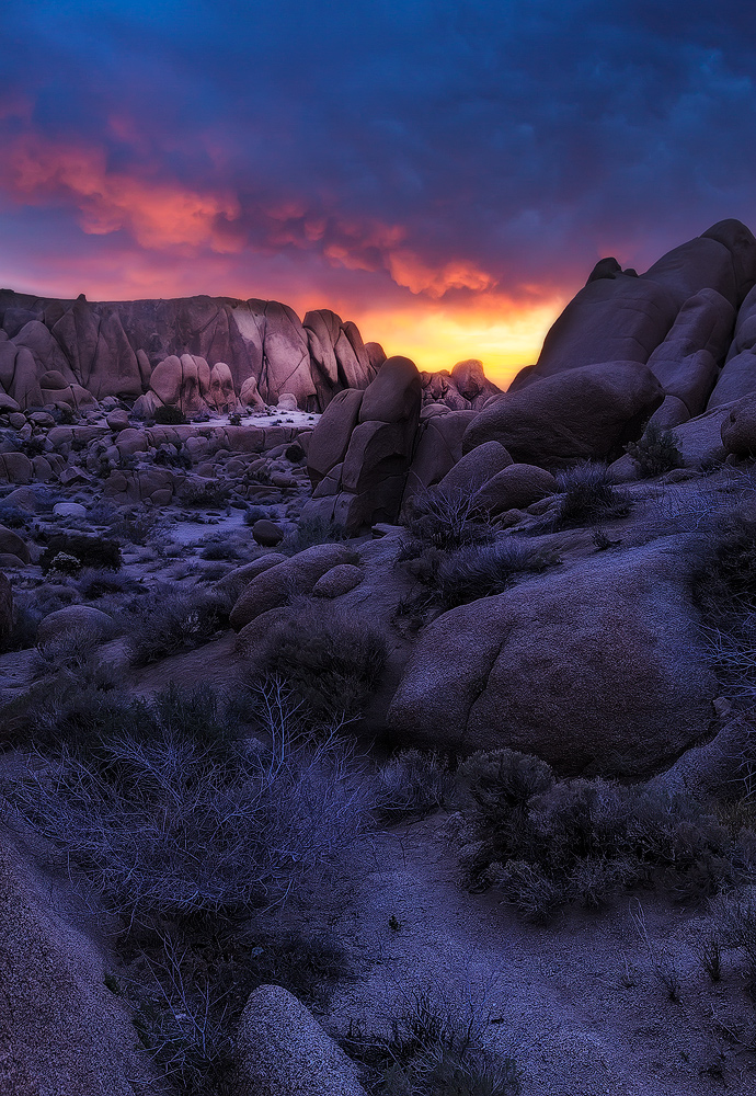
After a full night of shooting stars and the night sky, my friends and I caught a beautiful sunrise in Joshua Tree National Park. There was some seriously sick light that hit the clouds and this image doesn't even do justice to that .

Please see larger version.

I'd love to get yours thoughts and feedback on this.

Comments

15 comments
Comment posted by Scott Fricke on May 4, 2014 at 4:46 PM
You captured a beautiful moment there Sairam! I like the perspective you chose being in the shaded area around the corner from the direct light, it gives the scene a bit of mystery. I'd be tempted to crop off some of the bottom to above the bush, maybe to a square format just because it's a little empty and uninteresting down there. [I just looked at the larger version, maybe theres enough texture to be okay without the crop]] Very nice work! :toast:
Registered on January 19, 2007, 133 Posts, 1448 Comments
Comment posted by Sairam Sundaresan on May 4, 2014 at 5:52 PM
Thanks for the comment Scott, I did ponder cropping off the front, although I found the bush to be a nice anchor point in the front and the path doing a kind of zig zag a little interesting. Perhaps if everyone is of this opinion, I can post a cropped version just to see how it looks. :smile:
Registered on March 14, 2013, 100 Posts, 643 Comments
Comment posted by Stan Rose on May 4, 2014 at 6:02 PM
Pretty!
Yes, obviously the fg is the contentious part here. It does add some depth, but my vote would be to crop 1/2 the bush so the sky is 1/3 (its closer to 1/4 here)
I like everything else. The WB is definitely cool-and warming it might accentuate the sky more, but then you'd lose the mood--so i think its good as is :smile:
Registered on September 15, 2005, 836 Posts, 17099 Comments
Comment posted by Jared Warren on May 4, 2014 at 6:34 PM
Sairam, this is gorgeous. Great processing and control of the beautiful light. The warm/cool contrast is very nice IMO. My 2 cents on the cropping is that I don't mind it as is, but if I were to crop I'd cut to just above the center foreground rock, leaving the two foreground bushes as anchors. Really nice work! :toast:
Registered on May 11, 2012, 84 Posts, 931 Comments
Comment posted by Floris van Breugel on May 4, 2014 at 9:44 PM
I love the light and color gradient! I agree with Scott, I would crop it to a 4x5 horizontal (cutting out the bottom half, and just a tiny bit of the top of the sky), which would focus the image on the canyon, rocks, and light, which is what this image is all about. I love all the rounded shapes of the rocks - the canyon really has some depth to it.
Registered on December 19, 2008, 306 Posts, 4840 Comments
Comment posted by gary phillips on May 5, 2014 at 3:40 AM
I'm firmly in the crop camp, Sairam. You found some amazing light and did a super job from capture to presentation. I could even see going square here but no matter what you do, you have a winner. :toast:
Registered on October 24, 2013, 185 Posts, 4136 Comments
Comment posted by Bill Reid on May 5, 2014 at 2:51 PM
Beautiful colors and sky in this Sairam and the processing is very well done also. I agree that a crop from the bottom might help but that's just my thought. Beautiful as is and a great job. :toast:
Registered on January 27, 2013, 65 Posts, 2460 Comments
Comment posted by Nick Bristol on May 6, 2014 at 12:37 AM
Sairam, This is a beautiful image! Really some wonderful light and color you captured in this image. I like the crop suggestion to just above the foreground center rock as Jared mentioned. Very nice work on this!! :toast:

Nick Bristol
Lone Rock, WI
Registered on February 1, 2004, 752 Posts, 14140 Comments
Comment posted by Sairam Sundaresan on May 6, 2014 at 2:11 AM
Thanks for all the feedback guys. Here are 3 crops I played with. Please let me know which one works for you guys! :smile:

Crop 1
Registered on March 14, 2013, 100 Posts, 643 Comments
Comment posted by Sairam Sundaresan on May 6, 2014 at 2:11 AM
Crop 2
Registered on March 14, 2013, 100 Posts, 643 Comments
Comment posted by Sairam Sundaresan on May 6, 2014 at 2:11 AM
Crop 3
Registered on March 14, 2013, 100 Posts, 643 Comments
Comment posted by John Williams on May 6, 2014 at 3:46 AM
For me, that third crop for sure. I like the others, but that crazy sky is a major part of the image, and in the third crop it assumes a proper percentage of the photo. It also emphasizes those cool shorter rocks on the left; hard to appreciate in the other crops. Nice!
Registered on September 6, 2007, 221 Posts, 5985 Comments
Comment posted by Kah Kit Yoong on May 6, 2014 at 8:03 AM
Wonderful landscape, the light is exquisite. I would go with the final crop although I'm rather partial to the first crop too.
Registered on September 27, 2006, 636 Posts, 10682 Comments
Comment posted by Joseph Campisi on May 7, 2014 at 4:29 AM
I actually like the balance and flow of the original version Sairam, but the last semi square crop works well too. Nice work man! :toast:
Registered on November 24, 2008, 304 Posts, 3211 Comments
Comment posted by Sairam Sundaresan on May 7, 2014 at 2:26 PM
thanks guys! somehow, I'm still torn between crops 1 and 3 :confused:
Registered on March 14, 2013, 100 Posts, 643 Comments