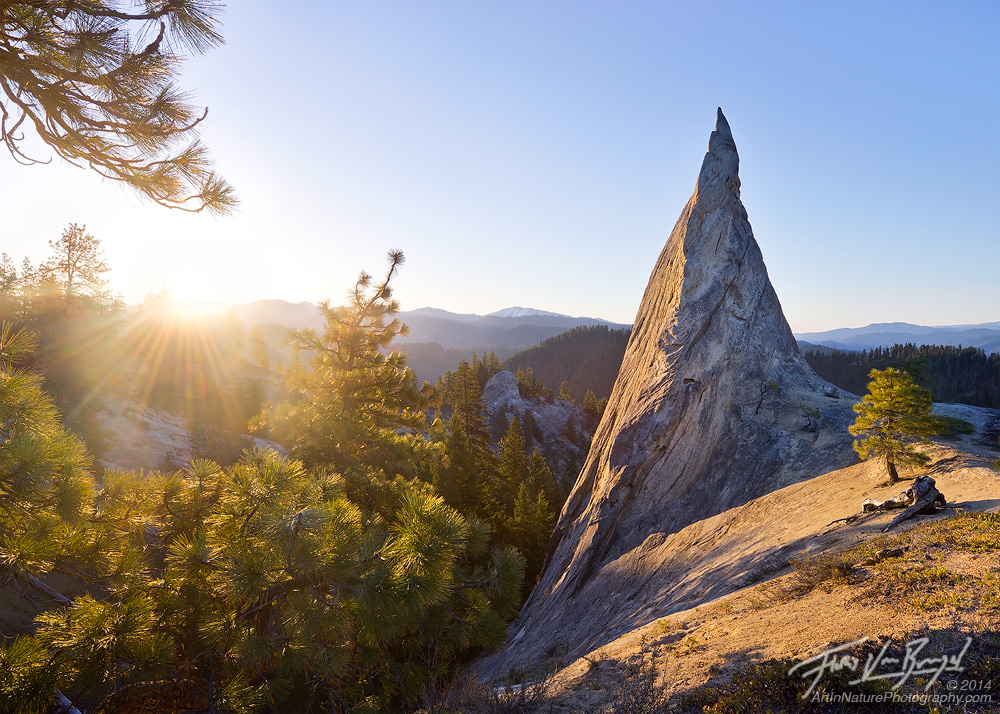
Cascade Spire
by Floris van Breugel
It's been a great spring here in the pacific northwest, and I've gotten a couple chances to get out and explore new areas. I just posted a bunch of new images to my blog, and wanted to share my favorite one here. I just love the bright warm feeling of sunshine, and the elegant, almost regal, appearance of the rock, and the solitude embodied by the young pine tree by its side. I actually came back to see what it would look like with a brilliant sunset/sunrise, but it just didn't compare to the simple elegance of the crisp clear sky in this image.
View the larger one, and thanks for your thoughts!

Comments
21 commentsNever stopped me, though
Honesty, the comp is too split for me. The tree corner yanks my eye big time, and the sun just blinds me, as does the flare.
The rhs is great, but nothing connects me in the photo to the lhs. I love the idea behind the shot, it's obviously a tough one to pull off--just doesn't quite get there for me.
Just wanted to explain the method behind the madness... maybe it was more helpful for me than you - I actually found it quite helpful to have to articulate those thoughts in writing, so for that, thank you!
But, perhaps you'd like this one more? I found it rather too simple, but as a pure study in form and light, I do like it: vertical composition
I completely understand your explanation--the only problem is that you of course had the benefit of being there, so your memory of the warmth etc helps you connect the dots, the viewer doesn't have that benefit.
Actually, the comp doesn't puzzle me that much, the only thing that really threw me was why you allowed flare into the shot (theres some pretty noticeable lens flare even at the bottom) Im pretty sure you could have eliminated that if you wanted to--so why didn't you want to?
light and shadow on the right as leading line with tree and that long rock as BG.
Nice image though.
Carol
I really liked your explanation of why you choose to shoot it the way you did. I had a similar thoughts but wouldn't have been able to articulate them nearly as well.
If I was never able to get outside again, I'd much prefer to view images like this, as they remind me of what its actually like to be outside. So much photography today has become more about making everything perfect that it almost looks cgi to me and in turns make me think more about the processing/computer work than it does about the subject matter.
Keep up the great work!
Thanks for posting, again.
Regarding the branches in the upper left - any bigger, and I found them too distracting, and without them, the flow was broken because of the empty space in the upper left. They also add the feeling of being in the forest, looking out over the incredible view.
Regarding the bright sun - again, the sun is bright, it should be bright in a photograph. I find most photographs these days (especially those including the sun) to be far too dark myself. While dramatic and eye catching on screen, it just doesn't relate to the natural world, which is what nature photographs are all about for me. It looks like the kind of stuff I would see in a disney movie and fantasy series like lord of the rings. Fantastical, but just not connected to the reality of the human experience. (That is of course different for night images, which should most certainly be rather dark).
As an aside, several non-photographer colleagues and friends of mine have, unprompted, said that they really enjoy this particular image.. usually no one says anything...
I agree there seems to be a lot of extremely dark images on the net lately and being into prints they don't appeal to me sometimes. Very nice job on this.
What gives me pause about this version is that a decent portion of the image under the sunstar is more washed out and tough to see. If there were a bit more contrast or less flare there, I think it would let my eye explore a bit more as you stated. Perhaps that is part of the intentional "blinding" you described or you may decide to keep it more in the sun and sky